12-colour watercolour palette suggestions
For many people, their first experience in watercolour is a 12-colour palette with pans of paint - often student grade. The W&N Cotman or perhaps a metal palette being popular choices. Often, the colours that are in the palettes are not really ideal. Many contain a black and/or white that it is preferable to avoid, many contain two very similar yellows or blues, or the colours just aren't strong enough to enjoy using.
Whatever the reason, you may be looking for a great 12-colour professional watercolour palette.
I'll show a number of suggestions here. I'll show them by brand, though you can usually mix up different brands of watercolour to get your ideal palette.
Whatever the reason, you may be looking for a great 12-colour professional watercolour palette.
I'll show a number of suggestions here. I'll show them by brand, though you can usually mix up different brands of watercolour to get your ideal palette.
Daniel Smith 12-colour palettes
I've suggested my Ultimate Mixing Palette of 15 colours here, and discussed variations including a 12-colour version. I'll show some other options using Daniel Smith watercolours here too. Daniel Smith watercolours come in tubes 15ml, with some available in 5ml tubes and some in watercolour sticks.
|
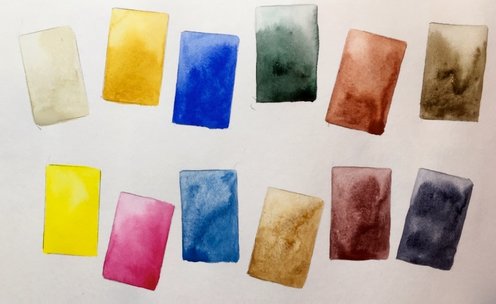
This is my favourite 12-colour palette for sketching, particularly urban sketching. You can read more about it here. It has loads of earth pigments and lots of granulation.
It contains buff titanium, hansa yellow medium, quinacridone gold, quinacridone rose, ultramarine, cerulean chromium, perylene green, goethite, burnt sienna, Indian red, raw umber and Jane's grey. It has a good range of earth colours for capturing landscapes and buildings, a good mixing green and just a single bright rose red that will mix lovely purples, oranges and even mid red hues. If you have space for two more colours (since you can usually fit 14 half pans into the metal palette boxes) I'd add sap green and undersea green for convenience or pyrrol scarlet and phthalo green BS for greater mixing range, but this palette works rather well with just 12 colours. |
|
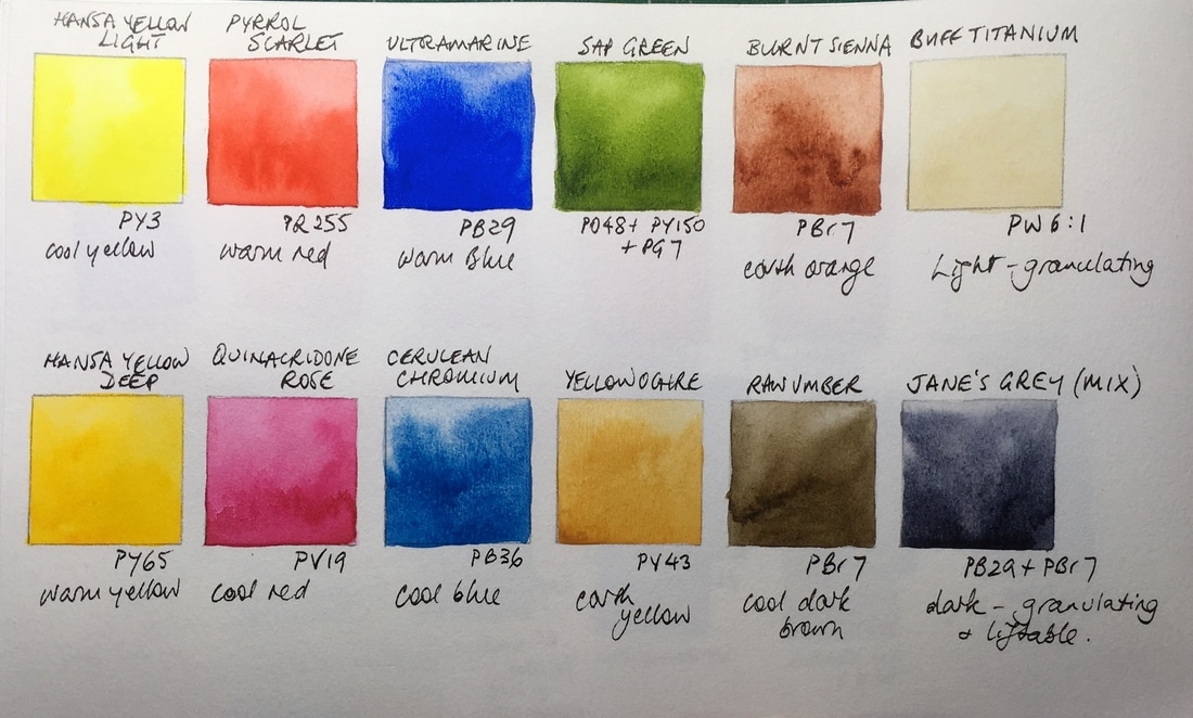
Here is another 12-colour option. This is my suggested more traditional palette. It has a warm and cool yellow, red and blue. It also have a useful convenience green, a yellow earth (or use raw sienna or goethite or Mont Amiata Natural sienna) a warm and cool brown and a dark and a light. Very workable.
It would work as a great beginner palette as well as an urban sketching palette as there are no phthalo colours to stain and cause trouble, nor any opaque cadmium colours to cover carefully drawn pen lines ;-) I've written more about this one here. If I were to add two more colours I'd add perylene green or undersea green and Indian red. |
|
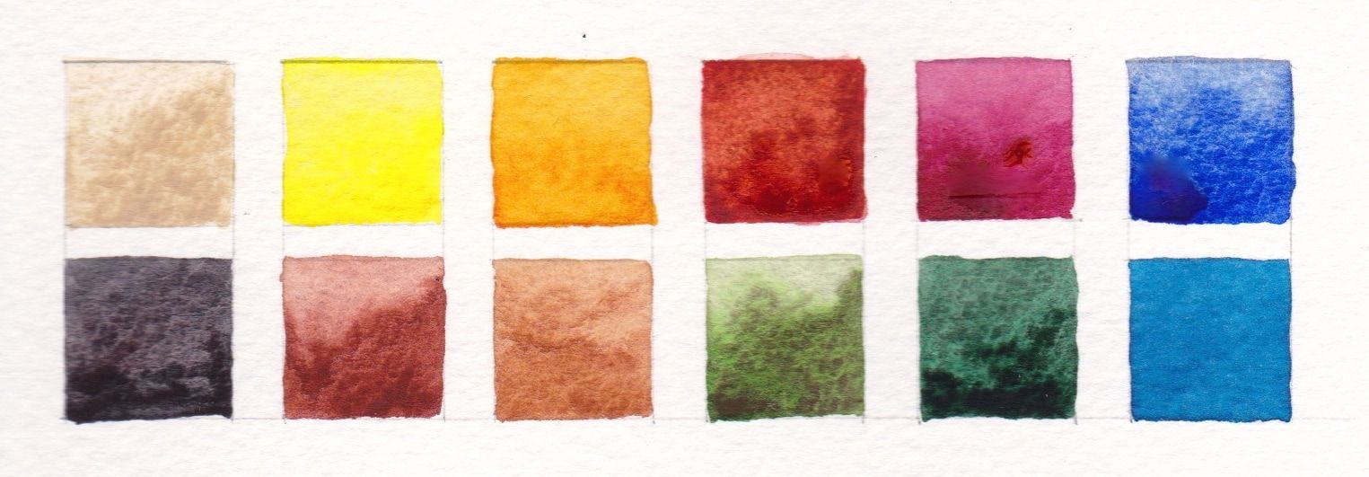
This is another interesting highly granulating 12-colour palette option, using buff titanium, hansa yellow medium (or light), quinacridone gold, transparent pyrrol orange, quinacridone rose, ultramarine, cerulean chromium, jadeite genuine, green apatite genuine, goethite, burnt sienna and Jane's grey.
If I were to two more to this I'd add raw umber and Indian red. |
Schmincke 12-colour palette
With the release of 35 new colours in 2017, Schmincke has filled a number of gaps in their range, and this is a lovely 12-colour palette for sketching or travel or even studio work that uses 4 of the new colours. Schmincke colours can be purchased in pans, half pans or tubes.
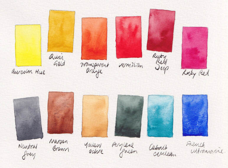
I don't usually add an orange to a 12-colour palette but the Schmincke Transparent Orange is just so beautiful it deserves to be in it. If you don't want orange, replace with Indian Red or perhaps a convenience green.
If you have room for 2 more colours, consider adding Indian Red, and/or a convenience green and/or Phthalo Green for mixing and/or Helio Cerulean (which is a phthalo blue GS)
You can see the full range of Schmincke watercolours here
|
Another option, particularly if you love painting flowers or are doing my courses, is to include Ruby Red Deep (instead of Green Umber) as a crimson is difficult to mix. I'd also include a mid yellow - Aureolin Hue - rather than a traditional cool yellow - because I prefer the brightness of a mid yellow; and quinacridone Gold instead of a traditional clean warm yellow, as I love the greens it will mix. Both options include Transparent Orange, which is really lovely to explore mixing with Ultramarine and with Cobalt Cerulean. Both also include Perylene green, which will mix fabulous greens with the yellows in the palette as well as being useful alone. I've also avoided the phthalo colours in these palettes, as I often do in a 12-colour palette. |
Da Vinci 12-colour palette.
Da Vinci are perhaps less will known outside the USA, but they are lovely watercolours. They make another of my favourite oranges so I'd include an orange in a 12-colour Da Vinci palette too, though you may prefer to use the warm red Permanent Red instead.
Hansa Yellow Light, Hansa Yellow Deep, Benzimida Orange Deep (or Permanent Red), Permanent Rose, Ultramarine, Cerulean Genuine, Sap Green, Phthalo green BS (or perylene green), yellow ochre, burnt sienna, Indian red and raw umber make up a great 12-colour palette.
If you have room for two more, you might add Permanent Alizarin (Quinacridone) if you do a lot of flower paintings, or phthalo blue GS and phthalo Green BS if you enjoy the transparent staining colours, or include phthalo green, perylene green and sap green for convenience and mixing options.
You can see all these colours on my blog here
(picture to come...)
Sennelier 12-colour palette
Sennelier from France make their watercolours available in full or half pans as well as tubes. I find the tube colours very runny due to the high honey content so would go with the pans or half pans for travel.
A 12-colour palette could be
Lemon Yellow (as a cool yellow) or Primary Yellow; Sennelier Yellow Deep or Quinacridone Gold as a warm yellow; Scarlet Laquer, Rose Dore Madder Lake (my preferred warm red pigment) or French Vermilion as a warm red; Rose Madder Lake or Carmine as a cool red; Ultramarine Deep as a warm blue; Cobalt Green as a cool blue (this is unusual, is it is a turquoise. Or use Phthalo Blue); Sap Green or Olive Green as a convenience green; Yellow Ochre as an earth yellow; Burnt Sienna as an earth orange; Caput Mortuum as an earth red; then Warm Grey as a convenient light for marble and stone; Payne's Grey as a convenient dark.
You can see all these colours on my blog here
(picture to come)
White Nights 12-colour palette
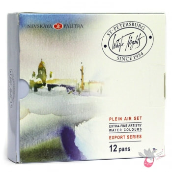
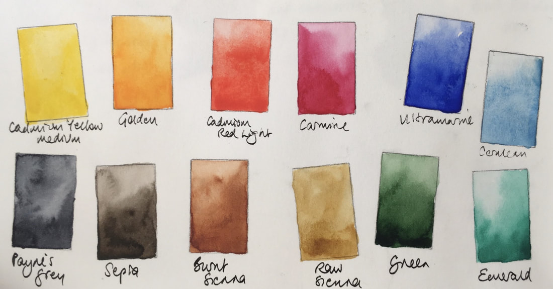
White Nights is an inexpensive watercolour range available in individual full pans and sets. This is a 12-colour plein air sketching palette that I suggested a few years ago. It contains Cadmium Yellow Medium, Golden, Cadmium Red Light, Carmine, Ultramarine, Cerulean, Emerald, Green, Raw Sienna, Burnt Sienna, Sepia and Payne's Grey. While this is not a brand I commonly use, I think it's a workable and affordable palette to get started in watercolour, for less than AU$50 from www.larrypost.com. See the set here
In 2017 White Nights released 9 new colours, including a number of useful quinacridones, that would change my choices for a 12-colour palette. Here is the rest of the St Petersburg range. Here is my original post about White Nights watercolours.
In 2017 White Nights released 9 new colours, including a number of useful quinacridones, that would change my choices for a 12-colour palette. Here is the rest of the St Petersburg range. Here is my original post about White Nights watercolours.
There are many and varied 12-colour palette options and finding what is best for you really depends on what you most enjoy painting. I usually use more than 12 colours in a palette, but with some trial and error I have devised a palette that I can really work with and enjoy. So will you :-) In the meantime these may give you some ideas to try.
I have deliberately avoided cadmium colours where possible as they are generally more expensive and they can be more difficult to work with as they are more opaque. I am thinking here about palettes that suit travel and urban sketching is particular, but these would also be suitable for studio palettes, perhaps set up with full rather than half sized pans.
I have deliberately avoided cadmium colours where possible as they are generally more expensive and they can be more difficult to work with as they are more opaque. I am thinking here about palettes that suit travel and urban sketching is particular, but these would also be suitable for studio palettes, perhaps set up with full rather than half sized pans.
This page last updated December 2017
