Characteristics of Watercolours - checking labels
Artist Quality Watercolours are characterised in a number of ways, including Opacity, Transparency, Granulation, whether Staining or liftable as well as Lightfastness. Some may have a number of characteristics and the tube will often give an idea of what to expect. Different brands will have different methods of showing the information and for some it is more difficult to find. You may have to check the website.
Lightfast ratings
Lightfast ratings may be I (excellent) to IV (fugitive) or ***** (excellent) to * (fugitive). Sadly, though, they are not always accurate, with fugitive colours being given a good rating by some manufacturers. It is so important to check the lightfast ratings of paints you are using if you are framing and selling your work. You can't necessarily trust recommendations by well-known artists since time and time again they will recommend Alizarin Crimson (made with pigment PR83 which is fugitive and will fade), Aureolin (made with PY40, which will fade or turn brown over time) and Opera Rose (made with a combination of PR122 and a fugitive florescent dye. It will also fade.)
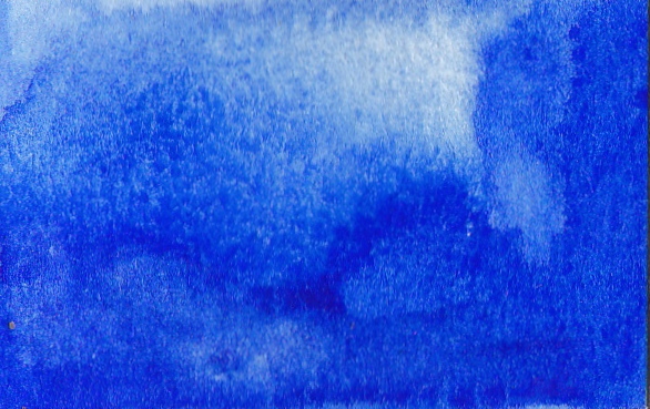
GranulationGranulation may be simply stated on the paint information as Y or N. Some paints granulate wildly, others just a bit, others not at all. Granulation is usually most noticeable in a wash on damp paper.
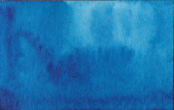
Ultramarine, a very popular and useful warm blue, granulates in a wash, so will not be a completely smooth colour when painted. Phthalo Blue, a very popular cool blue, has tiny particles of colour and does not granulate at all. It can be used for very smooth washes. Some of the most granulating paints are Daniel Smith Primateks and colours with Lunar Black PBk11. You will genuerally find that genuine Ultramarine, Cobalt, Manganese and Cerulean blues granulate but Prussian, Pththalo and Indanthrone blues do not. |
Staining
|
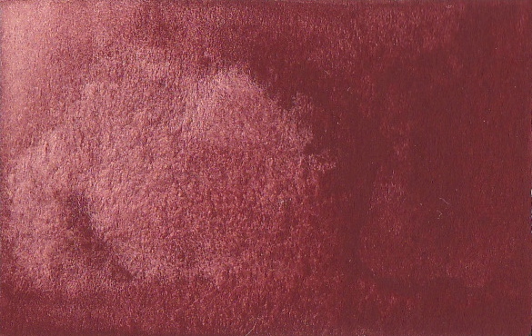
Staining may be rated 1 (non - staining, therefore liftable or completely removable once dry) to 4 (highly staining). Phthalo colours are generally very staining colours. Cobalt colours are very liftable. Staining colours can be excellent if you are using glazes to build up a painting. Liftable colours are useful for laying down a wash and lifting out highlights or leaf veins and so on. To test your colours, paint a small wash with a range from dark to light tone, allow to dry, and the use a fairly stiff damp brush to gently 'scrub' a section of the paint and dab with paper towel. Repeat gently but don't overdo it or you will damage the paper. If you can get back to white paper you have a non-staining colour. If some of the colour still shows on the paper it is a staining colour.
|
Transparency
|
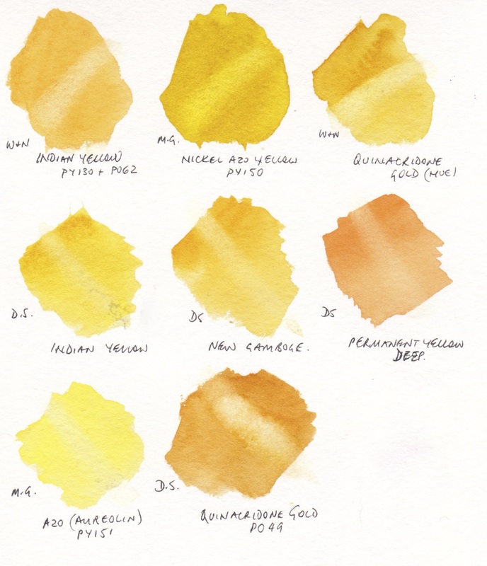
Transparency may be an empty 'O' for transparent, a half filled 'O' for semi-transparent and a filled in 'O' for opaque, or the tube may say T (transparent), S/T (semi-transparent), S/O (semi Opaque) or O (Opaque).
Phthalo Blue, pictured in the Granulation section, is a transparent colour. Quinacridone colours are transparent, as are Phthalos, Hansas, and many others. A colour may be transparent AND granulating like Ultramarine or opaque AND granulating like Indian red, which is one of the most opaque colours. |
Pigment Number
Paints should be labelled with the pigment number to show what they are made from. If there is just one pigment number they are single pigment paints. If there are two or more they are a mixed pigment paint. Pigment numbers are really helpful to translate colours from one medium to another - for example if you like a colour in oils and want to find it in watercolour, the pigment number may be helpful. However, the one pigment number may have many varied versions.
PW = Pigment White Eg Titanium White is PW6.
PY = Pigment Yellow
PO = Pigment Orange
PR = Pigment Red
PV = Pigment Violet
PB = Pigment Blue
PG = Pigment Green
PBr = Pigment Brown
PBk = Pigment Black
Sometimes there is a further number, so PB15 is phthalo blue, but PB15:3 is the Green Shade, PB15:6 is the Red Shade.
You can see much more on specific pigments on my blog such as PB29 and this on on PV19 and one on a range of blue pigments here. However you can see watercolours arranged by pigment numbers in the Painted Watercolour Swatches section of this website.
You can also look up pigments on the fabulous Color of Art Pigment Data Base or on Handprint.com's Guide to Watercolor Pigments
Series number
There will also be a series number on most artist grade watercolours that gives a indication of the cost of the pigment. Series 1 (0 in Schmincke) are generally lower cost pigments including earth pigments and series 4 or 5 (or more) are the most expensive pigments. Cadmium pigments are in the higher series range, along with cobalts. Higher cost does not mean better - many of the earth pigments have been around for centuries and are absolutely wonderful.
So What to Choose?
Even if you are a beginner, buy artist quality watercolours rather than student grade. They are more enjoyable and easier to use! Generally, earth pigments are likely to be granulating, Phthalo pigments are transparent and staining, Cobalt pigments are opaque and lift easily, Cadmiums are opaque, Pyrrols are more transparent. Some are considered semi-transparent or semi-opaque. All this can be very confusing. So what to choose?
What you want is a range of warm and cool, transparent and opaque, granulating and not, staining and liftable paints that suit your subject matter and style. It is very personal. My preference is for largely transparent watercolours, so I generally don't choose cadmiums or cobalts but transparent alternatives. There are some exceptions though, for example, I use Indian Red (PR101) which is generally opaque. Yellow ochre can also be semi opaque. Both can be very useful for landscapes. Cerulean is another semi-opaque and granulating watercolour if made with PB35 or PB36. It can be useful to mix a green that will cover other greens, especially if mixed with Yellow Ochre. It can be useful to have an opaque cadmium yellow for the same reason.
Since I paint a lot of landscapes, I love the granulating pigments. Ultramarine will granulate to some degree in almost any brand, though less with Schmincke Ultramarine Finest. Granulating Ultramarine can be lovely for greens in foliage, browns, neutrals and skies. If a non-granulating blue is required, Indanthrone blue (PB60) or Phthalo blue (PB15) may be the better choice. Phthalo blue comes in Red Shade and Green Shade from many manufacturers and is a useful mixing blue. A highly granulating cool but light blue is Manganese Blue (genuine) made with PB33. Many brands are made using alternative colours, so are called a hue, but Old Holland makes the genuine article and it is famous for painting shadows in snow.
Burnt Sienna, one of the most useful colours on the palette after the primaries, comes in a huge range of forms from an earthy orange-brown to a transparent burnt orange, and can be made from PBr7, PR101 and a whole host of other hues. My preference is for the PBr7 versions made by Da Vinci, Daniel Smith and M. Graham for example, rather than the PR101 hue by Winsor and Newton. Others prefer the brightness of the W&N version. It's a very personal choice. I am constantly adding to the Painted Watercolour Swatches section of my website to you can compare all these options for yourself. Also, see my Blog for more comparisons here.
Try to find colours you enjoy the look of that will mix together well, then paint with them and enjoy the process! If you want a great suggested palette of colours check the Getting Started in Watercolour tab for a suggestion to build up gradually, or The Ultimate Mixing Palette: a World of Colours tab for my recommended palette that could be used for a lifetime of painting!


