6 - Blue Watercolour SwatchesThere are literally hundreds of artist quality watercolours available from many brands. I have tested many of them and created swatches as seen on the right. The square box is painted into a damp wash at the top to show the colour mixed in water, with more pigment added towards the bottom. The rectangle is painted in a juicy wash to show the mass-tone. The small squares at the bottom of the swatch have the pigment number and characteristics - staining, lightfast rating, granulation and transparency.
For more information, see the Blue Artiscreation pigment datebase page here. See the Handprint Blue pigment page here, but note that this comprehensive information is based on tests completed in 2004. |
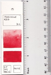
The size of my swatches
|
Single Pigment Blue Watercolours
Blue pigments are denoted as 'PB' for Pigment Blue, followed by a number. for example, PB29 is Ultramarine Blue. This will be a transparent, liftable and granulating blue, as a general rule.
Note - I am in the process of separating all the blue swatches into separate pigment sections. It takes a while as every swatch needs to be located in my files and reloaded...
Note - I am in the process of separating all the blue swatches into separate pigment sections. It takes a while as every swatch needs to be located in my files and reloaded...
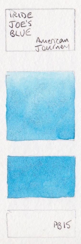
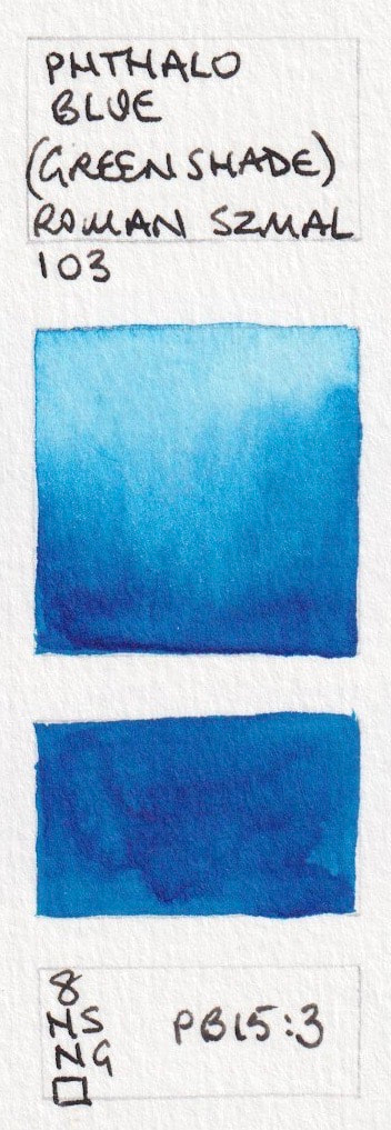
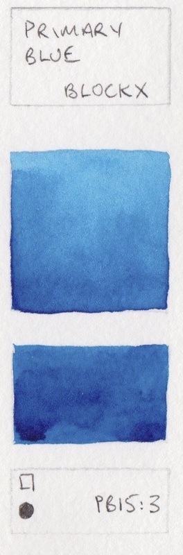
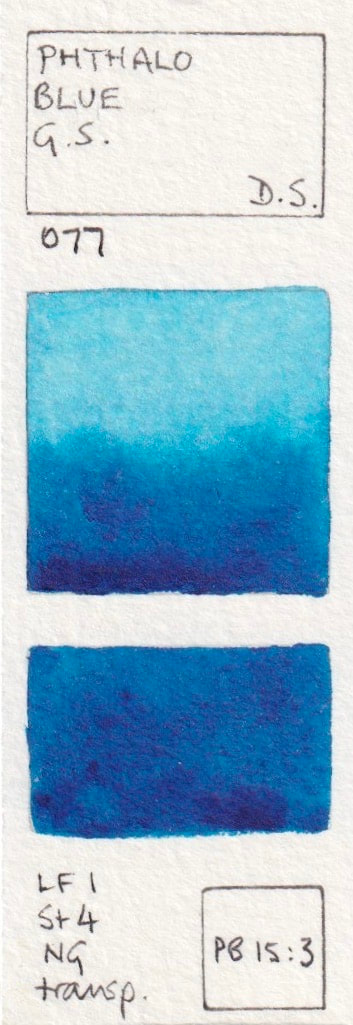
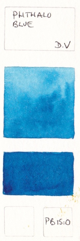
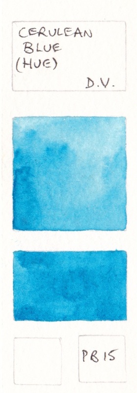
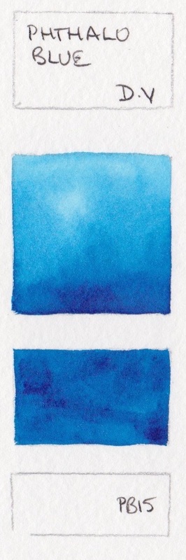
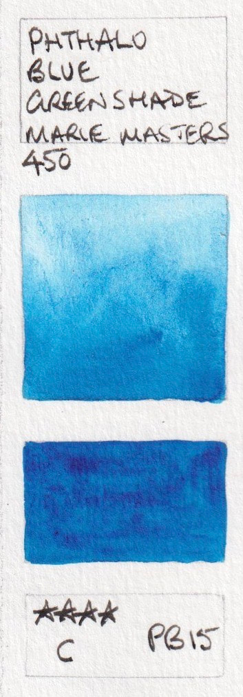
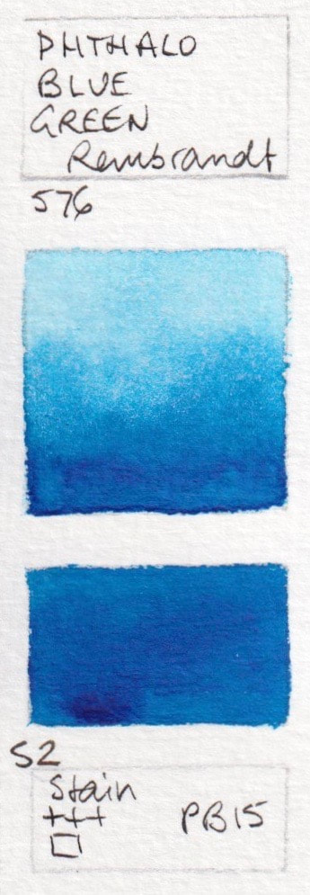
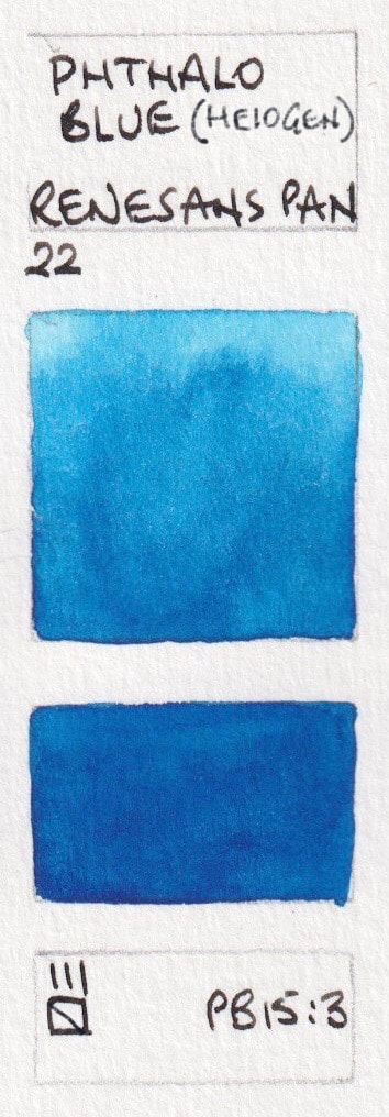
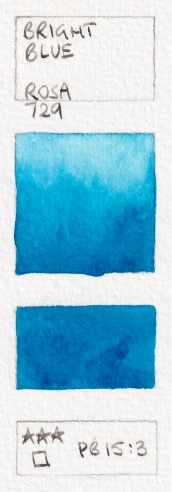
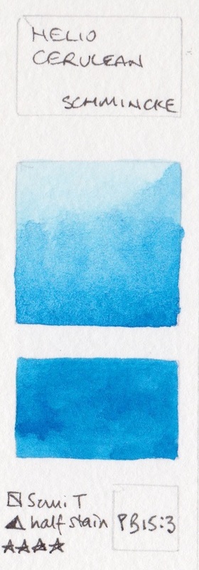
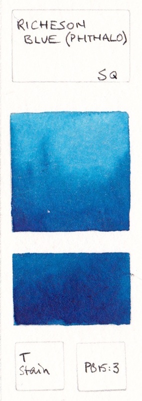
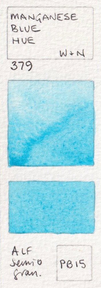
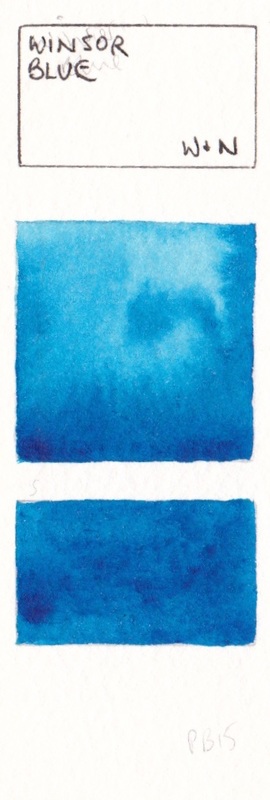
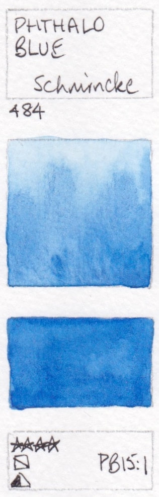
PB15: Phthalo Blues, and others made with PB15, PB15:3 and PB15:4 including Manganese blue hues.
Note that the common palette colour Phthalo Blue comes in RS (Red Shade) and GS (Green Shade) versions. While Phthalo Blue is the most useful name, this pigment is also known as Azure Blue, Intense Blue, Marine Blue, Monestreal Blue, Oriental Blue, Winsor Blue by W&N and Helio Blue by Schmincke and many others. I always prefer the name to indicate the pigment used as that gives a better idea of what to expect in the paint.
The green shade, made with PB15:3, is the more common choice as a transparent, staining cool blue option. The Red Shade, generally made with PB15:6, is slightly warmer, and is shown below.
Hover over any square to see the brand details. Click for full swatch.
Shown here are
The green shade, made with PB15:3, is the more common choice as a transparent, staining cool blue option. The Red Shade, generally made with PB15:6, is slightly warmer, and is shown below.
Hover over any square to see the brand details. Click for full swatch.
Shown here are
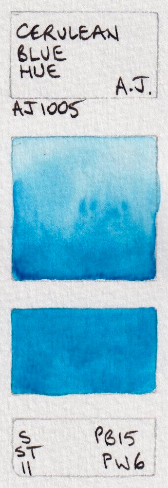
- Trasnsparent Cerulean ; A Gallo; Iridescent Joe's Blue - American Journey; Joe's Blue (Phthalo) - American Journey; Phthalo Blue (Green Shade) - Aquarius Watercolour; Phthalo Blue (Turquoise Shade) PB15:4 - Aquarius Watercolour. New 2023
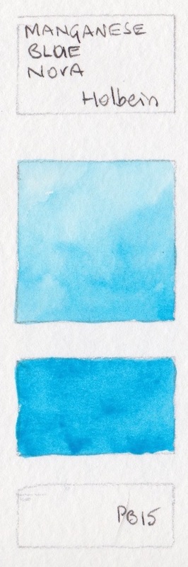
- Primary Blue - Blockx; Manganese Blue Hue - Daler Rowney; Manganese Blue Hue* - Daniel Smith; Phthalo Blue GS* - Daniel Smith; Phthalo Blue - Da Vinci;
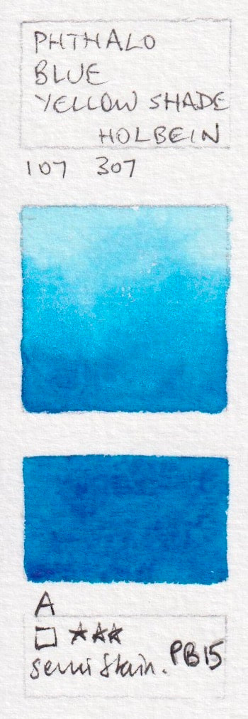
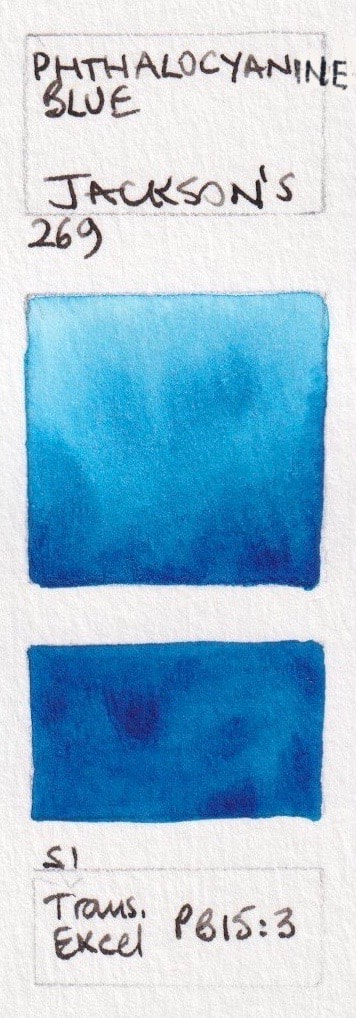
- Cerulean Blue Hue -Da Vinci; Phthalo Blue - Da Vinci; Phthalo Blue Yellow Shade - Holbein PB15; Manganese Blue Nova - Holbein; Phthalocyanine Blue - Jackson's;
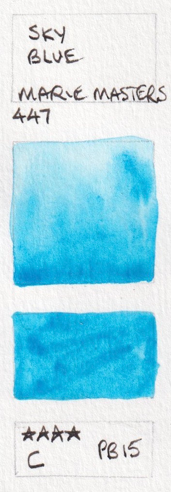
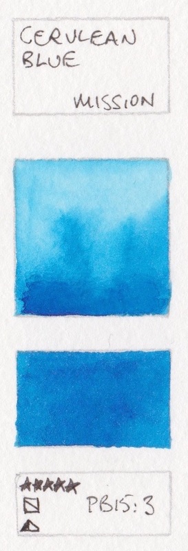
- Sky Blue - Marie Masters; Phthalo Blue Green Shade - Marie Masters; Cerulean Blue - Mission Gold; Scheveningen Blue - Old Holland; Phthalo Blue Green - Rembrandt;
- Phthalo Blue (Heliogen) - Renesans half pan; Bright Blue* - Rosa; Helio Cerulean - Schmincke; Richeson Blue (Phthalo) - Stephen Quiller; Azure - White Nights;
- Manganese Blue Hue - Winsor & Newton; Winsor Blue, Green Shade - Winsor & Newton


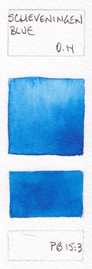

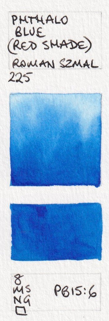
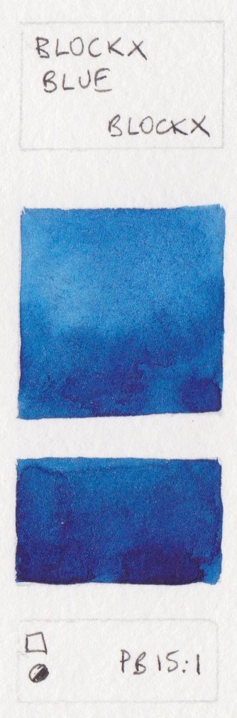
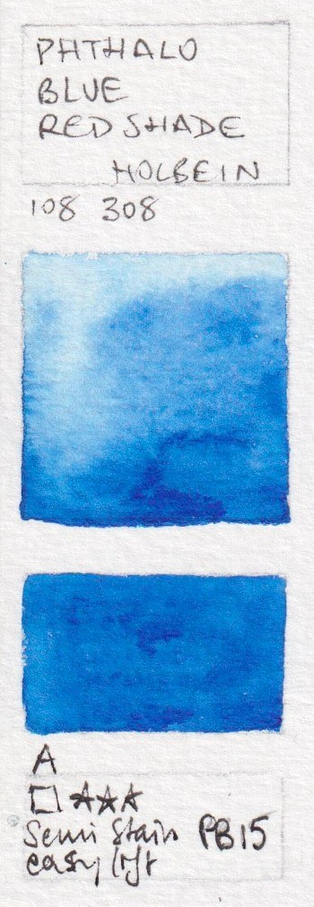
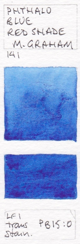
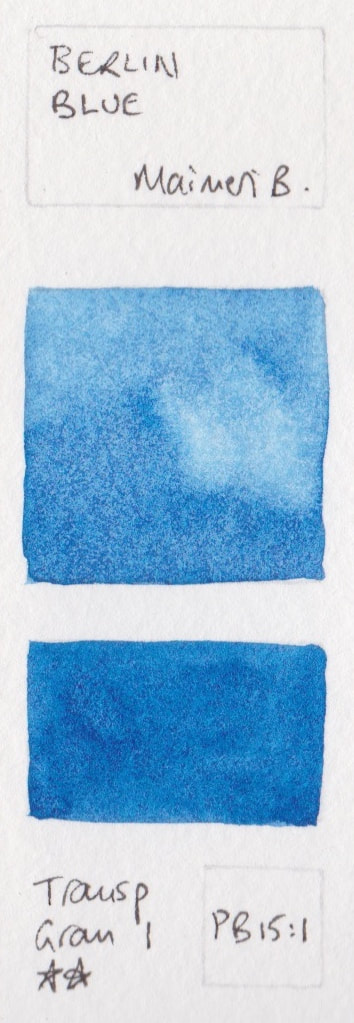
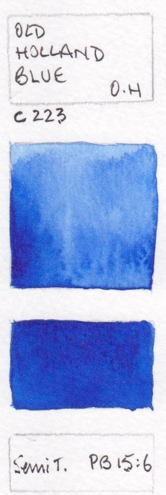
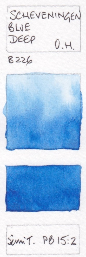
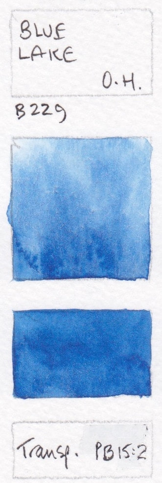
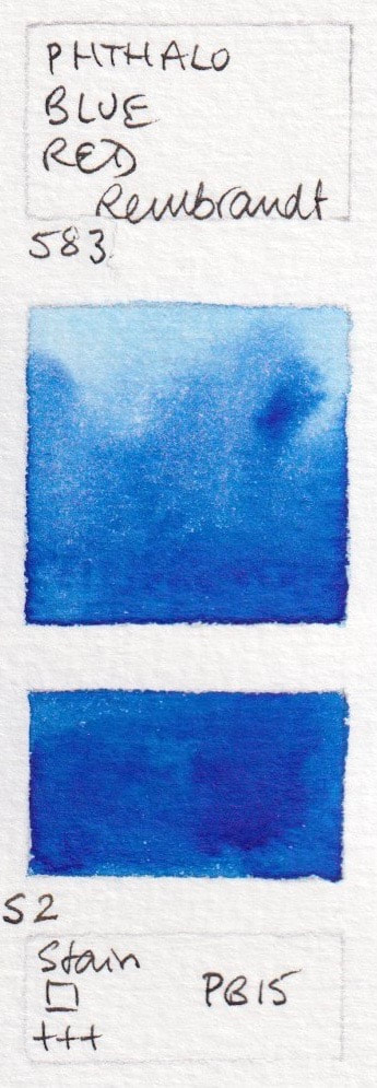
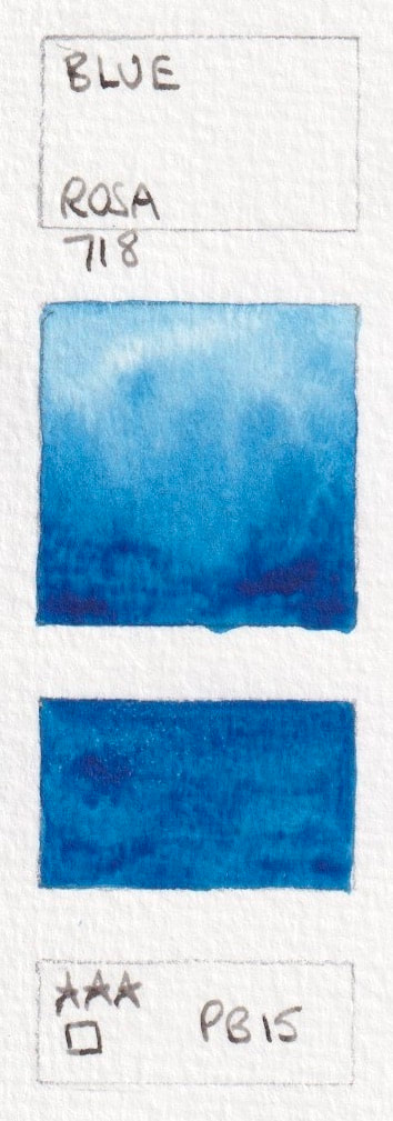
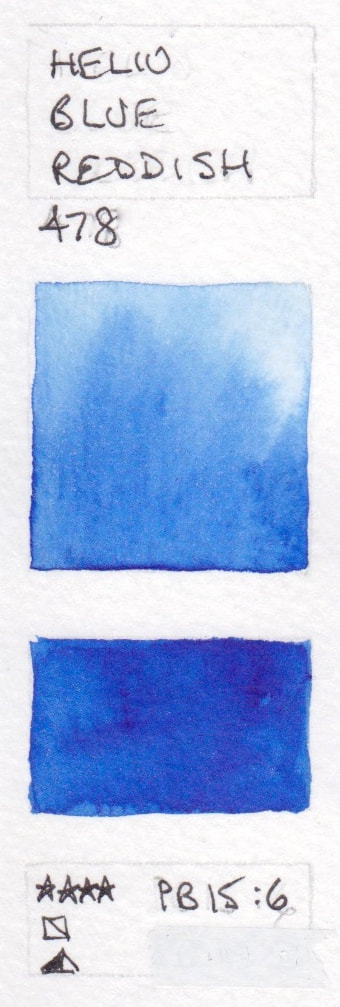
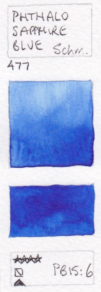
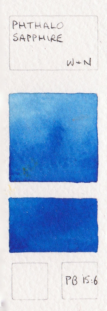
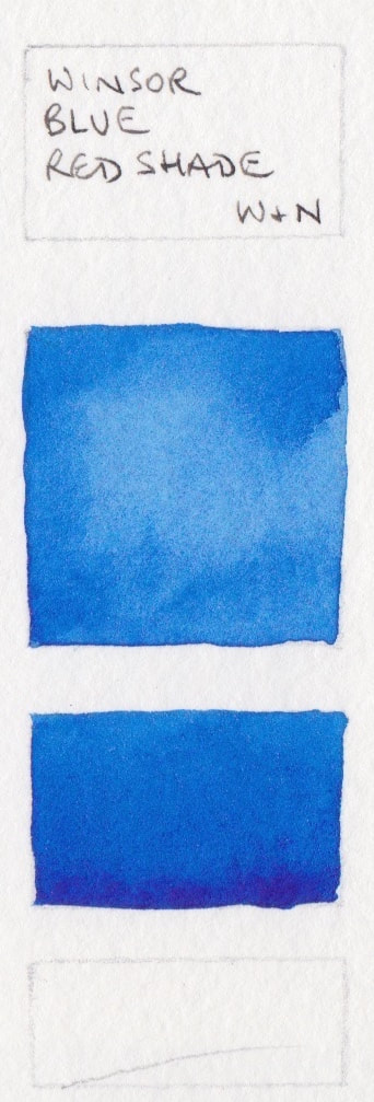
PB15, PB15:0, PB15:1, PB15:6, - Phthalo Blue Red Shade
Phthalo Blue Red Shade (RS) is slightly warmer than the more common Green Shade (GS). Made with unspecified PB16, or PB15:0, PB16:1 and PM15:6. It is a lovely colour its own, and can be made cooler with the addition of a little phthalo green PG7. Shown here in alphabetical order by manufacturer
- Phthalo Blue (Red Shade) - Aquarius; Blockx Blue - Blockx watercolour; Phthalo Blue RS* - Daniel Smith; Phthalo Blue Red Shade - Da Vinci watercolour; Phthalo Blue Red Shade - Holbein PB15;
- Berlin Blue - MaimeriBlu; Phthalo Blue Red Shade - M.Graham; Old Holland Blue - Old Holland; Scheveningen Blue Deep - Old Holland; Blue Lake - Old Holland ;
- Phthalo Blue Red - Rembrandt Watercolours; Blue* - Rosa; Blue Sennelier - Sennelier Watercolour; Helio Blue Reddish - Schmincke (Discontinued); Phthalo Blue Sapphire - Schmincke;
- Phthalo Blue - Schmincke; Phthalo Sapphire - Winsor & Newton; Winsor Blue Red Shade - Winsor & Newton


PV15 - Smalt Blue
Smalt Blue by Winsor & Newton is only just in the blue range - so close to a violet.

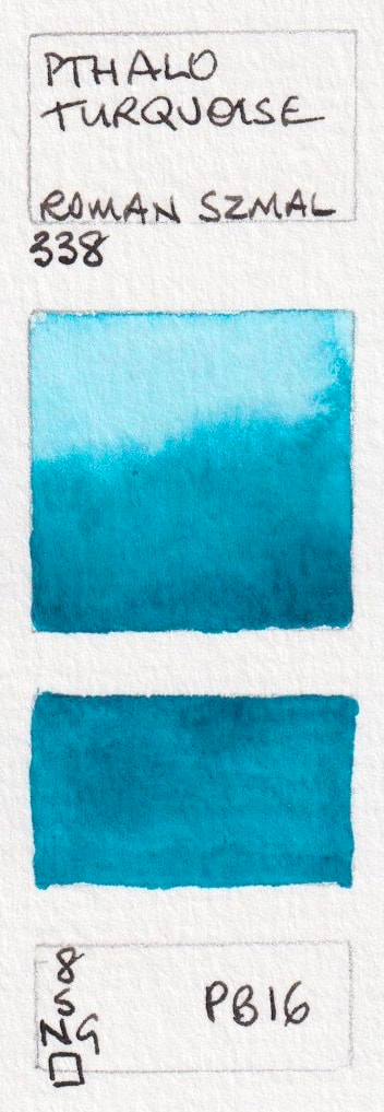
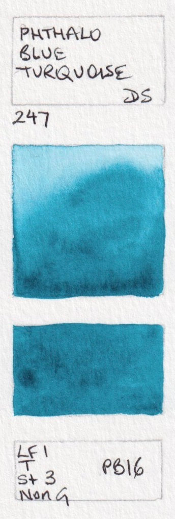
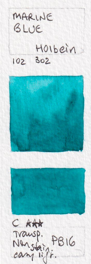
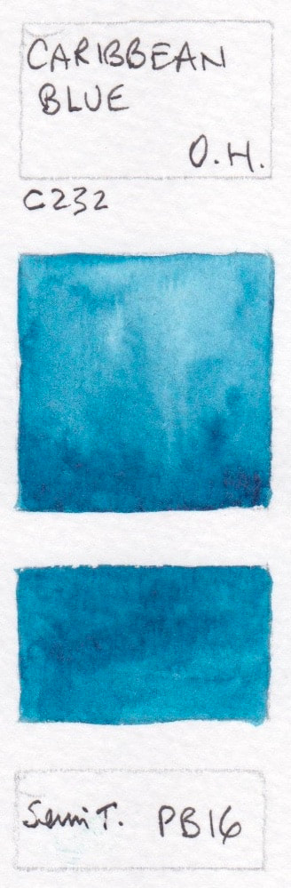
PB16
Phthalocyanine Turquoise is the official name for this pigment, but it is also known by many others. Shown here are:
- Phthalo Turquoise* - Aquarius; Phthalo Blue Turquoise* - Daniel Smith; Marine Blue - Holbein, Caribbean Blue - Old Holland; Phthalo Turquoise - Windsor & Newton.

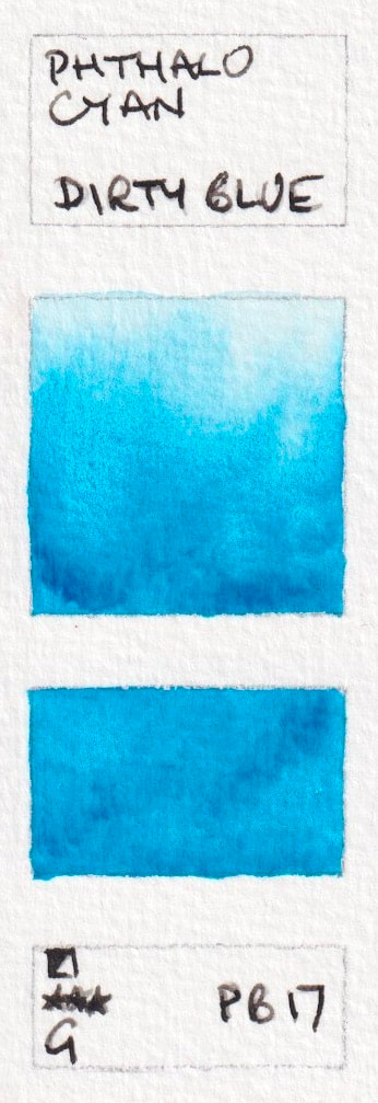
PB17
Officinally Phthalocyanine Cyan, there are a number of colours made from this pigment by Holbein that I haven't tested. Shown here is:
Phthalo Cyan - Dirty Blue
Phthalo Cyan - Dirty Blue
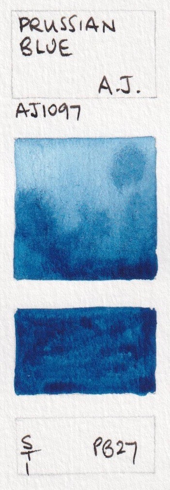
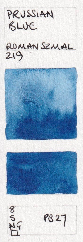
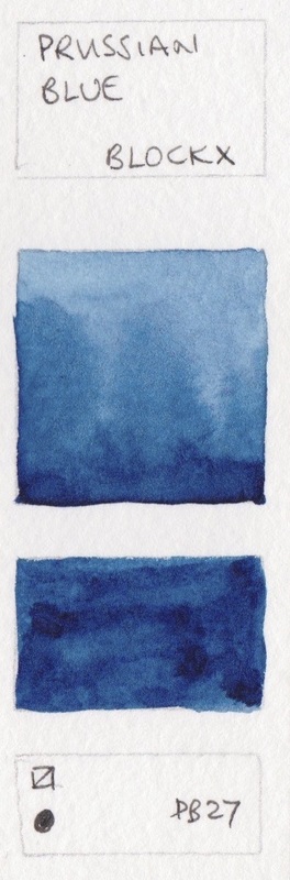
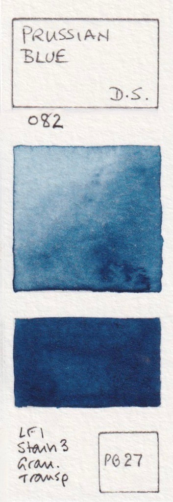
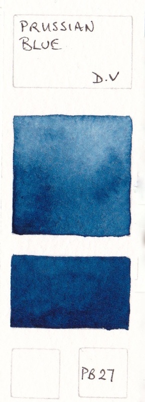
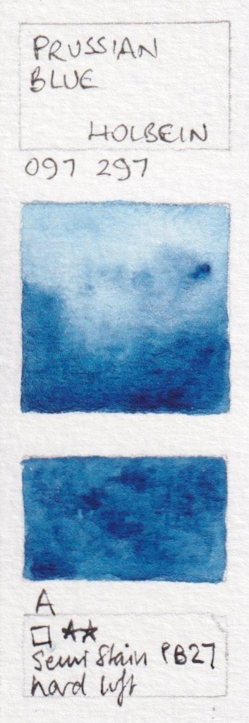
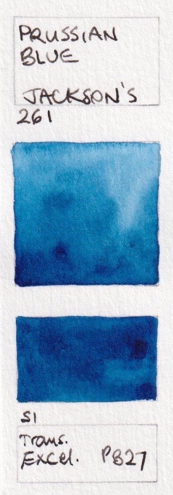
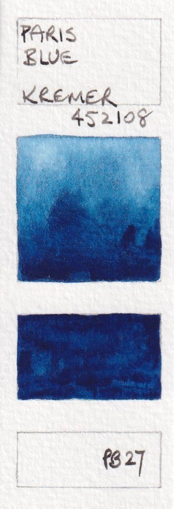
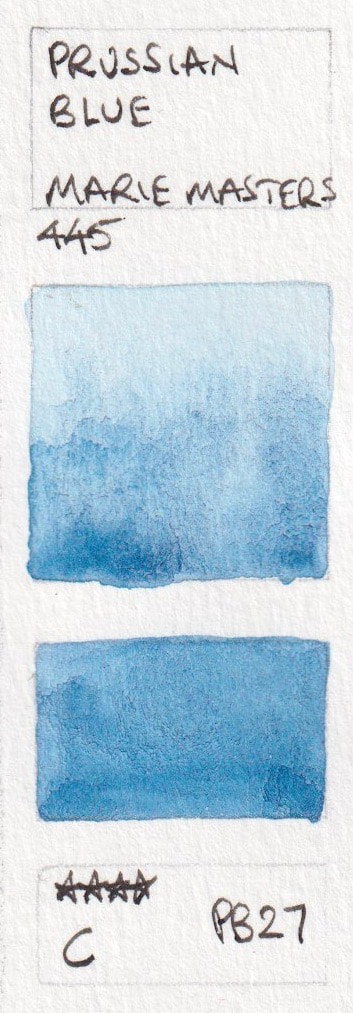
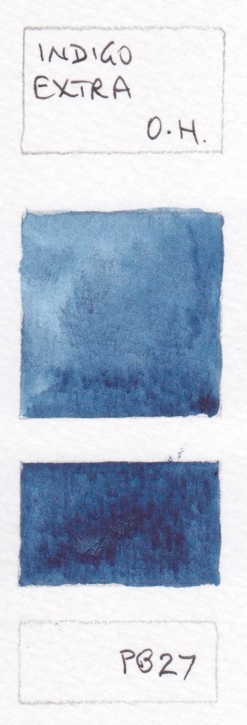
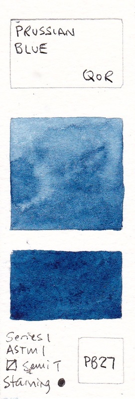
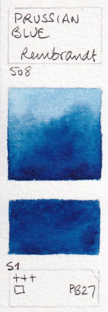
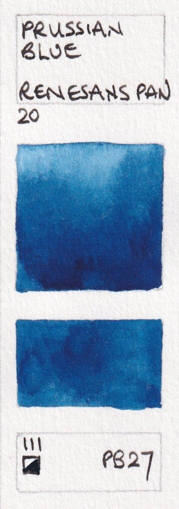
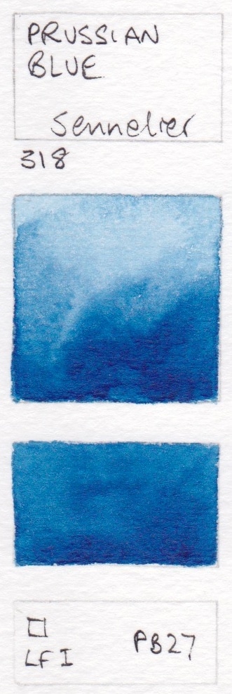
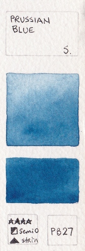
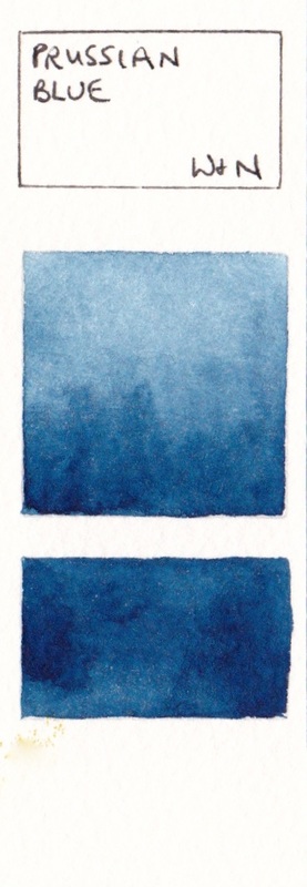
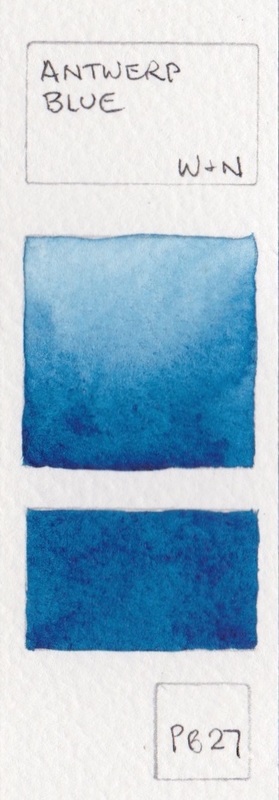
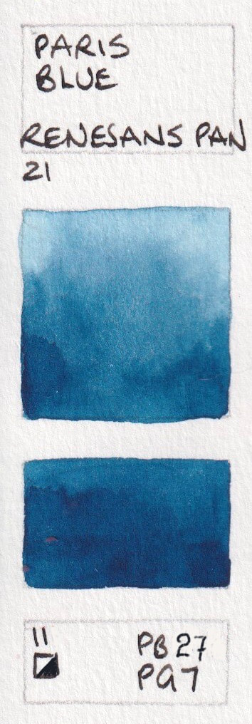
PB27: Prussian Blue or Paris Blue. Deep, cool and less staining than phthalo blues.
There are many other names in use for colours using this pigment.
- Prussian Blue - American Journey; Prussian Blue - Aquarius Watercolours; Prussian Blue - Blockx; Prussian Blue* - Daniel Smith; Prussian Blue - Da Vinci;
- Prussian Blue - Holbein; Prussian Blue - Jackson's; Paris Blue - Kremer; Prussian Blue - Marie Masters; Prussian Blue - Mission Gold;
- Prussian Blue - M.Graham; Indigo Extra - Old Holland; Prussian Blue - QoR; Prussian Blue - Rembrandt; Prussian Blue - Renesans half pan;
- Prussian Blue - Sennelier; Prussian Blue - Schmincke; Prussian Blue - Winsor & Newton; Antwerp Blue - Winsor & Newton


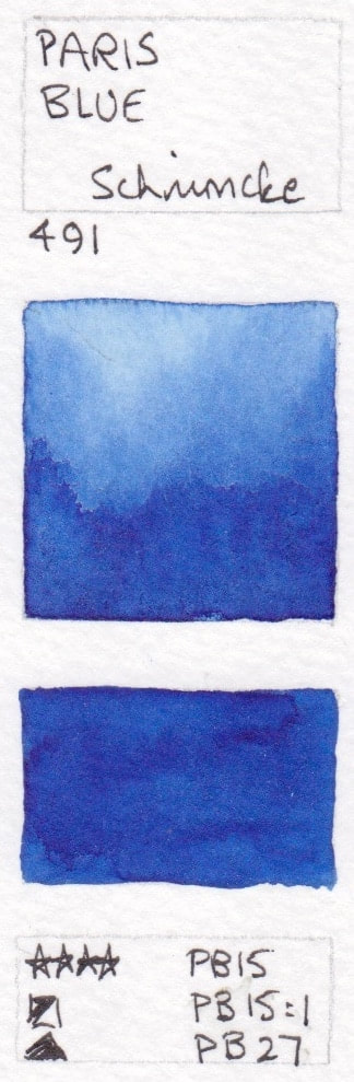
Mixed pigment Prussian Blue / Paris Blue hues
Paris Blue - Schmincke Watercolour PB15+PB15:1+PB27
Paris Blue - Schmincke Watercolour PB15+PB15:1+PB27
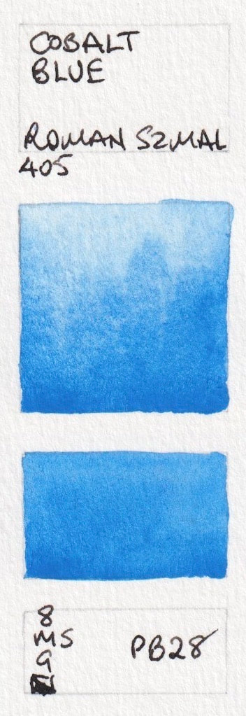
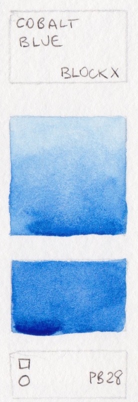
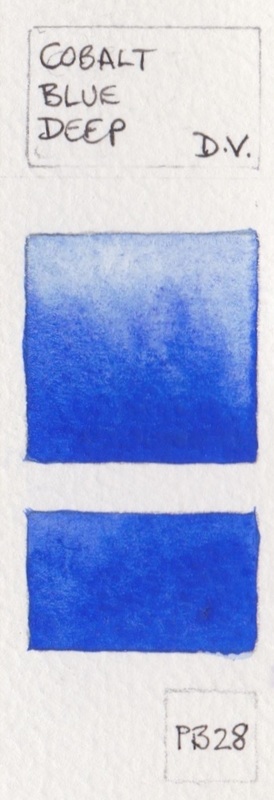
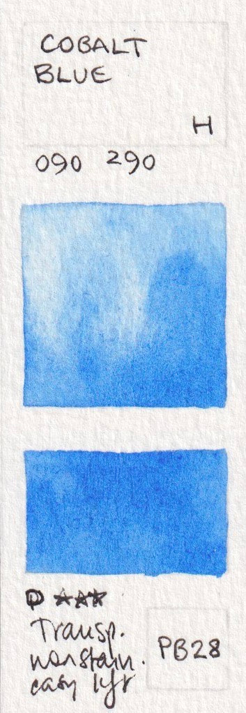
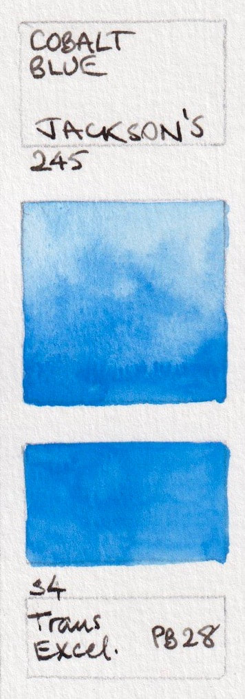
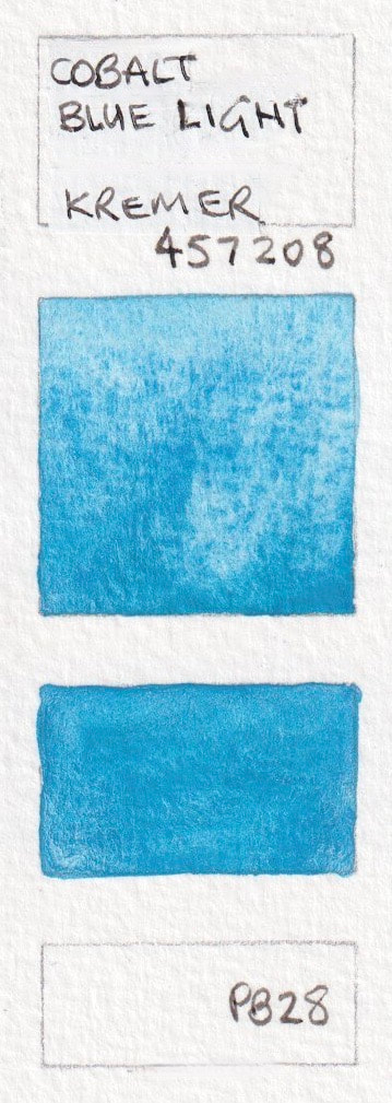
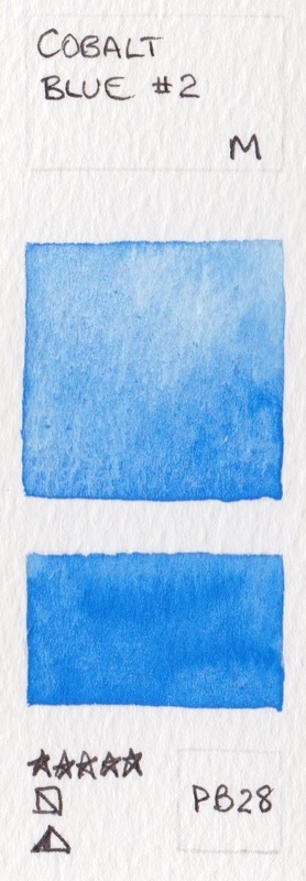
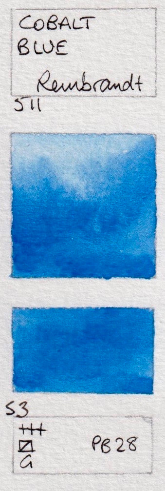
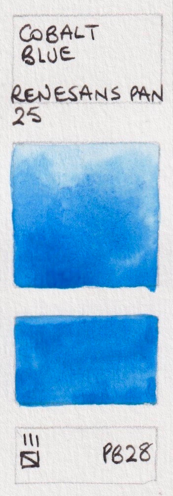
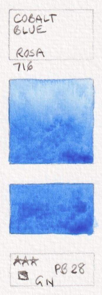
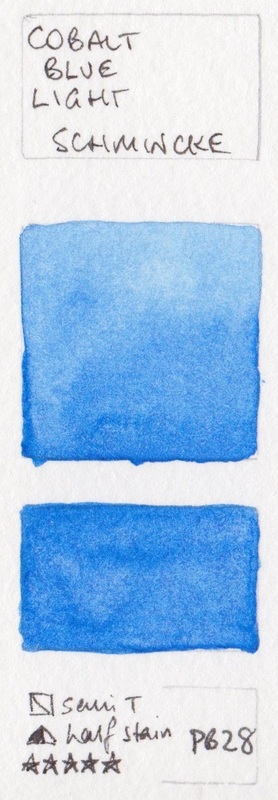
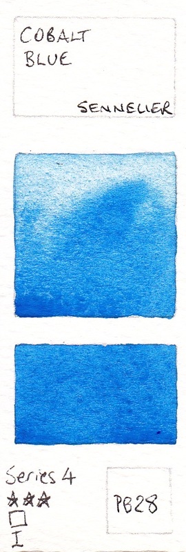
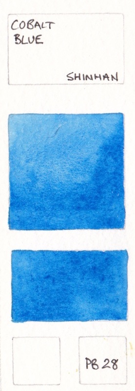
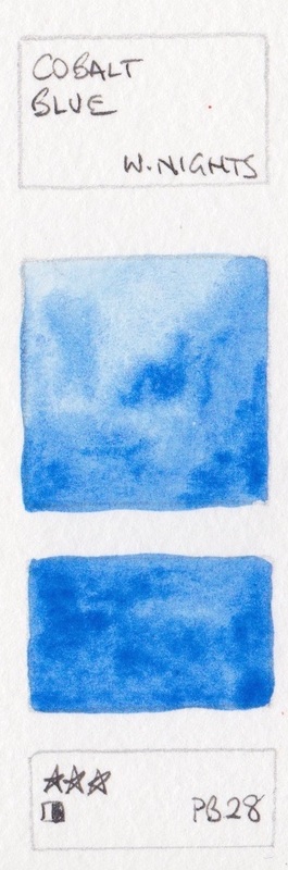
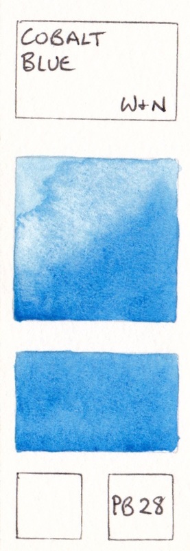
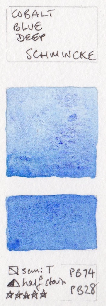
PB28: Cobalt Blues. Mostly mid to warm blues, granulating and liftable.
PB28 has two versions - the mid blue and the aqua blue shown below. See also PB74 - Cobalt Blue Deep.
- Cobalt Blue - Art Spectrum; Cobalt Blue - American Journey; Cobalt Blue* - Aquarius; Cobalt Blue - Blockx; Cobalt Blue* - Daniel Smith
- Cobalt Blue Deep - Da Vinci; Cobalt Blue - Holbein; Cobalt Blue - Jackson's; Cerulean Blue - Jackson's ; Cobalt Blue Pale - Kremer;
- Cobalt Blue Light - Kremer; Cobalt blue #2 - Mission Gold; Cobalt Blue - Old Holland; Cobalt Blue - Rembrandt; Cobalt Blue - Renesans pan;
- Cobalt Blue - Rosa; Cobalt Blue Light - Schmincke; Cobalt Blue - Sennelier; Cerulean Blue - Sennelier; Cobalt Blue - ShinHan; Cobalt
- Blue - White Nights; Cobalt Blue - Winsor & Newton


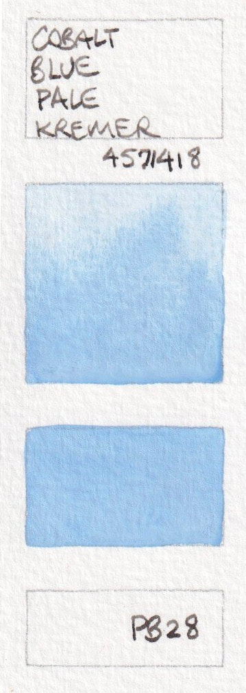


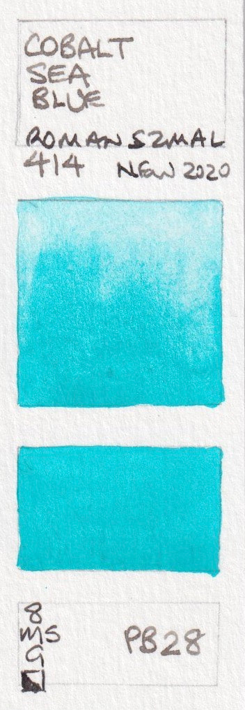
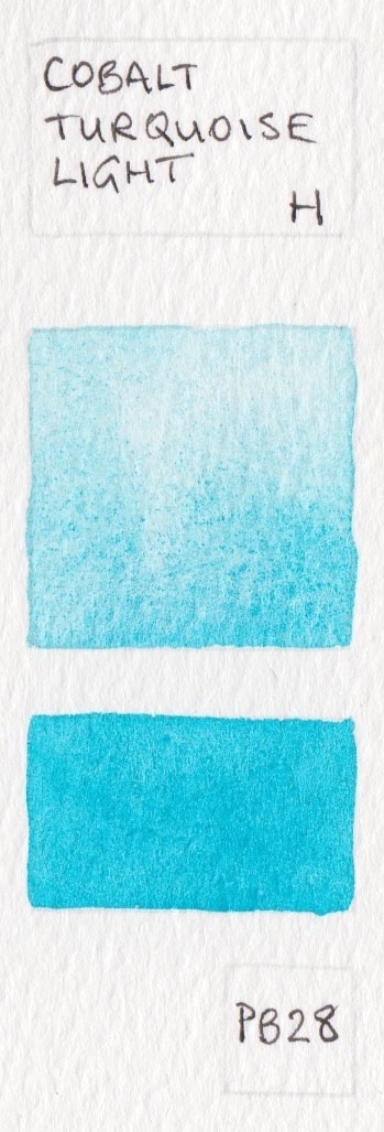
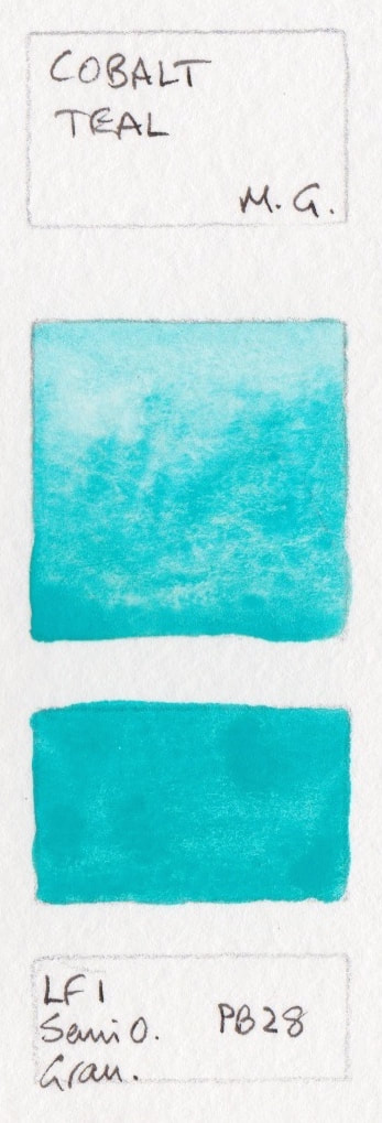
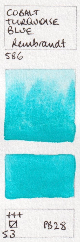
PB28 Cobalt Turquoise and Teals
Cobalt Sea Blue - Aquarius; Cobalt Turquoise Light - Holbein; Cobalt Blue Pale - Kremer ; Cobalt Teal - M.Graham; Cobalt Turquoise Blue - Rembrandt;

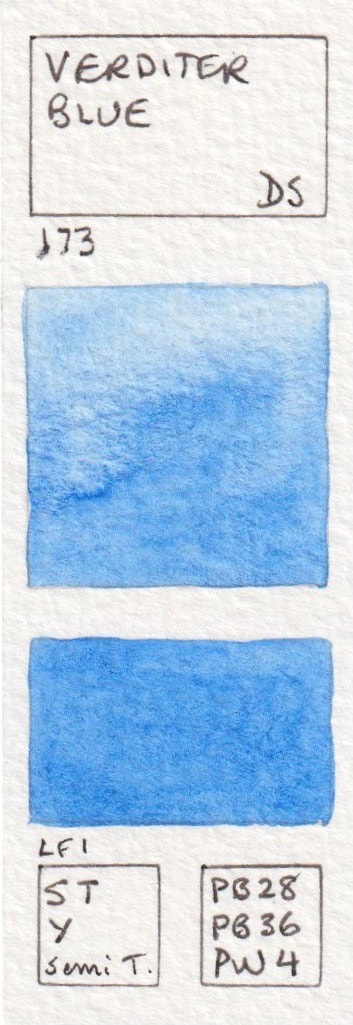
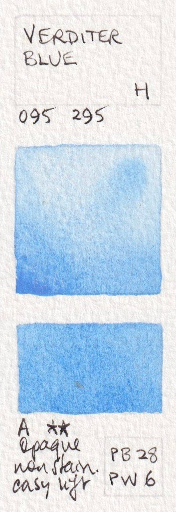
Mixed pigments blues containing PB28
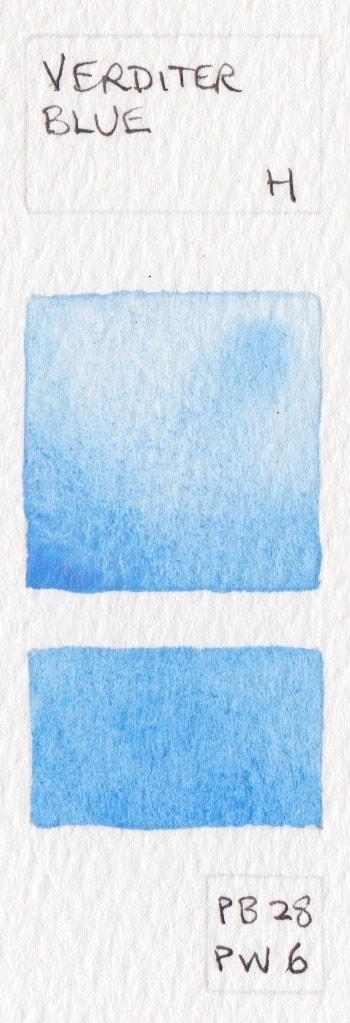
Verditer Blue* - Daniel Smith PB28 + PB 36 + PW4; Verditer Blue - Holbein PB28 + PW6; Cobalt Blue Deep - Schmincke PB74 + PB28
Verditer Blue* - Daniel Smith PB28 + PB 36 + PW4; Verditer Blue - Holbein PB28 + PW6; Cobalt Blue Deep - Schmincke PB74 + PB28

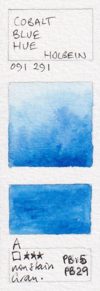
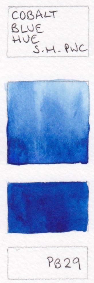
Cobalt Blue hues
Cobalt Blue is an expensive pigment. Ultramarine and a white pigment are sometimes used to approximate this colour, with greater or lesser success. These colours should always be called a cobalt blue 'hue'.
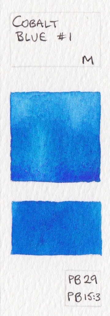
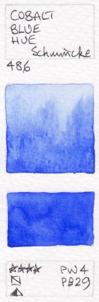
Cobalt Blue Hue - Holbein PB15 + PB29; Cobalt Blue - Marie Masters PB15 + PB29 + PW6; Cobalt Blue #1 - Mission Gold PB29 + PB15:3; Cobalt Blue Hue - Schmincke Watercolour PW4+PB29;
Cobalt Blue Hue - Holbein PB15 + PB29; Cobalt Blue - Marie Masters PB15 + PB29 + PW6; Cobalt Blue #1 - Mission Gold PB29 + PB15:3; Cobalt Blue Hue - Schmincke Watercolour PW4+PB29;

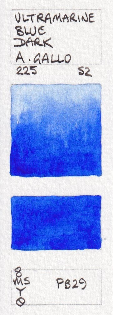
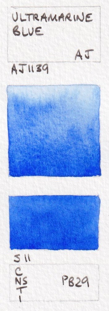
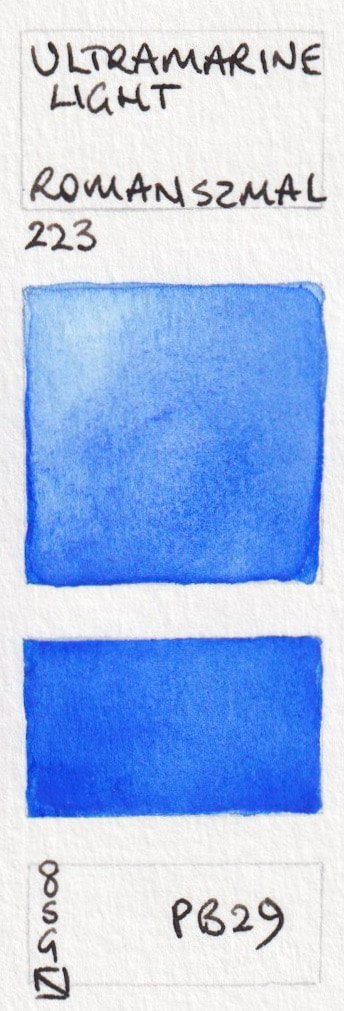
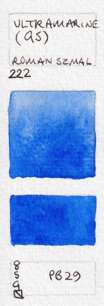
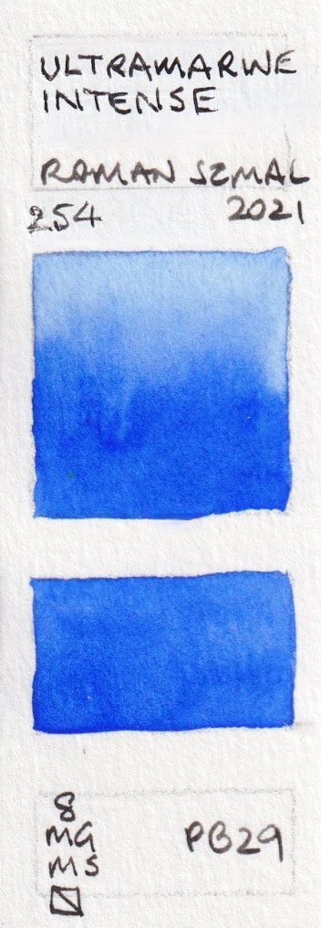
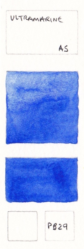
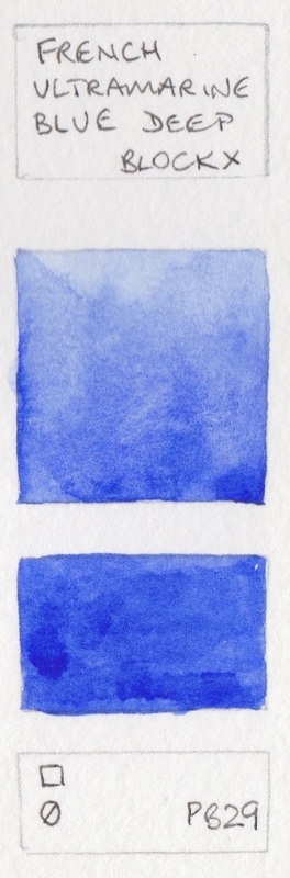
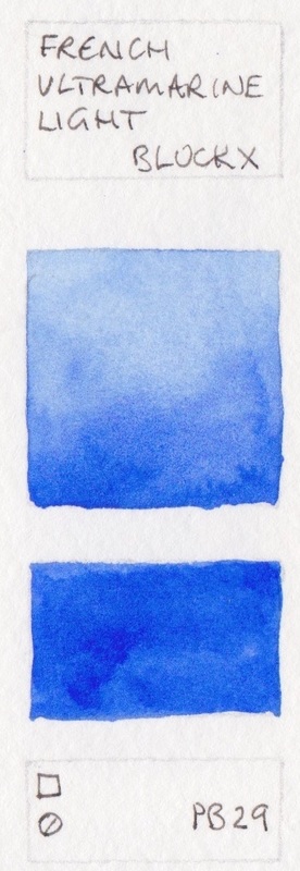
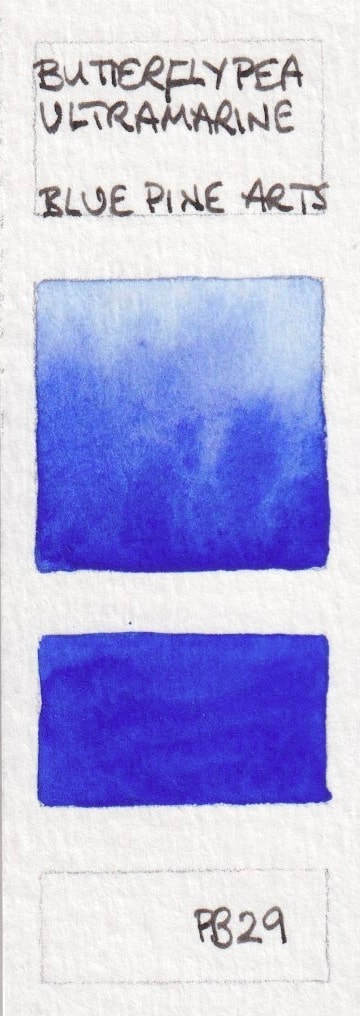
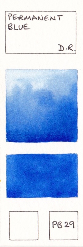
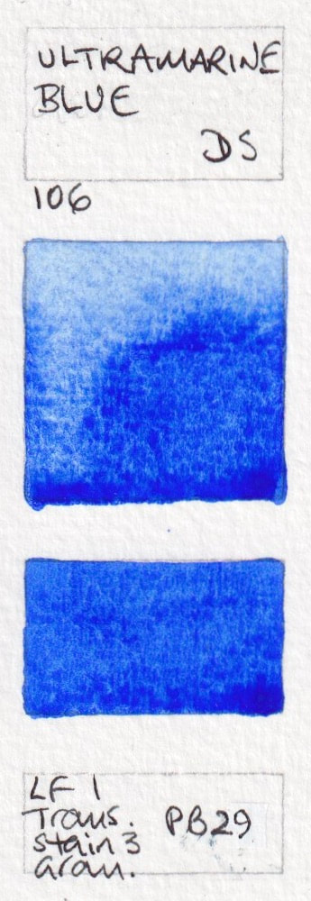
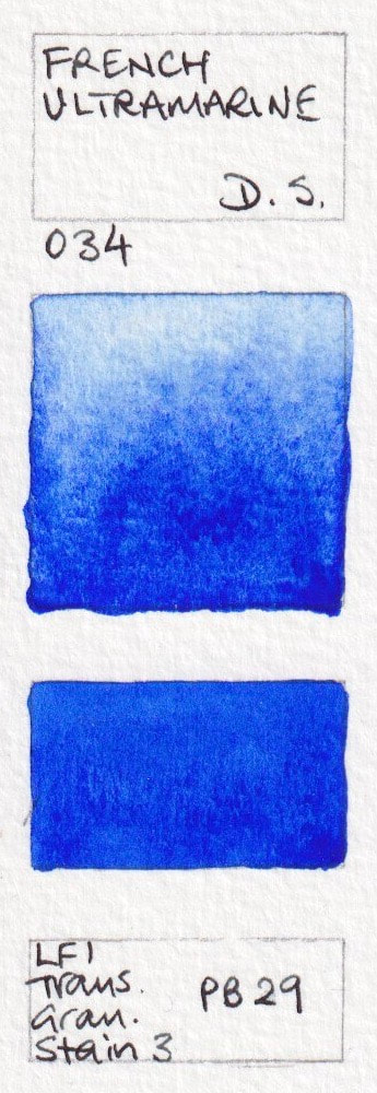
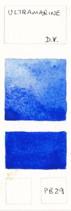
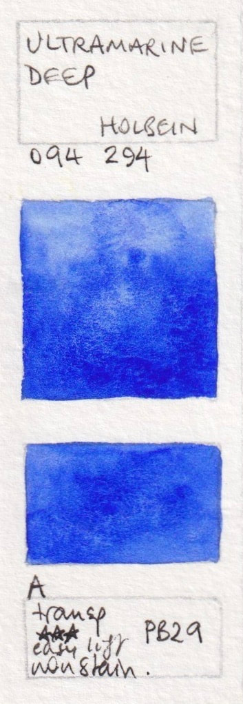
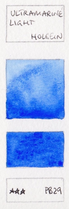
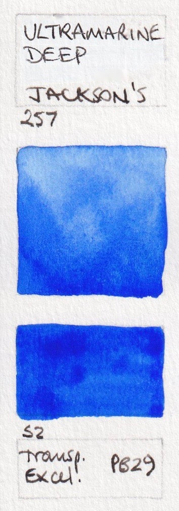
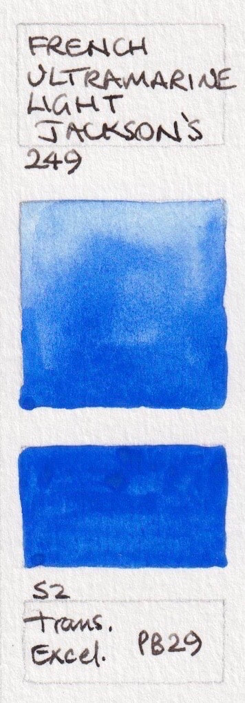
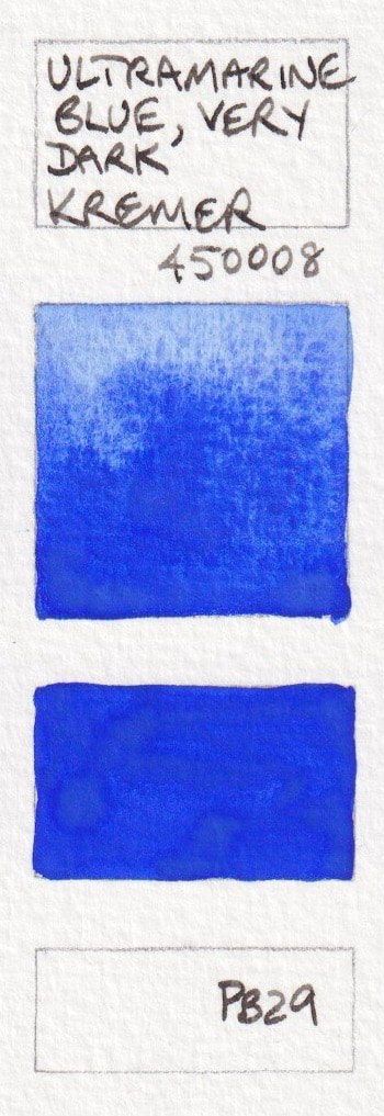
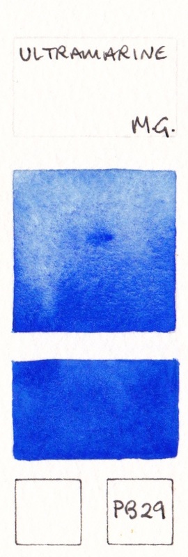
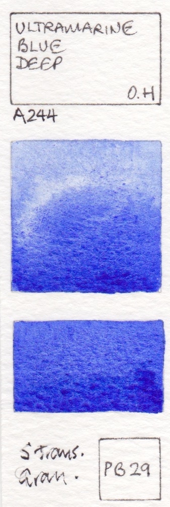
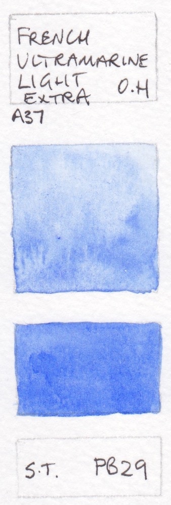
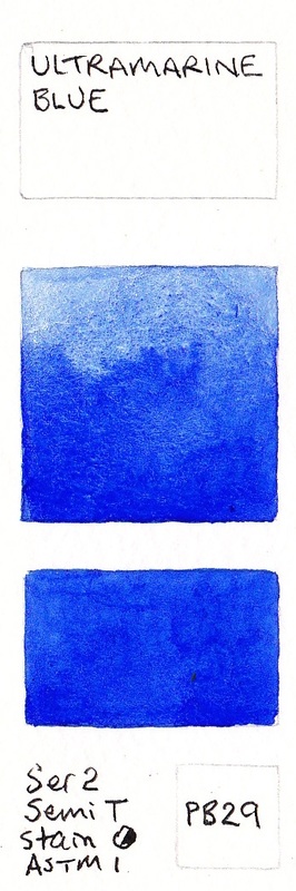
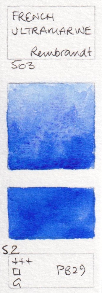
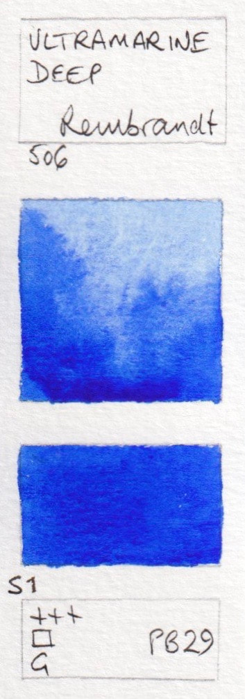
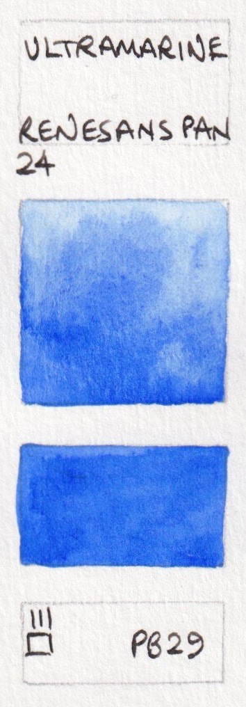
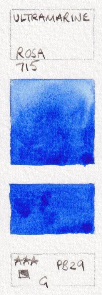
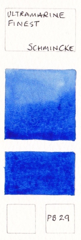
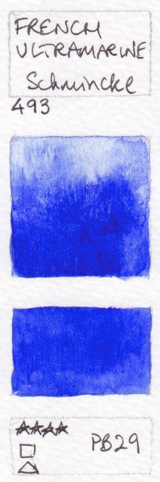
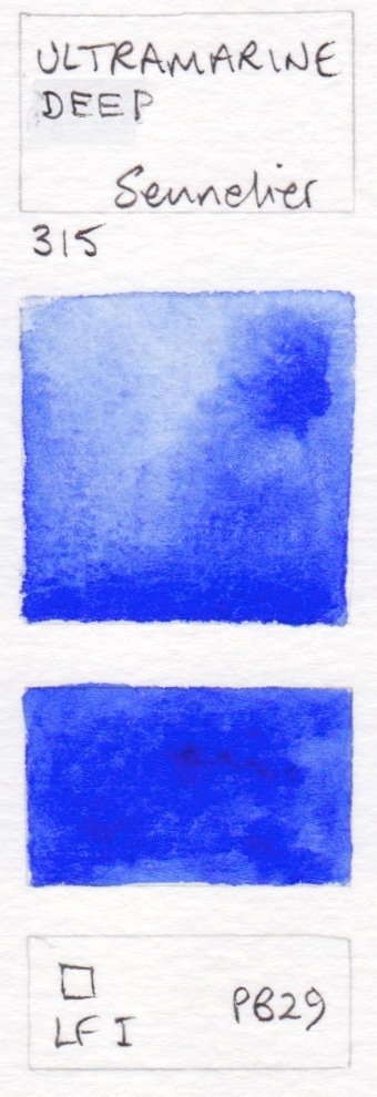
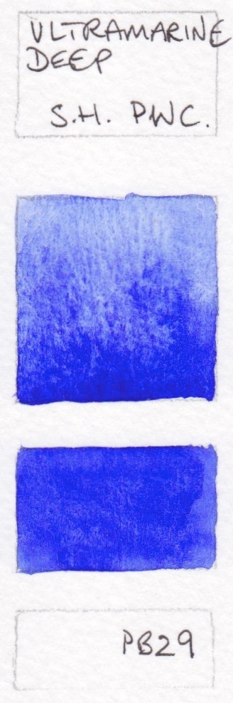
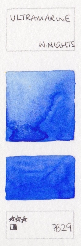
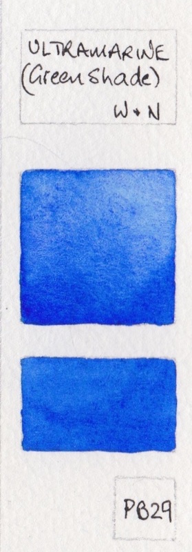
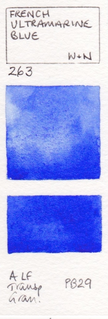
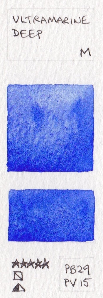
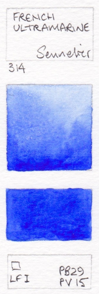
Ultramarine Blues, and others made with PB29. Warm, liftable and granulating.
Ultramarine is an indispensable warm blue in watercolour. Granulating and liftable, it mixes to create wonderful realistic greens and greys. It often appears as a French version and a regular version, with the French being slightly warmer. It isn't necessary to have more than one version in your palette. Schmincke Ultramarine Finest is the least granulating, Old Holland Blue Deep is the warmest and probably the most granulating.
- Ultramarine Blue Dark - A Gallo watercolour; Ultramarine Blue - American Journey; Ultramarine Light - Aquarius; Ultramarine (GS) - Aquarius; Ultramarine Intense Aquarius;
- French Ultramarine - Aquarius; Ultramarine - Art Spectrum; French Ultramarine Blue Deep - Blockx; French Ultramarine Light - Blockx; Butterfly Ultramarine - Blue Pine Arts;
- Permanent Blue - Daler Rowney; Ultramarine* - Daniel Smith; French Ultramarine* - Daniel Smith; Ultramarine - Da Vinci; French Ultramarine, Red Shade - Da Vinci;
- Ultramarine Deep - Holbein; Ultramarine Light - Holbein; Ultramarine Deep - Jackson's; French Ultramarine Light - Jackson's; Ultramarine Blue, Very Dark - Kremer;
- Ultramarine Blue, Light - Kremer; Ultramarine - M.Graham; Ultramarine Light - Mission Gold; Ultramarine Blue Deep - Old Holland; Ultramarine Blue - Old Holland;
- French Ultramarine Light Extra - Old Holland; Ultramarine Blue - QoR; French Ultramarine - Rembrandt; Ultramarine Deep - Rembrandt; Polish Blue (was Poland Blue) - Renesans half pan;
- Ultramarine Blue - Renesans half pan; Ultramarine* - Rosa; Ultramarine Finest - Schmincke; French Ultramarine - Schmincke; Ultramarine Blue Deep - Sennelier;
- Cobalt Blue Hue - ShinHan (not sure this is actually PB29); Ultramarine Deep - ShinHan PWC; Ultramarine - ShinHan; Ultramarine - White Nights; Ultramarine (Green Shade) - Winsor & Newton;
- French Ultramarine - Winsor & Newton


Ultramarine blues - not single pigment. French Ultramarine is usually slighter warmer, so a PV15 has been added to warm up the ultramarine without losing the granulation.
Ultramarine Deep - Mission Gold PB29 + PV15; French Ultramarine - Sennelier PB29+PV15.
Ultramarine Deep - Mission Gold PB29 + PV15; French Ultramarine - Sennelier PB29+PV15.
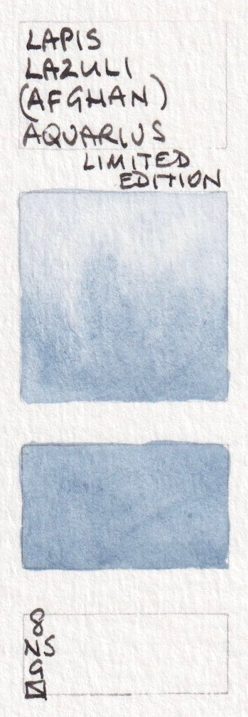
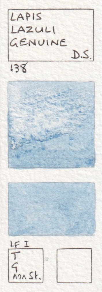
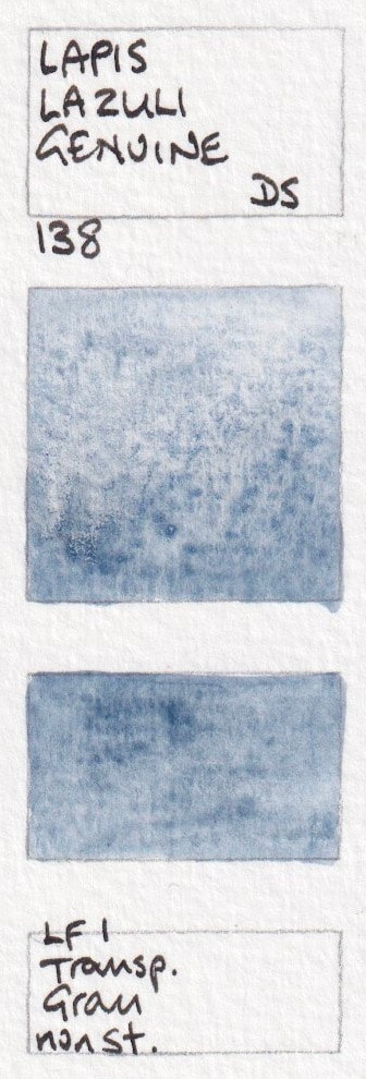
Lapis Lazuli - Genuine
It is really difficult to extract the gorgeous blue pigment from the Lapis Lazuli stone, but the Zecchi sample shows how beautiful this semi precious pigment can look.
- Lapis Lazuli Genuine - A Gallo watercolour; Lapis Lazuli (Afghan) Limited Edition. Aquarius Watercolour. New 2023; Lazulite (Lapis Lazuli) - Aquarius; Lapis Lazuli Genuine* - Daniel Smith; Lapis Lazuli from Chile - Kremer;
- Lapis Lazuli - Zecchi


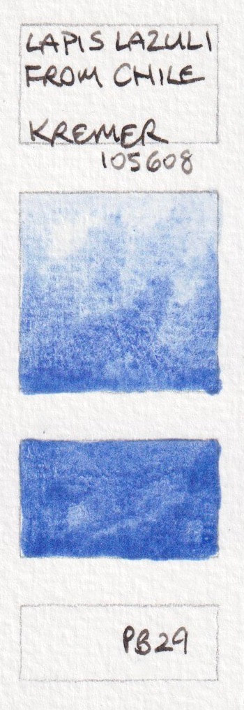

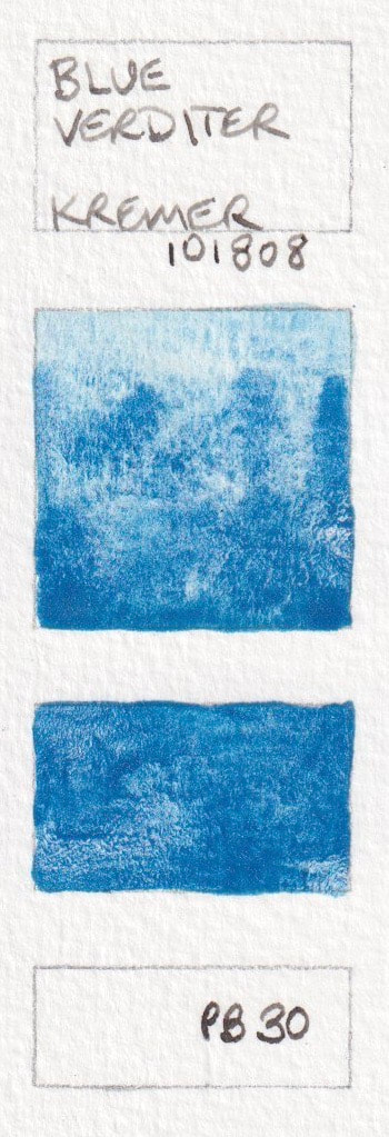
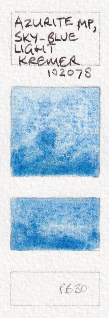
PB30.
Blue Verditer, Kremer and Azurite MP Sky-Blue Light, Kremer
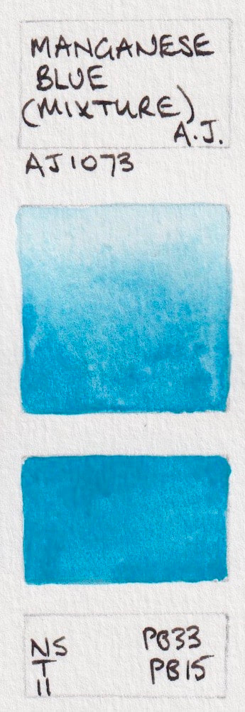
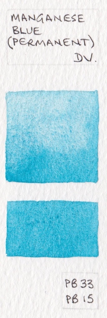
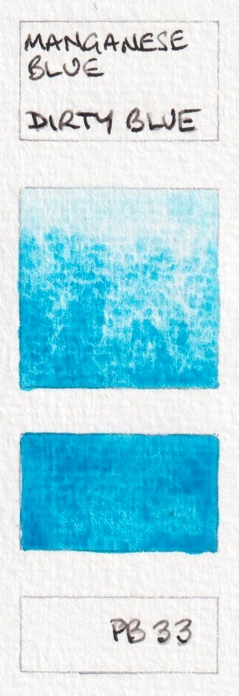
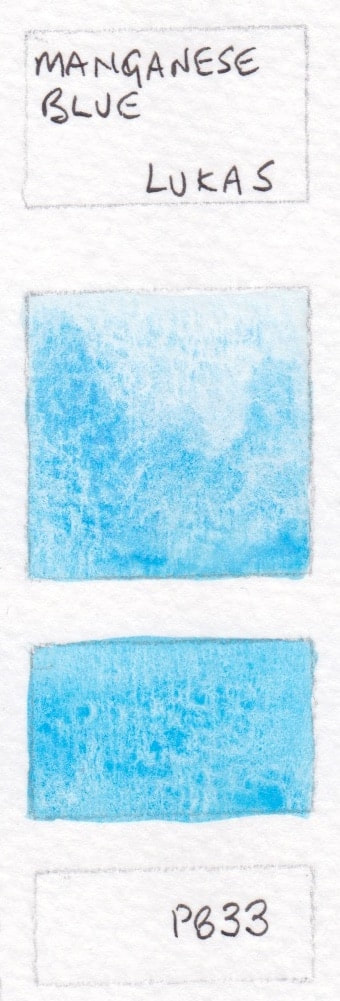
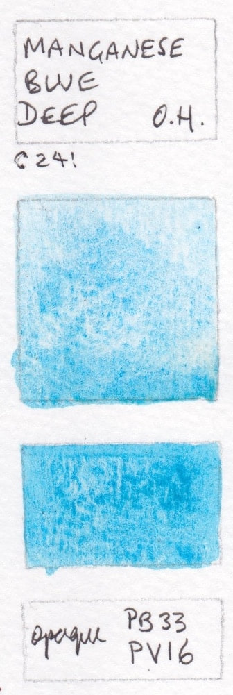
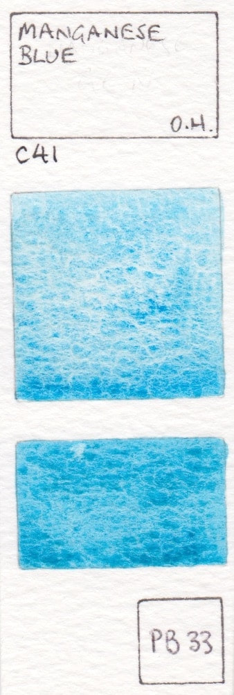
PB33 Manganese Blue.
No longer readily available, this is a super granulating cool greenish blue pigment. I've included single pigment (Old Holland and Lukas) and mixtures that contain PB33 (Old Holland and Da Vinci). Dirty Blue is one of the only current manufacturers, and his is a rich and strong version.
- Manganese Blue (Mixture) - American Journey PB33, PB15; Manganese Blue (Permanent) - Da Vinci PB33 + PB15; Manganese Blue - Dirty Blue; Manganese Blue - Lukas PB33 (discontinued); Manganese Blue Deep - Old Holland PB33+PV16;
- Manganese Blue Genuine - Old Holland watercolour PB33 (discontinued);
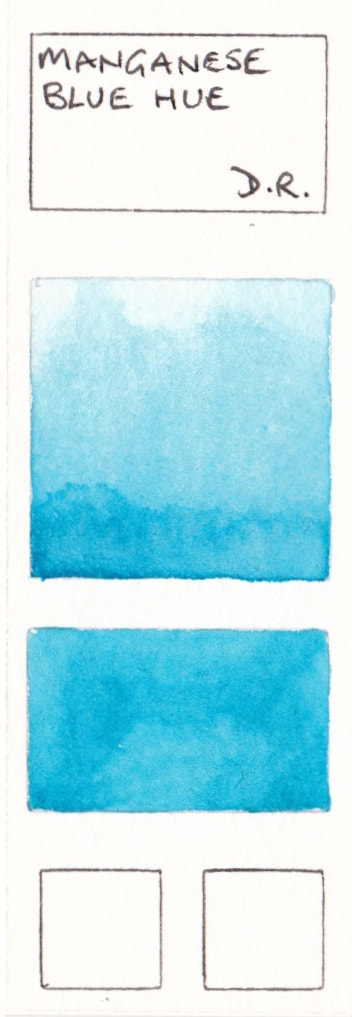
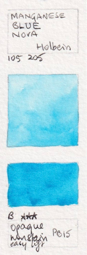
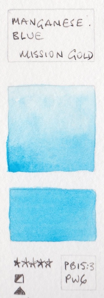
Manganese Blue Hues
Manganese blue hues are generally made with PB15, often with white pigments. Some of these are included in the PB15 single pigment section. Manganese Blue Hue - Daler Rowney PB15:3 + PW5; Manganese Blue Hue* - Daniel Smith PB15, Manganese Blue Nova - Holbein PB15; Manganese Blue - Mission Gold PB15:3+PW; Manganese Blue Hue - Winsor & Newton PB15
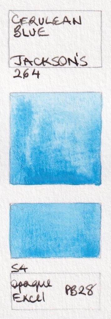
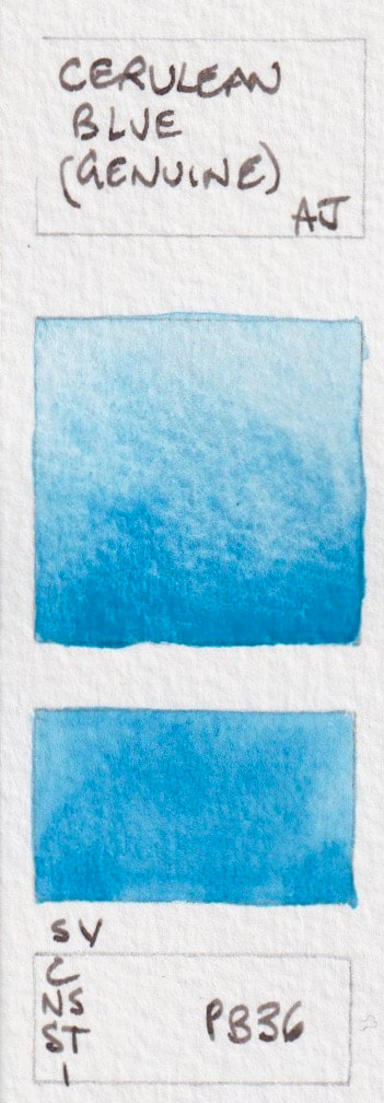
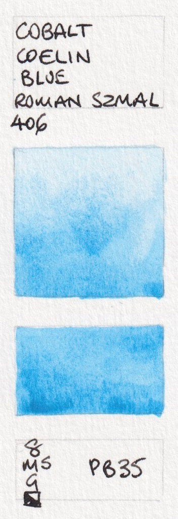
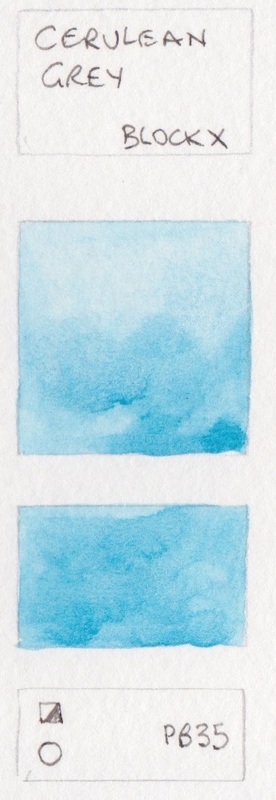
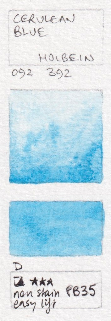
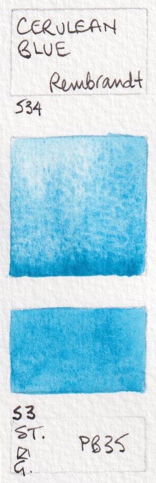
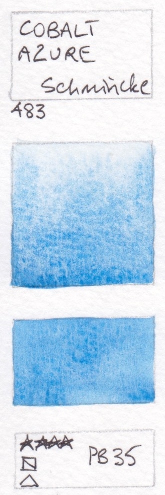
PB35: Cerulean Blues - tend to be cool, granulating and liftable.
Cerulean comes in two different pigments - PB35 and PB36.
- Cerulean blue (Genuine) - American Journey; Cobalt Coelin Blue* - Aquarius; Cerulean Grey - Blockx; Cerulean Blue* - Daniel Smith; Cerulean Blue - Holbein Watercolour
- Cerulean Blue - Jackson's; Cerulean Blue - Old Holland; Cerulean Blue Light - Old Holland; Cerulean Blue - Rembrandt ; Cobalt Azure - Schmincke;
- Cerulean Blue - Winsor & Newton


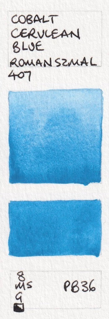
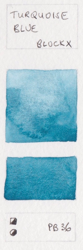
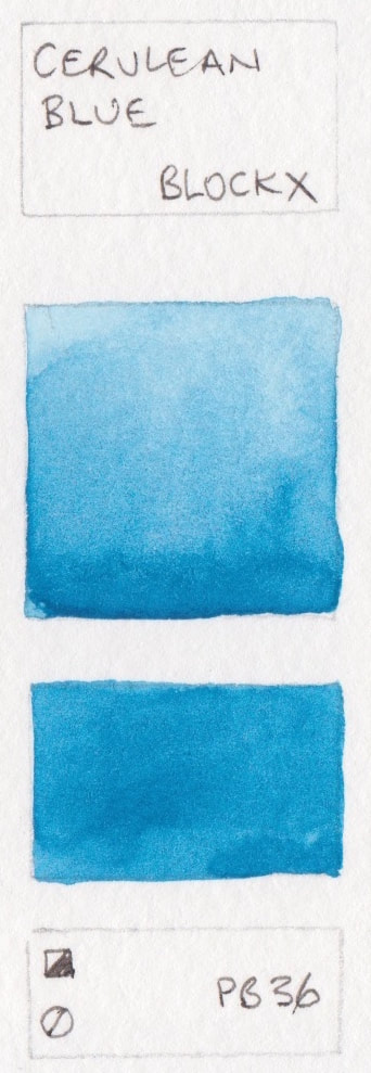
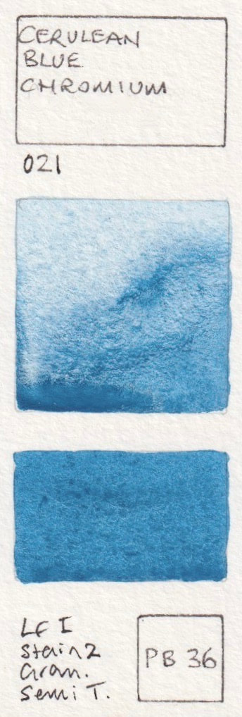
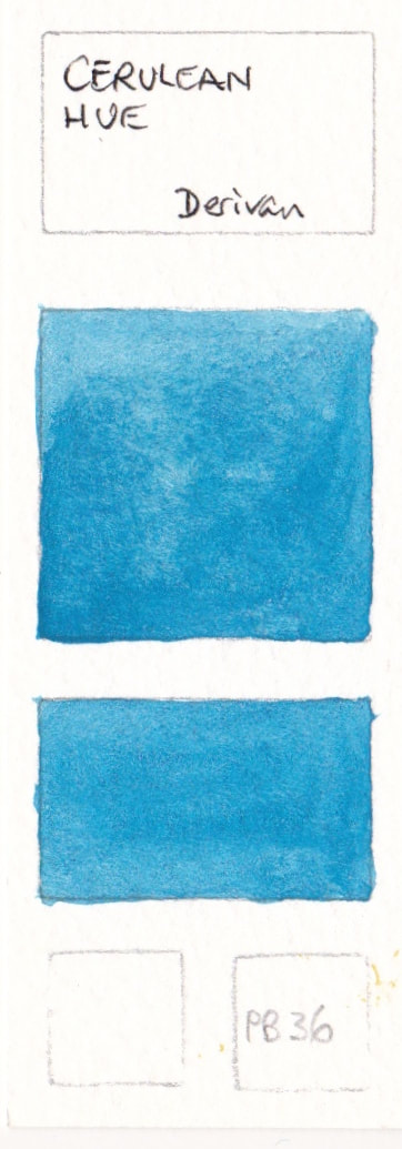
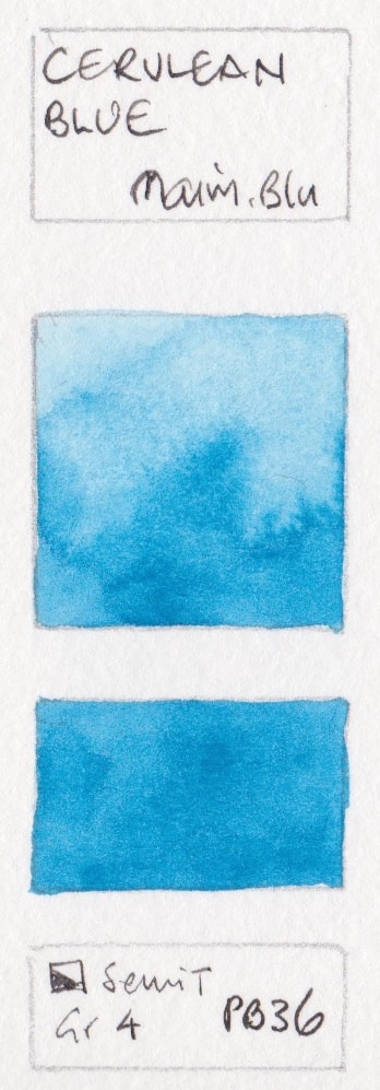
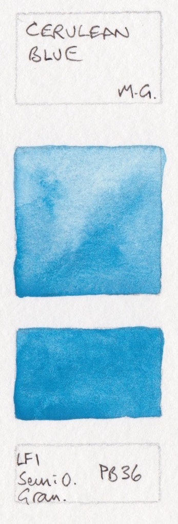
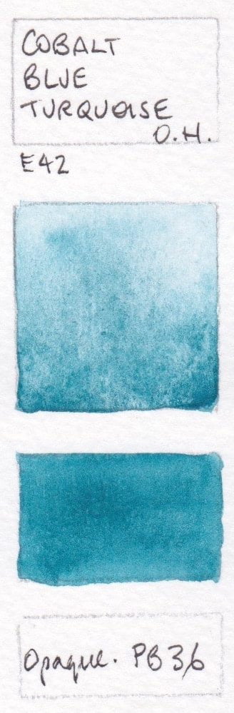
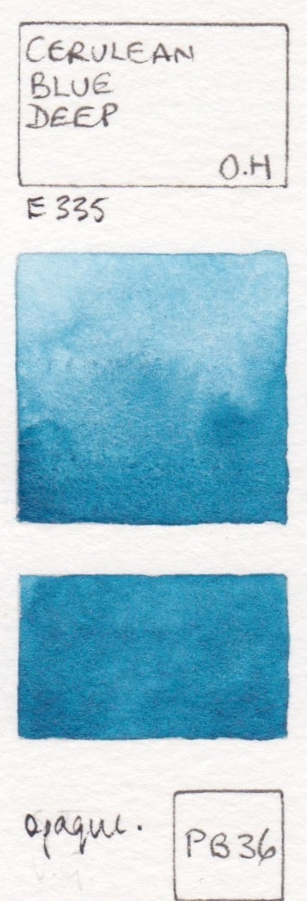
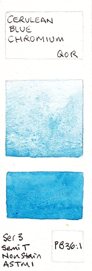
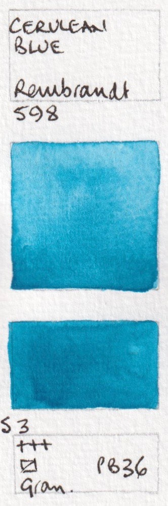
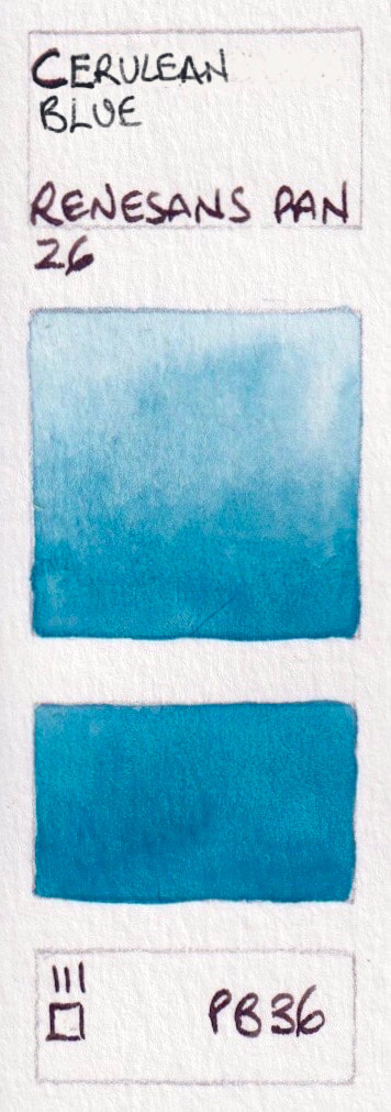
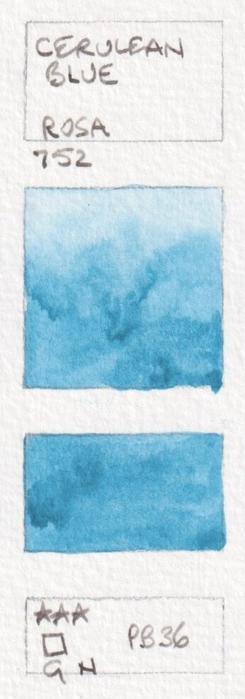
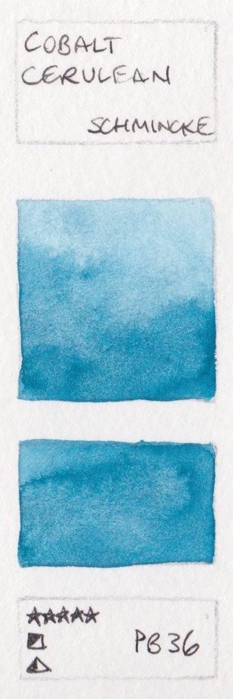
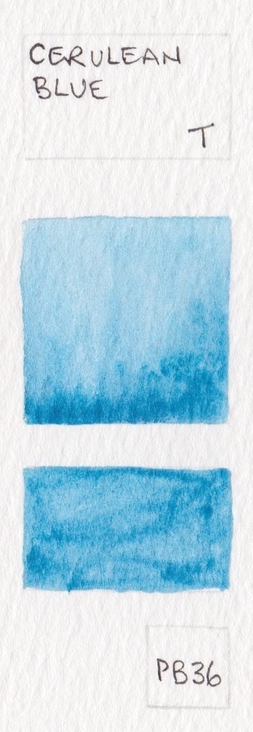
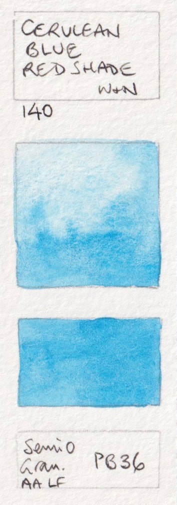
PB36: Cerulean blues and Cobalt Turquoise. Generally cooler and richer than PB35.
I prefer the greener PB36 which may be called Cerulean Chromium by Daniel Smith, Cobalt Cerulean in Schmincke and Cerulean Genuine in Da Vinci. Names can be confusing, especially as PB36 can also be a turquoise.
- Cobalt Cerulean Blue* - Aquarius; Turquoise Blue - Blockx; Cerulean Blue - Blockx; Cerulean Blue Chromium* - Daniel Smith; Cerulean Blue Genuine - Da Vinci;
- Cerulean Hue - Derivan; Cerulean Blue - MaimeriBlu; Cerulean Blue - M. Graham; Cobalt Blue Turquoise - Old Holland; Cerulean Blue Deep - Old Holland;
- Cerulean Blue Chromium - QoR; Cerulean Blue - Rembrandt; Cerulean Blue Deep - Rembrandt; Cerulean Blue - Renesans; Cerulean* - Rosa;
- Cobalt Cerulean, Schmincke; Cerulean Blue - Turner; Cerulean blue Red Shade - Winsor & Newton


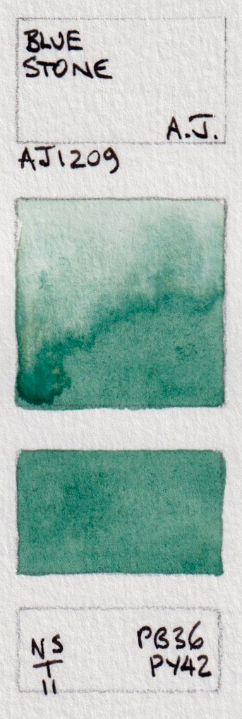
Mixed pigment blues containing PB36

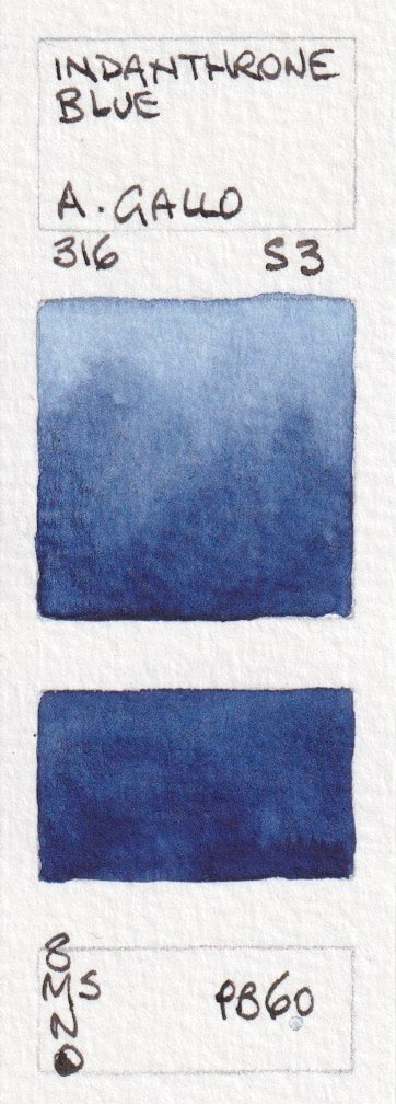
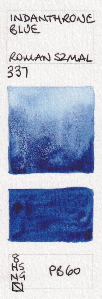
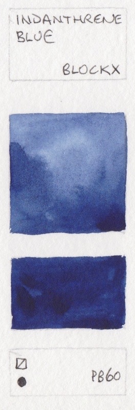
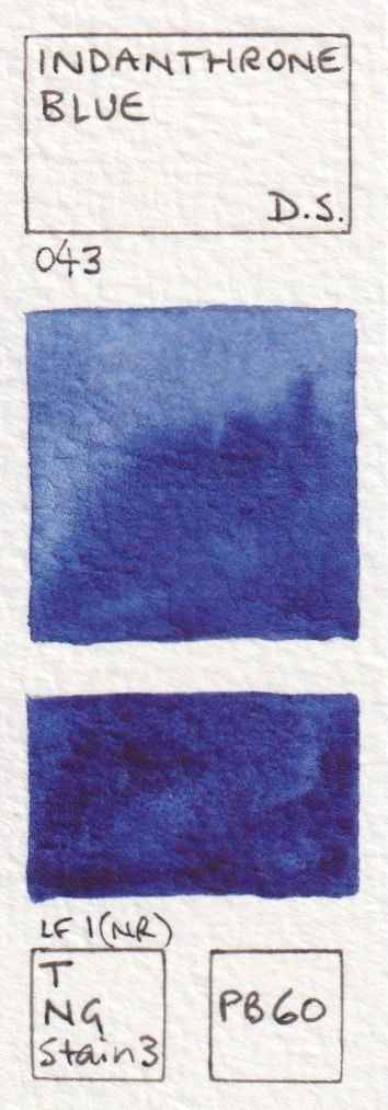
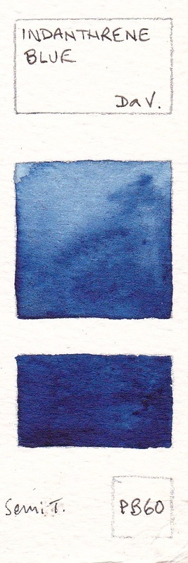
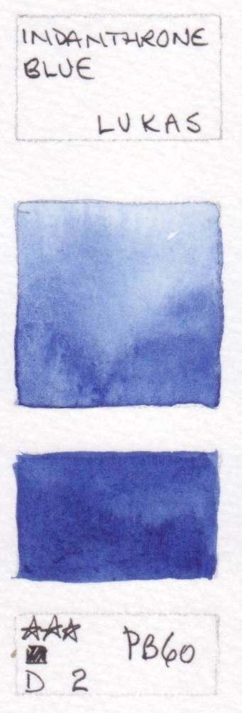
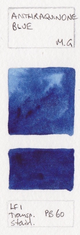
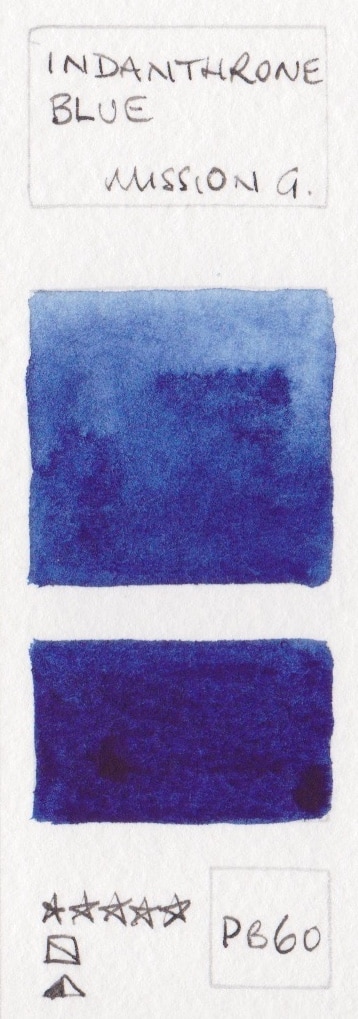
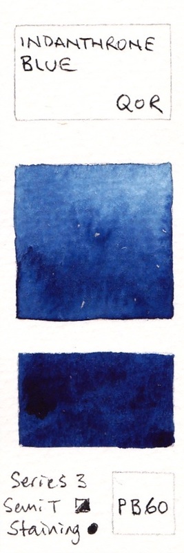
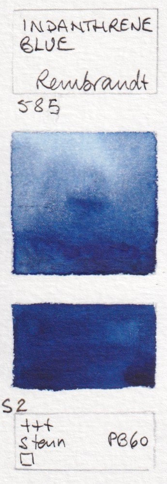
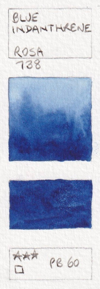
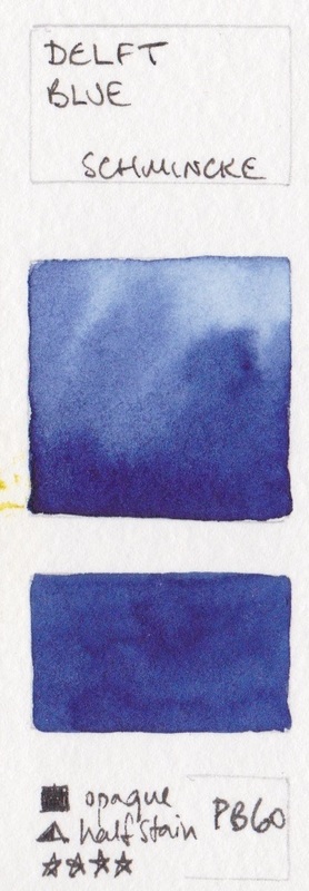
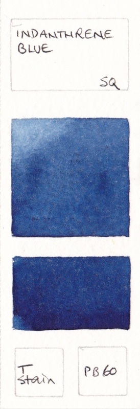
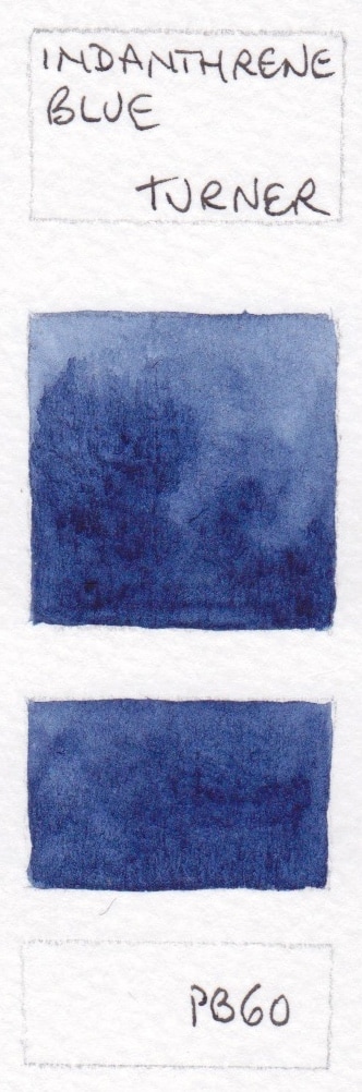
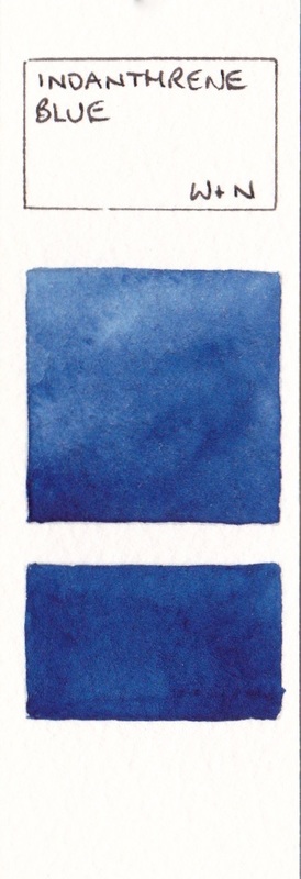
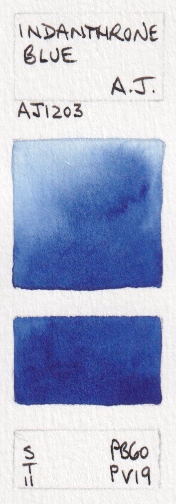
Indanthrone/Indanthrene Blues PB60. Deep, warm and non-granulating.
This rich deep blue can be warm (leaning towards purple) or cool (leaning towards green) depending on the course of the pigment. Winsor & Newton is a definite cool version, Daniel Smith is a definite warm version. Staining and non-granulating.
- Indanthrone Blue, A Gallo; Indanthrone Blue* - Aquarius; Indanthrene Blue - Blockx; Indanthrone Blue* - Daniel Smith; Indanthrene Blue - Da Vinci;
- Royal Blue - Holbein; Indanthrone Blue - Lukas; Anthraquinone blue, M.Graham; Indanthrone Blue - Mission Gold; Indanthrone Blue - QoR;
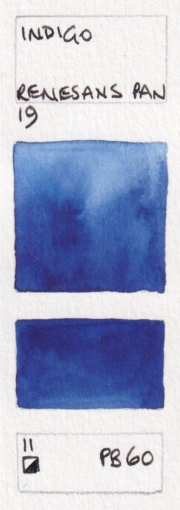
- Indanthrene Blue - Rembrandt; Indigo - Renesans half pan; Indanthrene Blue* - Rosa; Delft Blue - Schmincke; Blue Indanthrone - Sennelier;
- Indanthrene Blue - Stephen Quiller; Indanthrene Blue - Turner; Indanthrene Blue - Winsor & Newton


Mixed pigment Indanthrone Blue. American Journey includes PB60 and PV19.
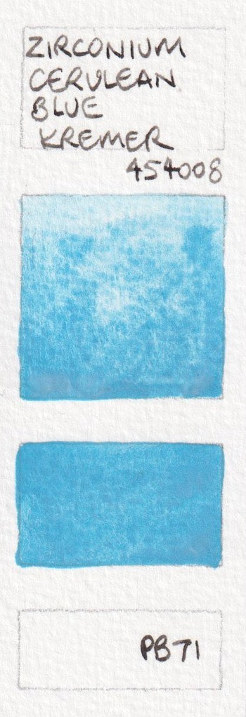
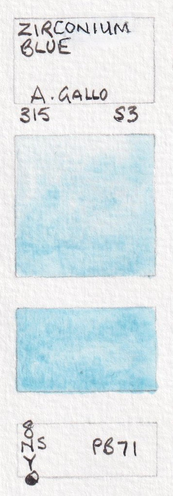
PB71 - Zirconium Blue
Zirconium Blue - A Gallo; Zirconium Cerulean Blue, Kremer
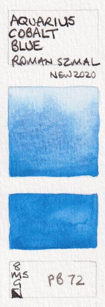
PB72
Aquarius Cobalt Blue - Aquarius
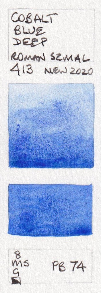
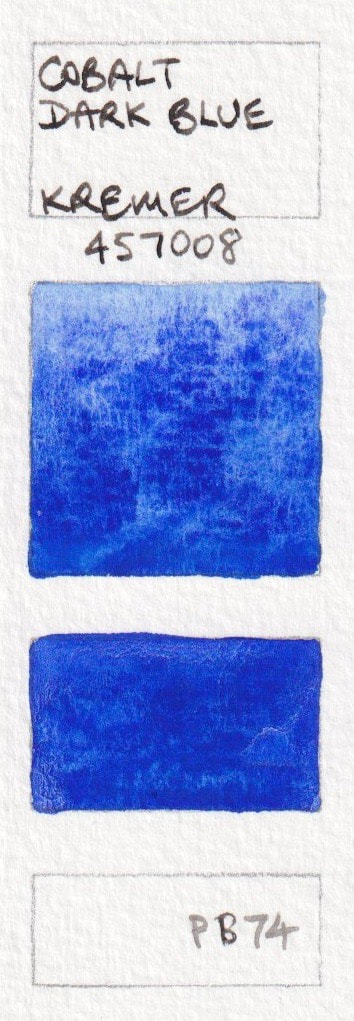
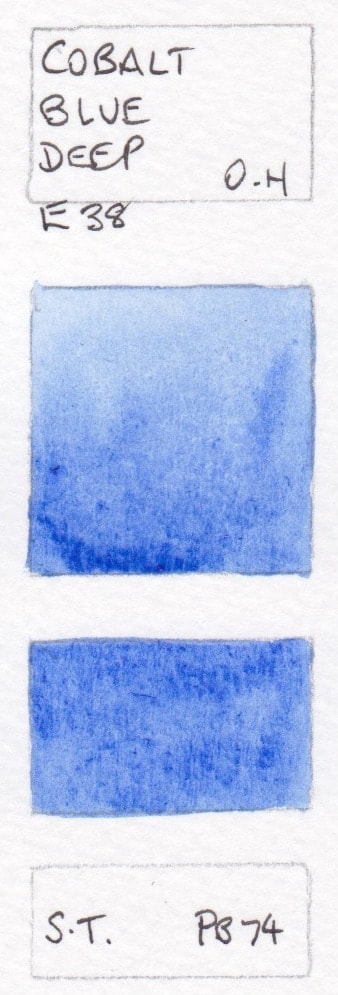
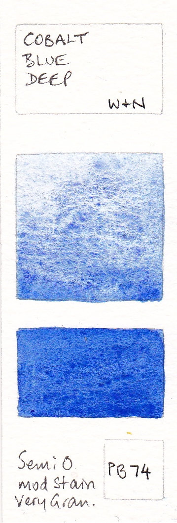
PB74 - Cobalt Blue Deep
See also PB28
Cobalt Blue Deep - Aquarius; Cobalt Blue Dark - Blockx; Cobalt Dark Blue - Kremer Cobalt Blue Deep - Old Holland; Cobalt Blue Deep - Winsor & Newton
Cobalt Blue Deep - Aquarius; Cobalt Blue Dark - Blockx; Cobalt Dark Blue - Kremer Cobalt Blue Deep - Old Holland; Cobalt Blue Deep - Winsor & Newton

Mixed pigment Cobalt Blue hues using PB74
PB74 is an expensive pigment so sometimes other pigments are used to create a hue of the colour.
Cobalt Blue Deep - Schmincke PB74 + PB28
Cobalt Blue Deep - Schmincke PB74 + PB28
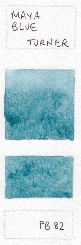
PB82
Mayan Dark Blue* - Daniel Smith; Maya Blue - Turner

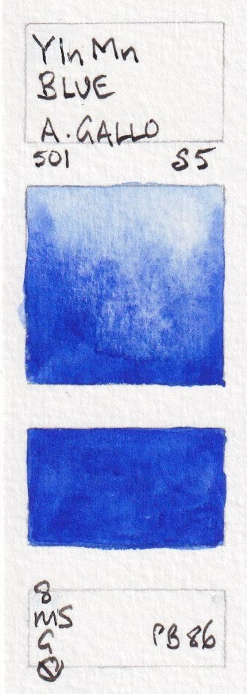
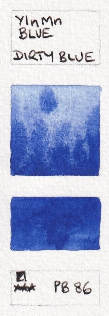
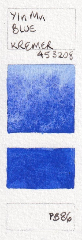
PB86 YInMn Blue
This expensive pigment was discovered in 2009 in Seattle. Shown here are a sample from Daniel Smith and three quite different versions of this interesting pigment.
YInMn Blue* - A. Gallo; YInMn Blue* - Daniel Smith R&D; YInMn Blue* - Dirty Blue; YInMn Blue - Kremer; YInMn Blue - Schmincke (limited edition).
YInMn Blue* - A. Gallo; YInMn Blue* - Daniel Smith R&D; YInMn Blue* - Dirty Blue; YInMn Blue - Kremer; YInMn Blue - Schmincke (limited edition).


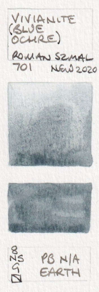
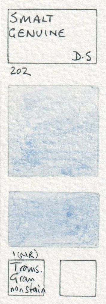
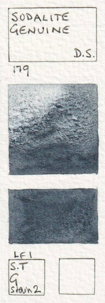
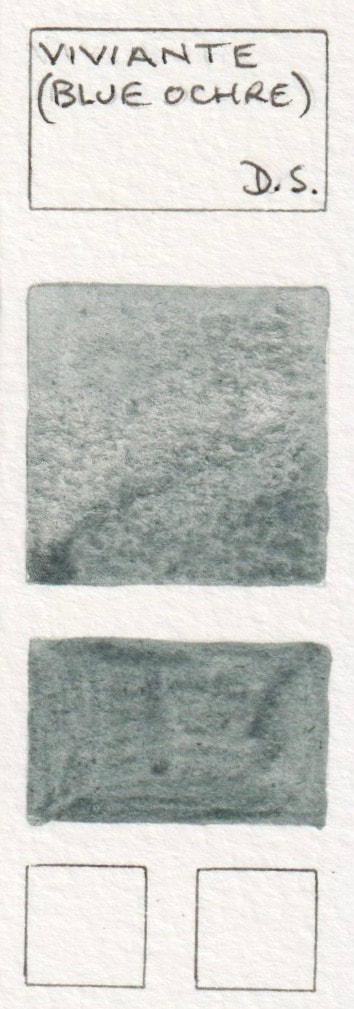
Other single pigment blues - mineral blue watercolours.
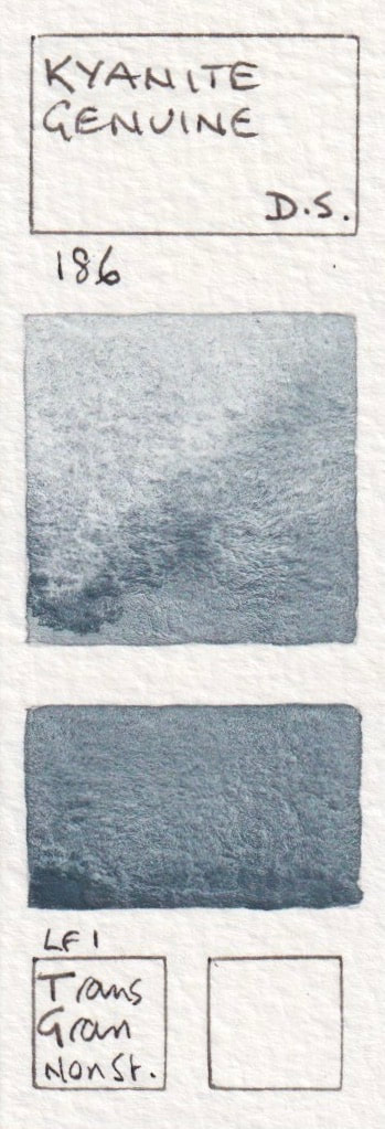
- Vivianite (Blue Ochre) - Aquarius; Smalt Genuine* - Daniel Smith (discontinued); Sodalite Genuine* - Daniel Smith; Vivianite Genuine (Blue Ochre)*- Daniel Smith (Discontinued); Kyanite Genuine* - Daniel Smith;
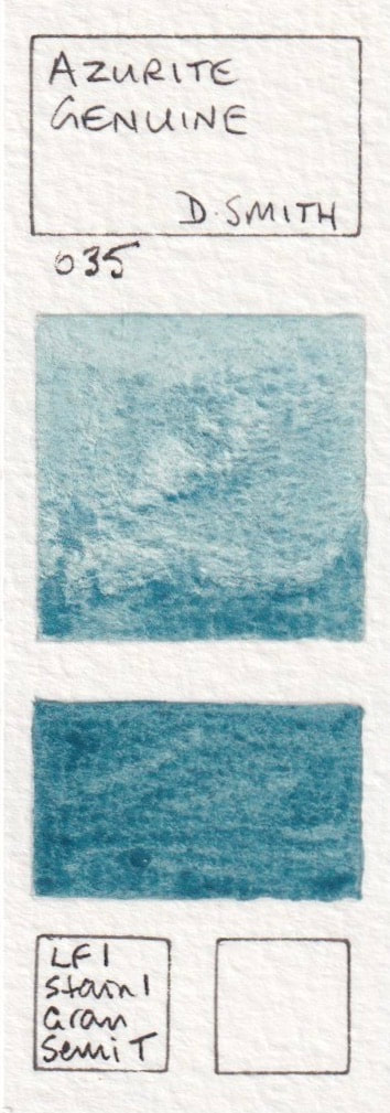
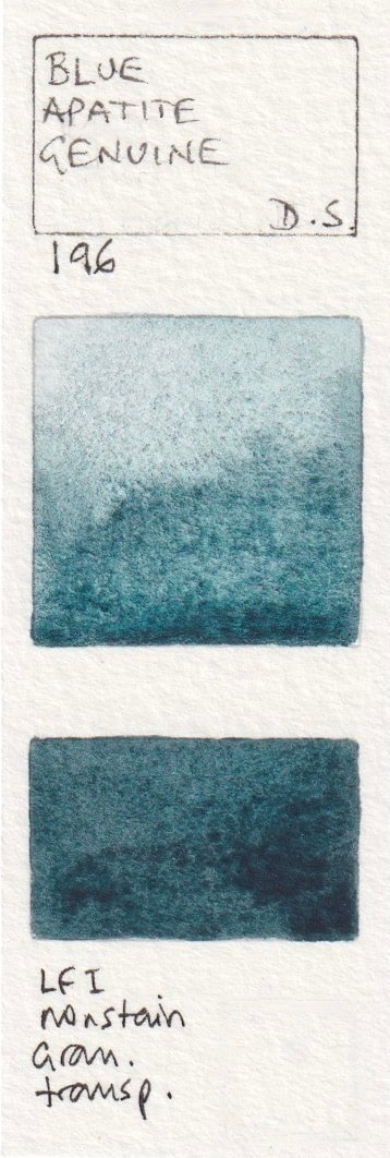
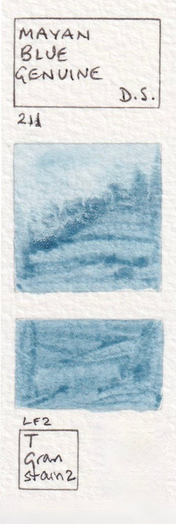
- Azurite Genuine* - Daniel Smith (discontinued); Blue Apatite Genuine* - Daniel Smith watercolour; Mayan Blue Genuine* - Daniel Smith; Lapis Lazuli Genuine* - Daniel Smith
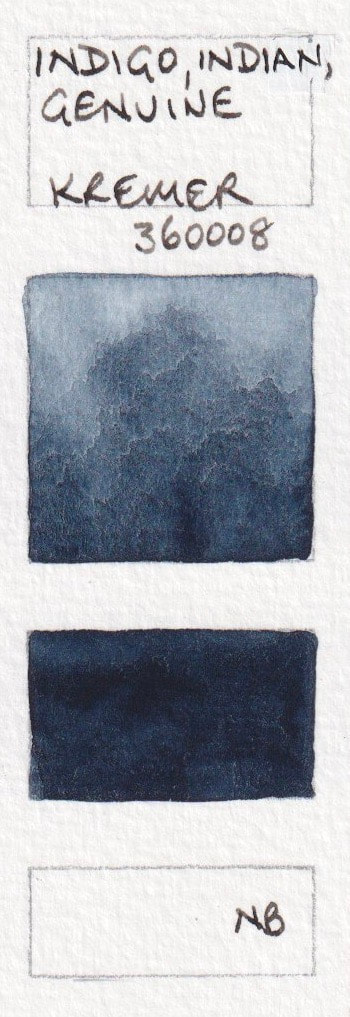
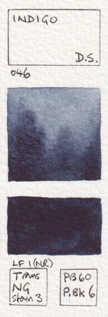
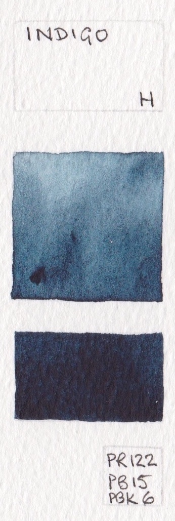
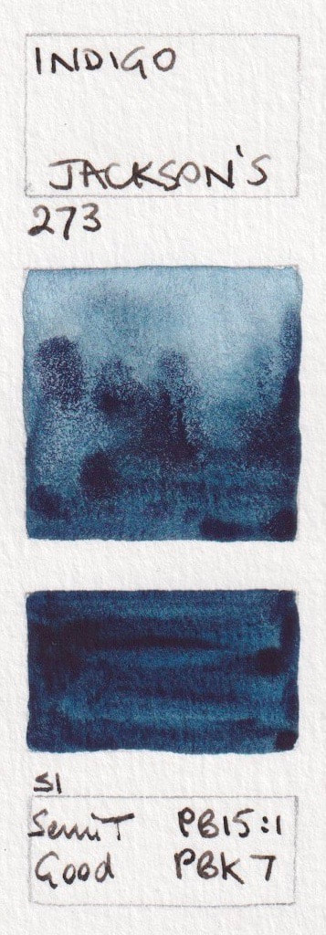
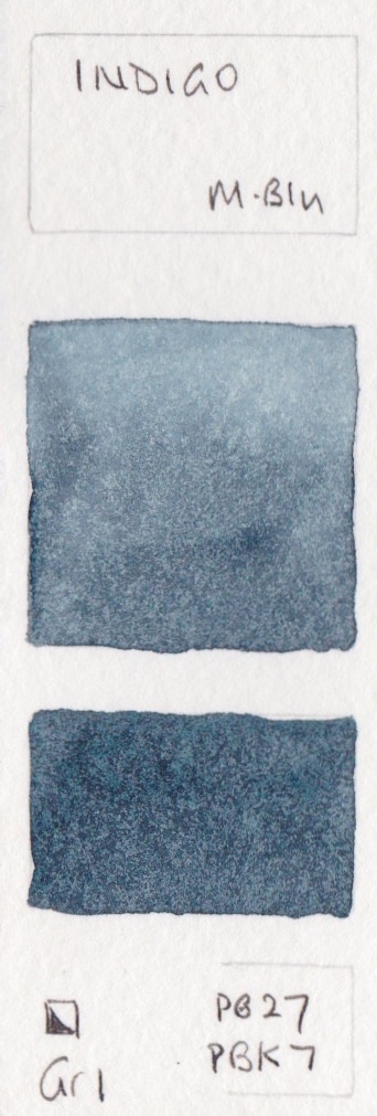
NB1 - Natural Indigo
Most watercolours include an Indigo hue rather than using the genuine but less lightfast natural pigment.
Indigo - A Gallo Watercolour; Indigo, Indian, Genuine - Kremer
Indigo - A Gallo Watercolour; Indigo, Indian, Genuine - Kremer

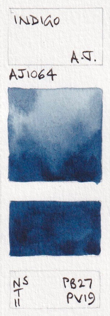
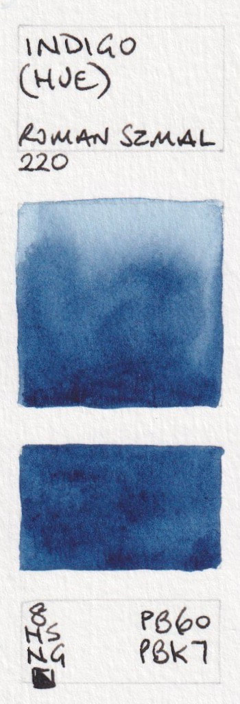
Mixed Pigment 'Indigo' Blue watercolours.
Most Indigo hues use a blue and a black pigment. Those based around PB60 are likely to be warmer, whereas those based around PB27 or PB15 are likely to be cooler. American Journey and Da Vinci don't include a black pigment in the mix. Shown here in alphabetic order based on manufacturer are
- Indigo - American Journey PB27 + PV19; Indigo (Hue)* - Aquarius PB60 + PBk7; Indigo - Blockx PB29 + PB15 + PBk9; Indigo* - Daniel Smith PB60 + PBk6;
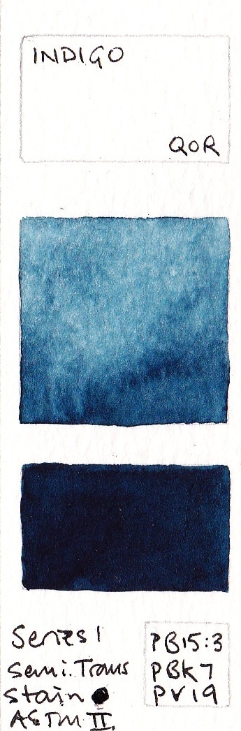
- Indigo - Da Vinci PB7 + PV19; Indigo - Jackson's PB15:1 + PBk7; Indigo - MaimeriBlu (discontinued) PB27+PBk7; Indigo Extra - Old Holland PB15:5 + PR177 + PBk9; Indigo - QoR PB15:3 + PBk7 + PV19;
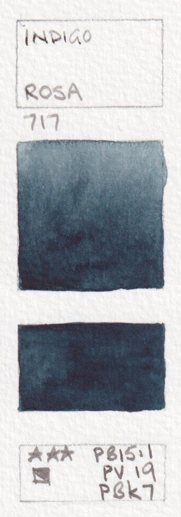
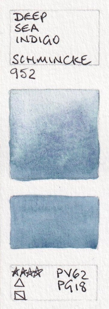
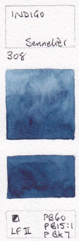
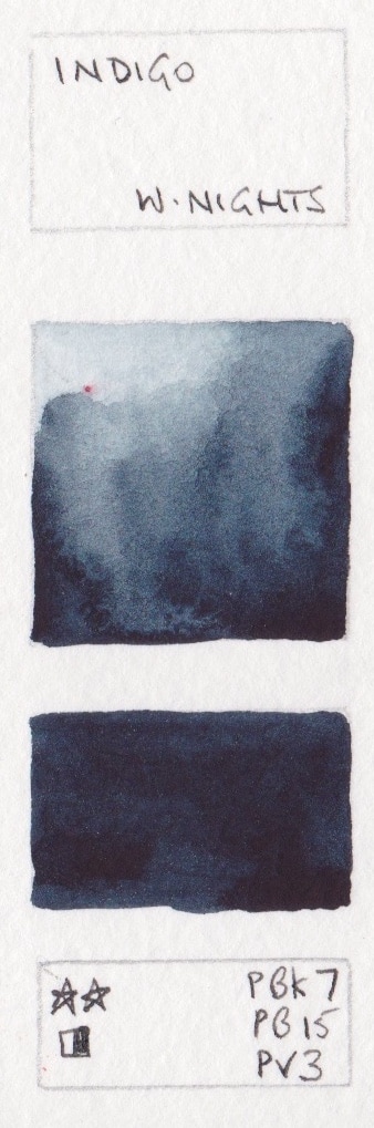
- Indigo* - Rosa PB15:1 + PV19 + PBk7; Deep Sea Indigo - Schmincke PV62, PG18; Indigo - Sennelier PB60 + PB15:1 + PBk7; Indigo - White Nights PBk7+ PB15 + PV3;
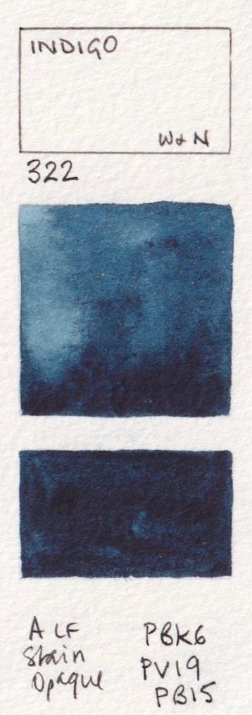
- Indigo - Winsor & Newton PBk6 + PV19 + PB15.


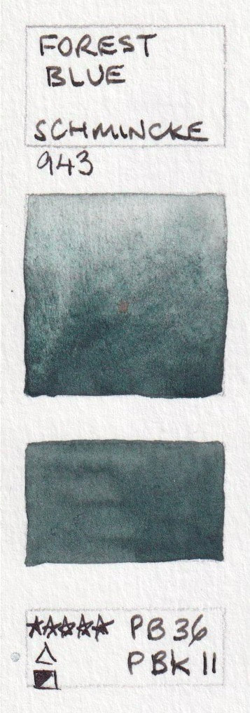
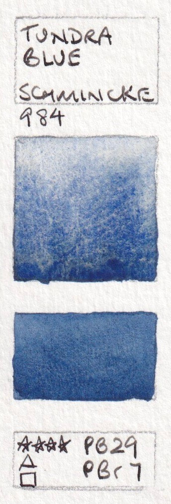
Mixed Pigment Dark Blues
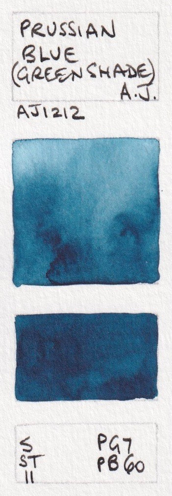
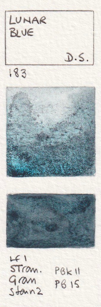
- Midnight Blue - A Gallo PB15.1, PBk9; Prussian Blue (Green Shade) - American Journey; Lunar Blue* - Daniel Smith; Paris Blue - Renesans half pan; Forest Blue - Schmincke PB36 + PBk11;
- Tundra Blue - Schmincke PB29 + PBr7

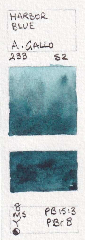
Mixed pigment turquoise blues (see also the Turquoise section)
These have names with blue in them, though don't look blue.
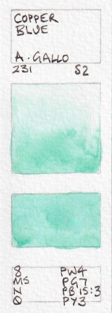
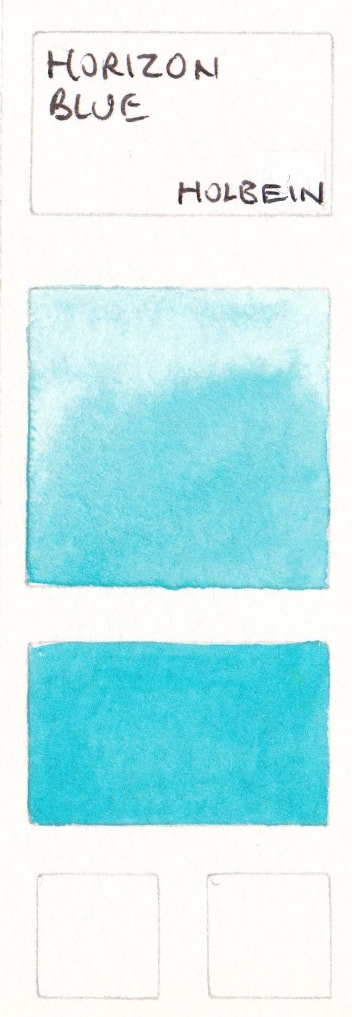
- Harbor Blue, - A Gallo Watercolour PB15:3 + PBr8; Teal blue - A Gallo Watercolour PB15:3 + PG7 + PW6; Copper Blue - A Gallo watercolour PW4 + PG7 + PB15.3 + PY3; Ocean Blue - Aquarius PB24 + PB15.3; Horizon Blue - Holbein PB15 + PG7 + PW1;
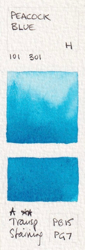
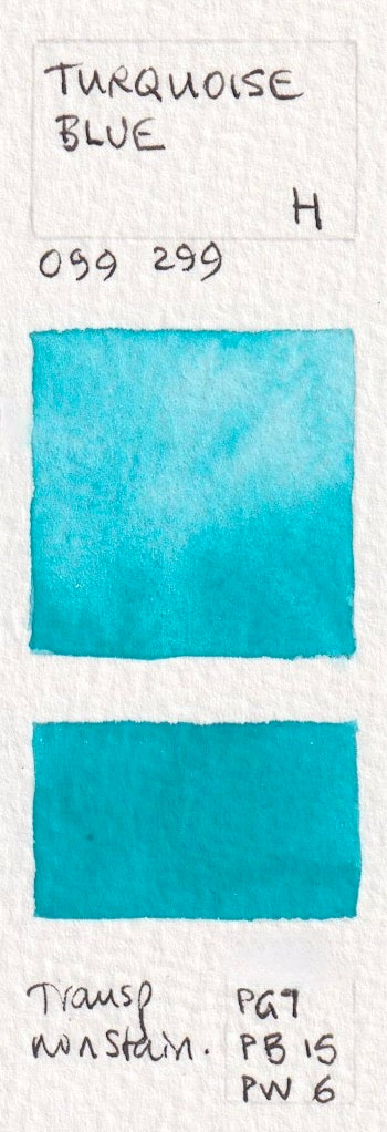
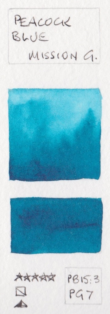
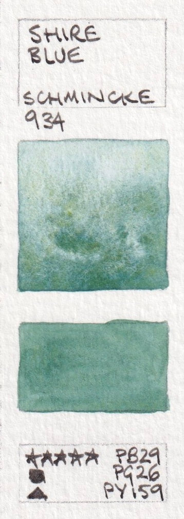
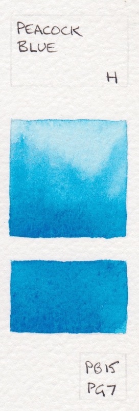
- Peacock Blue - Holbein PB15 + PG7; Turquoise Blue - Holbein PG7 + PB15 + PW6; Peacock Blue - Mijello Mission PB15:3 + PG7; Shire Blue - Schmincke PB29 + PG26 + PY159


Mixed Pigment Blue watercolours
If a pigment is no longer available or expensive, some manufactures make a mix or hue of the colour. Common examples are Manganese blue PB33, which is only available now from Old Holland, and Cobalt Blue PB28, which is an expensive pigment, though worth it for the real thing. Indigo is another common mix since genuine indigo is not suitable for watercolour.
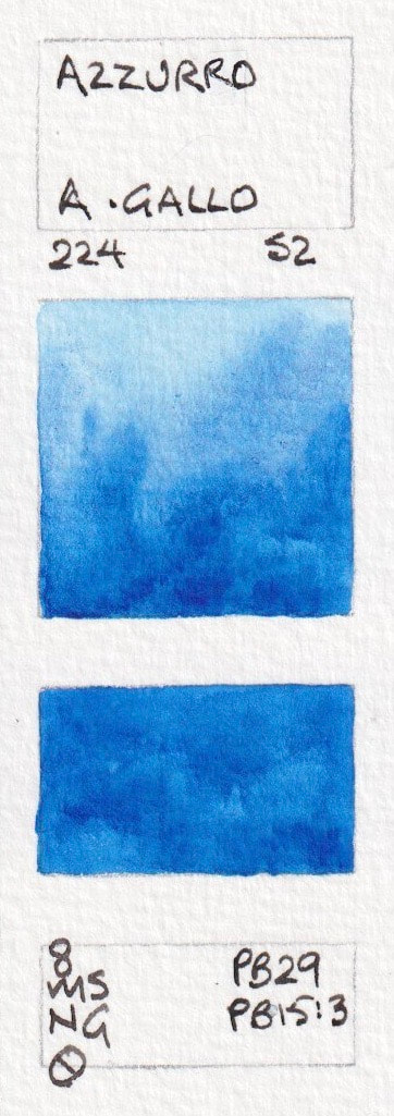
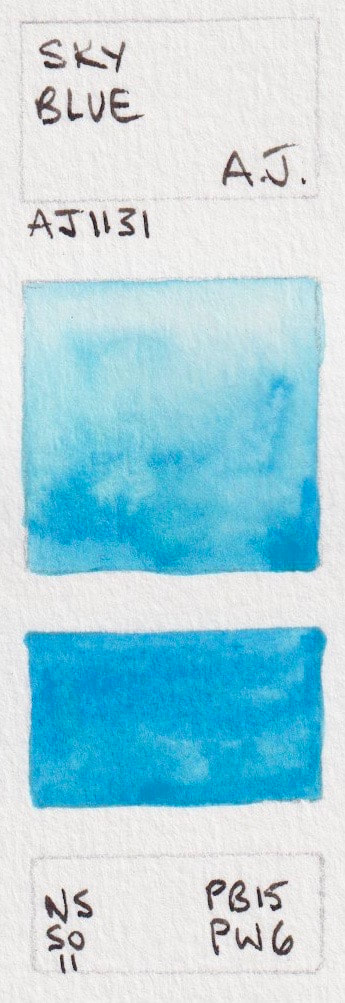
- Azzurro - A Gallo PB29 + PB15:3; Cerulean Blue Hue - American Journey watercolour PB15, PW6; Manganese Blue (Mixture) - American Journey watercolour PB33, PB15; Sky Blue - American Journey watercolour PB15 + PW6; Peacock Blue - American Journey PG7 + PB15;
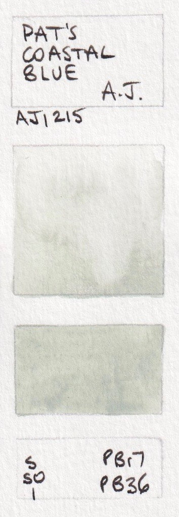
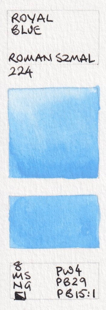
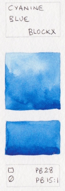
- Pat's Coastal Blue - American Journey PBr7, PB36 (and white?); Sky blue - Aquarius PW4, PB15.1; Royal Blue - Aquarius PW4 + PB29 + PB15:1; Tasman Blue - Art Spectrum PW4 + PB29 + PG7; Cyanine Blue - Blockx PB28 + PB15:1;
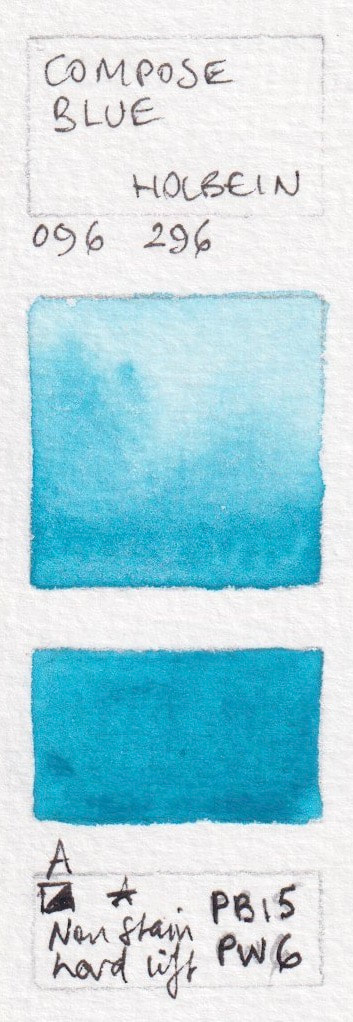
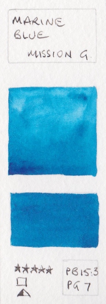
- Cobalt Blue Hue - Derivan PB29 + PB15; Verditer Blue - Holbein PB28 + PW6; Peacock Blue - Holbein PB15 + PG7; Compose Blue - Holbein PB15 + PW4; Marine Blue - Mission Gold PB15:3+PG7;
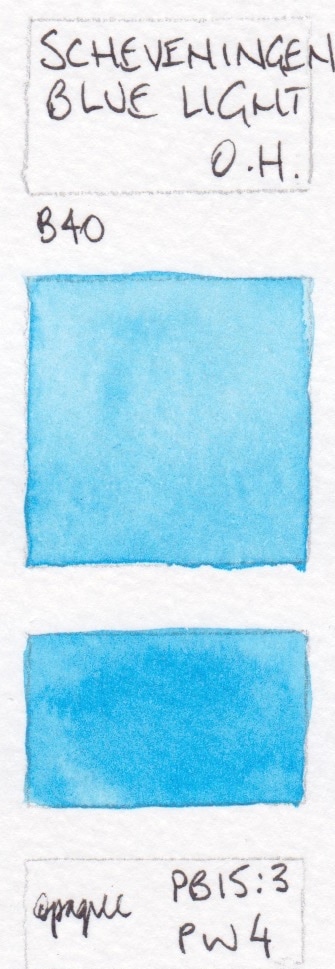
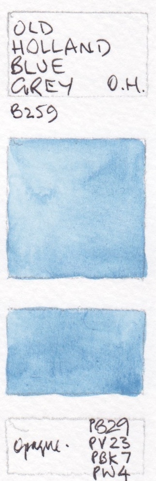
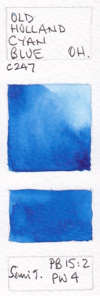
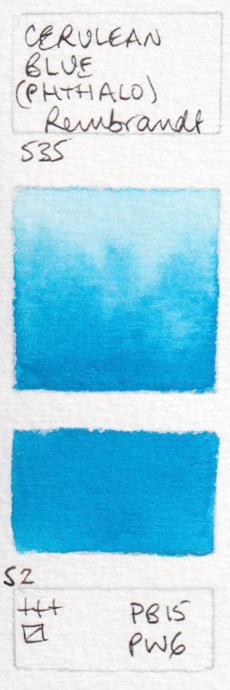
- Manganese Blue - Mission Gold PB15:3+PW6; Scheveningen Blue Light - Old Holland PB15:3+PW4; Old Holland blue Grey - Old Holland Watercolour PB29+PV23+PBk7+PW4; Old Holland Cyan blue - Old Holland Watercolour PB15:2+PW4; Cerulean Blue (Phthalo) - Rembrandt PB15, PW6;
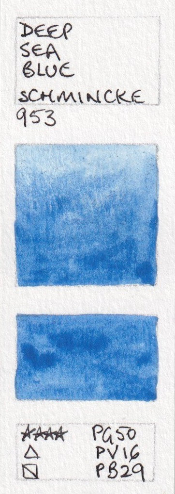
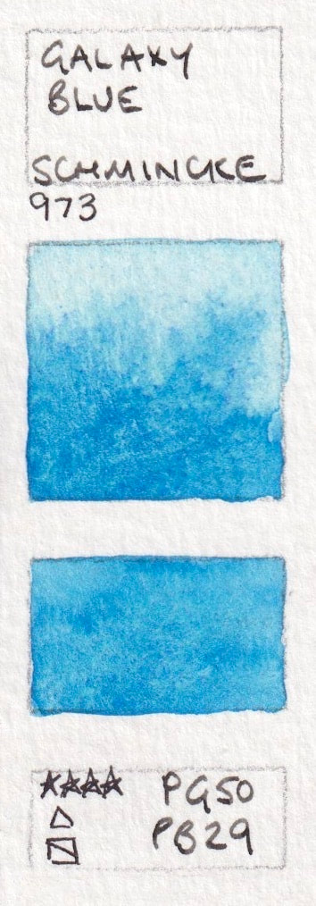
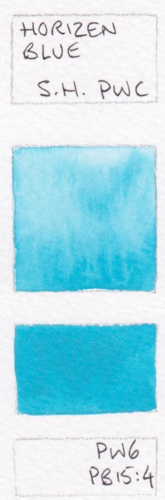
- Deep Sea Blue - Schmincke PG50, PV16, PB29; Glacier Turquoise - Schmincke PG50 + PV16; Galaxy Blue - Schmincke PG50 + PB29; Cinereous Blue - Sennelier PB15:3+PW4; Horizon blue - ShinHan PWC PW6+PB15:4;


Mixed Pigment mid to warm Blues
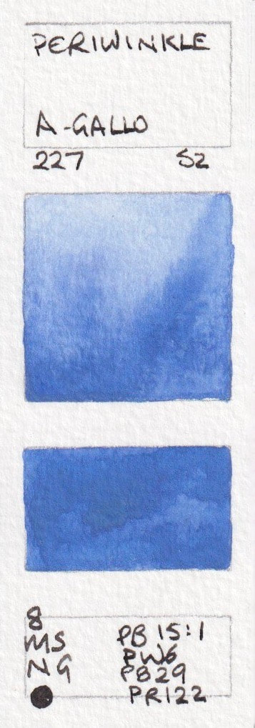
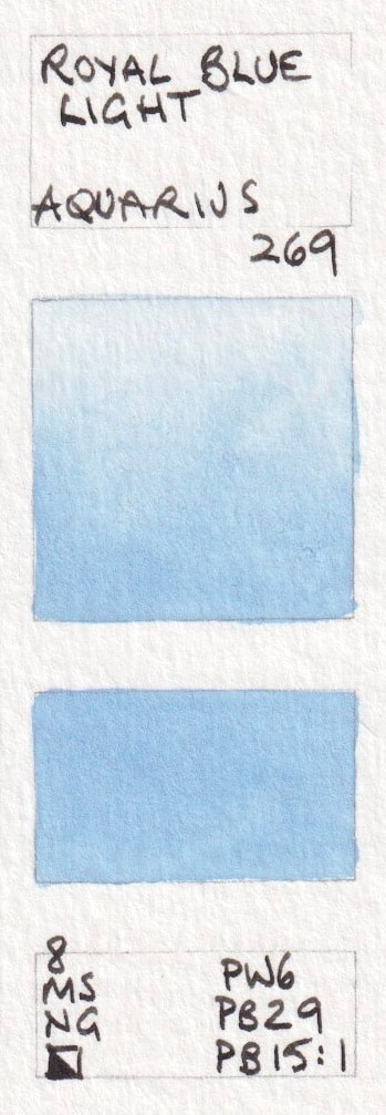
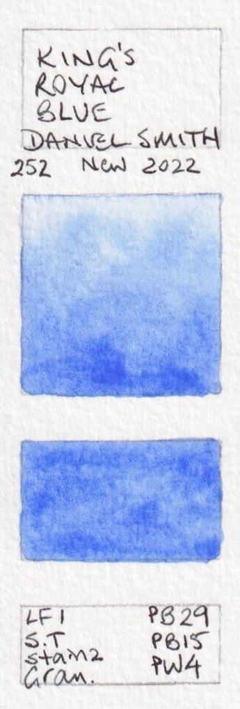
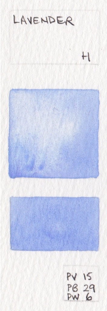
- Periwinkle - A Gallo PB15.1, PW6, PB29, PR122; Royal Blue Light - Aquarius Watercolour PW6 + PB29 + PB15:1 New 2023; Verditer Blue - Daniel Smith PB 28 + PB 36 + PW4; King's Royal Blue* - Daniel Smith PB29 + PB15 + PW4 New 2022; Lavender* - Daniel Smith PW6 + PV15 + PB29;
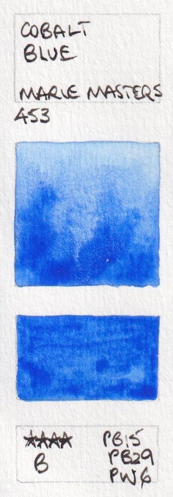
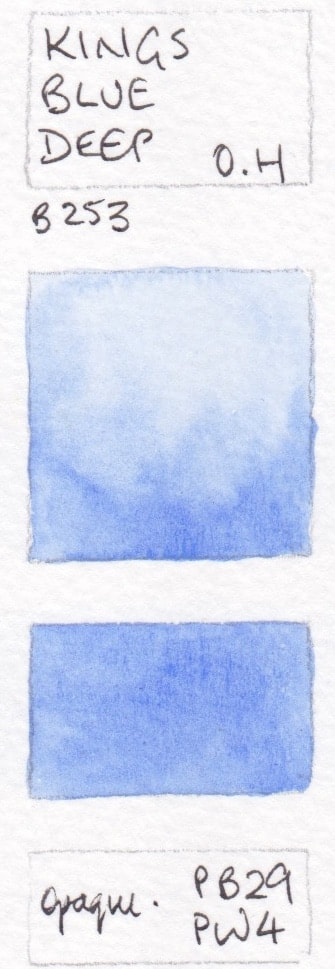
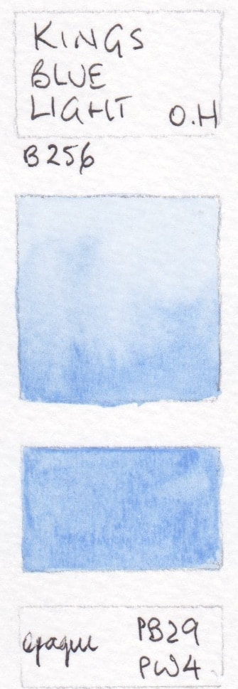
- Lavender - Holbein PB15 + PB29 + PW6; Cobalt Blue - Marie Masters PB15 + PB29 + PW6; King's Blue Deep - Old Holland PB29+PW4; King's blue Light - Old Holland PB29+PW4; Royal Blue* - Rosa PB29 + PW6 + PW4;
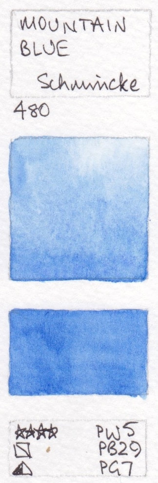
- Mountain Blue - Schmincke PW5 + PB29 + PG7; Cobalt Blue Deep - Schmincke PB74+PB28; Glacier Blue - Schmincke PB29 + PG50


These swatches are painted and added as a guide. The intention is show the characteristics of each colour when painted. The colour reproduction is not perfect but hopefully will still be helpful used in conjunction with the manufacturer's website. Thank you to those of you, from Canada, Sweden, Hong Kong, the UK, Australia and the USA, who have helped me with this section by sharing your favourite colours. If you notice errors please let me know so I can correct them. If you have artist quality watercolour that are not shown here and want to help me build up this resource, also please let me know :-)
This page was last updated in October 2023. Swatches marked * have been colour-matches as closely as I can.