Cool Yellows
Cool yellows are those that have a green bias. It is useful to have one cool and one warm yellow in a split primary palette. Common examples are Lemon Yellow, Spectrum lemon, Cadmium Yellow Light, Hansa Yellow Light, Transparent Yellow, Nickel Azo Yellow, and many more. When mixing with other colours, a cool yellow will make pure bright greens when mixed with a cool (greenish) blue, mid greens when mixed with a warm (purple) blue, neutral oranges when mixed with a cool (purple) red and mid oranges when mixed with a warm (orange) red. To neutralise, add purple.
Another option is to use a 'primary' or mid yellow that is neutral - neither warm nor cool - as the main yellow in your palette. Excellent examples are Azo Yellow by M.Graham, Hansa Yellow Medium by Daniel Smith, Pure Yellow by Schmincke and Winsor Yellow by Winsor & Newton. For more information on a mid yellow see my blog entry here. For More information about yellows from a range of companies see my Blog entry here
Note that although Aureolin is a mid yellow, is is not recommended as it fades and turns grey. See my lightfast tests at here
Cadmium Yellow Light
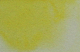
Cadmium Yellow Light. Daniel Smith watercolour.
Cadmium Yellow Light is made from a superb pigment PY 35. Lightfast and very useful in the palette. It is an opaque pigment.
A cheaper, more transparent alternative is Hansa Yellow Light, which is my preferred light or lemon yellow. The hues created would be very similar to those pictured below but I prefer the more transparent option for most of my painting. I use cadmium yellow light if I need a more opaque lemon yellow.
A cheaper, more transparent alternative is Hansa Yellow Light, which is my preferred light or lemon yellow. The hues created would be very similar to those pictured below but I prefer the more transparent option for most of my painting. I use cadmium yellow light if I need a more opaque lemon yellow.
Pure bright greens - Cool Yellow + Phthalo Blue
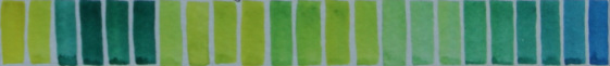
Hansa Yellow Light (left) mixed with Phthalo Blue (right).
Hansa yellow light, a lemon or greenish yellow, creates pure bright greens when mixed with Phthalo Blue. There is no red in the mix to neutralise or dull the colour.
Bright Blues - Cadmium Yellow Light + Cerulean
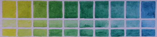
Cadmium Yellow Light (left) mixed with Cerulean Blue (right).
Cerulean is an opaque blue, with less tinting strength than Phthalo Blue (above). Pure, bright and opaque greens are created.
Mid greens - Cool Yellow + Cobalt Blue
Cadmium Yellow Light (left) mixed with Cobalt Blue (right).
Cobalt Blue is a warmer blue than Phthalo Blue, so the greens created are not quite so bright. They are easy to lift if necessary.
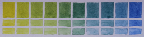
Mid greens - Cadmium Yellow Light + Ultramarine
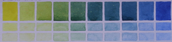
Cadmium Yellow Light (left) mixed with Ultramarine (right).
Due to its bias towards purple, Ultramarine mixes with a greenish yellow to create slightly less pure greens. For really neutral greens, see the Warm Yellows tab.
Neutral oranges - Cadmium Yellow Light + Anthraquinoid Red
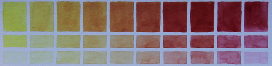
Cadmium Yellow Light (left) mixed with Anthraquinoid Red (right).
Neutral, useful oranges.
Neutral Yellows - Cadmium Yellow Light + Raw Sienna
Cadmium Yellow Light (left) mixed with Raw Sienna (right)
This combination creates an interesting range of yellow ochre hues.
Neutral oranges - Cadmium Yellow Light + Burnt Sienna
Cadmium Yellow Light (left) mixed with Burnt Sienna (right).
interesting for flesh tones and landscapes
Neutral Purples - Cadmium Yellow Light + Imperial Purple
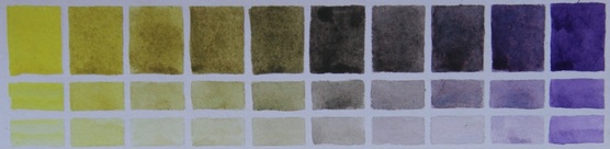
Cadmium Yellow Light (left) mixed with Daniel Smith Imperial Purple (right)
Imperial Purple is a mixture of Ultramarine Blue and Quinacridone Rose. It granulates beautifully. Since purple is the opposite of yellow it also creates shadow yellow colours and interesting neutrals.
Neutral Oranges - Cadmium Yellow Light + Quinacridone Rose

Cadmium Yellow Light (left) mixed with Quinacridoe Rose (right).
Quinacridone Rose is on the purple bias so the oranges created are quite neutral, although mixed with Hansa Yellow Light it also creates a good red. Some artists use Quinacridone Rose as their cool primary red.