Warm blues
Warm blues are those with a purple bias rather than a green bias. They will appear to come forward in a painting, whereas cool blues will recede. It is useful to have a warm and a cool blue in a split primary palette - when mixed together they will create a mid blue.
When mixing with other colours, the warm blue will create clear purples when mixed with a cool (rose or pink) red, neutralised olive greens when mixed with a warm (orange) yellow, mid greens when mixed with a cool (greenish) yellow and mid neutralised purples when mixed with a warm (orange) red. When mixed with it's opposite, orange, it will create neutrals and greys.
Examples of warm blues are Ultramarine and Indanthrone Blue. Cobalt Blue is almost a primary blue but it is also included here. To see a paint-out with comments on a huge range of blues in many brands see my Blog post here. To see all the blue watercolours I have tried see here.
Ultramarine Blue

Ultramarine Blue. PB 29.
Ultramarine Blue is one of the most useful blues for watercolour painting. It is a warm blue, so on the purple side rather than the green side, and will mix with pinks and crimsons to make wonderful purples, with warm yellows to make realistic greens, and with oranges/orange-browns to make great neutrals, as well as a whole range of other colours. If you only want one blue, make it this one!
Buy artist quality, and look for PB29 in the pigment section of the tube. It should create a semi-tansparent, granulating, lightfast (ASTM 1) colour.
PB29: complex sodium aluminium silicate.
For more information on Ultramarine and comparisons between brands see my blog entry here.
Buy artist quality, and look for PB29 in the pigment section of the tube. It should create a semi-tansparent, granulating, lightfast (ASTM 1) colour.
PB29: complex sodium aluminium silicate.
For more information on Ultramarine and comparisons between brands see my blog entry here.
Pure bright purples - Ultramarine + Quinacridone Rose

Ultramarine (left) mixed with Quinacridone Rose (right).
Here is Ultramarine Blue mixed with Quinacridone Rose, which creates gorgeous pure purples. There is no yellow to dull or neutralise the mix. Quinacridone Magenta PR122 is another lovely mixing colour for clear purples.
Pure bright Purples with Quinacridone Violet

Ultramarine (left) mixed with Quinacridone Violet (right).
Quinacridone Violet is another option when creating pure purples with a warm blue, in this case Ultramarine. Some brands may call this permanent violet, but look for PV19
Purples - Ultramarine + Anthraquinoid Red

Ultramarine (left) mixed with Anthraquinoid Red (right).
Ultramarine mixed with a crimson red, in this case Anthraquinoid Red, (though you could use Permanent Alizarin, Pyrrol Crimson or other crimson colours for these mixes), will also create purples though not as pure as the Quinacridone Rose and Quinacridone Violet.
Neutralised greens - Ultramarine + Cadmium Yellow Deep

Ultramarine (left) mixed with Cadmium Yellow Deep (right).
Here, Ultramarine is mixed with a warm yellow to create realistic greens. Warm yellows include Cadmium Yellow Deep, Indian yellow, New Gamboge, Hansa Yellow Deep an many more. They are on the orange side of yellow. Quinacridone gold is a transparent and slightly neutralised warm yellow and make fabulous greens for Australian landscapes.
Neutralised transparent greens - Ultramarine + New Gamboge

Ultramarine mixed with New Gamboge
Ultramarine mixed with a transparent warm yellow, in this case New Gamboge, will create transparent neutralised greens.
Neutralised transparent greens - Ultramarine + Quinacridone Gold

Ultramarine (left) mixed with Quinacridone Gold (right).
A really useful combination! Quinacridone Gold, Daniel Smith watercolour, is my favourite warm mixing yellow. In other brands it can be a more dull or a more green hue.
Mid greens - Ultramarine + Cadmium Yellow Light

Ultramarine Blue (left) mixed with Cadmium Yellow Light (right).
This card shows a range of greens possible with Ultramarine mixed with the cooler lemon yellow Cadmium Yellow Light.
Turquoises - Ulramarine + Phthalo Green

Ultramarine (left) mixed with Phthalo Green (right).
Here, Ultramarine blue is mixed with Phthalo Green to create a range of cool blues and turquoise greens.
Greys and neutrals - Ultramarine Blue + Burnt Sienna

Ultramarine (left) mixed with art Spectrum Burnt Sienna (right).
To make a gorgeous series of useful greys without adding black (which will dull down your painting), mix Ultramarine with Burnt Sienna, a neutral orange-brown. This will create an invaluable range of light greys, light blue greys for skies, deep browns, deep stormy greys as well as Indigo and Burnt Umber shades. it is a useful mix for deep shadows and, with lots of water, for painting white objects in shadow.
Note that Ultramarine Blue, made from PB29, is a granulating pigment so don't expect smooth washes, but enjoy the granulation as the pigment settles into the paper. Art Spectrum Burnt Sienna is also highly granulating.
Note that Ultramarine Blue, made from PB29, is a granulating pigment so don't expect smooth washes, but enjoy the granulation as the pigment settles into the paper. Art Spectrum Burnt Sienna is also highly granulating.
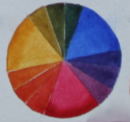
Ultramarine + Quinacrdone gold + Quinacridone Rose in a colour wheel

Colour wheel with Ultramarine, Quinacridone Gold and Quinacridone Rose.
Ultramarine, Quinacridone gold and Quinacridone Rose create a very useful primary triad for creating natural, life-like colours. The greens and oranges are slightly neutralised but the purples are bright and pure. The oranges created by mixing the Quinacridone Gold and Quinacridone Rose is neutralised by Ultramarine to create browns and neutral darks.
Ultramarine mixed with common palette colours

Ultramarine with cadmium yellow light, cadmium yellow deep, quinacridone sienna, cadmium red medium, permanent alizarin, quinacridone rose, quinacridone violet, imperial purple, buff titanium, indigo, manganese blue, phthalo blue, phthalo green, sap green, raw sienna, burnt sienna, indian red, burnt umber.
Cobalt Blue

This beautiful blue is often regarded as a primary blue since it is a very pure blue, neither yellow nor green in bias so some artists prefer to use Cobalt Blue as their main blue. I think it behaves more as a warm blue than a cool blue so I have included it here. It has less tinting strength than Ultramarine, my preferred blue for mixing, but has a lovely character.
Cobalt colours lift out easily which can be helpful if lifting out of a wet painted sky to make clouds.
Pigment is PB 28. Don't buy a cobalt hue, which is often created with ultramarine and white - you could mix that yourself.
Cobalt colours lift out easily which can be helpful if lifting out of a wet painted sky to make clouds.
Pigment is PB 28. Don't buy a cobalt hue, which is often created with ultramarine and white - you could mix that yourself.
Pure to mid Greens - Cobalt Blue + Cadmium Yellow Light

Cobalt Blue (left) mixed with Cadmium Yellow Light (right).
The lighter tones are created by adding more water to the mixtures in the top row.
Neutral Greens - Cobalt Blue + Cadmium Yellow Deep

Cobalt Blue (left) mixed with Cadmium Yellow Deep (right).
With a warm yellow, Cadmium Yellow Deep, the greens are more neutralised, but still not as 'olive' as greens made with Ultramarine with warm yellow.
Pure Purples - Cobalt Blue + Quinacridone Violet

Cobalt Blue (left) mixed with Quinacridone Violet (right).
Cobalt Blue makes lovely pure purple and mauve colours when mixed with Quinacridone Rose, Quinacridone Violet or Quinacridone Pink. Many of the best purple watercolours available are mixtures like this. They are easy to make yourself, but may be chosen for convenience. (See Quinacridones Tab for more)
Indanthrone Blue (Indanthrene Blue)
|
This is a gorgeous deep warm blue made with PB60. It is a non-granulating blue that will run wild on damp paper. I don't see it as a better warm blue than Ultramarine, but I love it as an additional blue in my palette. It makes wonderful greens with a range of yellows and is very effective for a night sky.
|
