Split Primaries in action.
It is very difficult to get a full colour range, and be able to produce bright, mid and neutralised secondaries, with only one red, one yellow and one blue unless they are very carefully chosen (for example a mid yellow, a rose or magenta-red and a cool to mid blue). Consequently a split primary system is often used, especially since we don't only want bight secondary colours - often it's the more dull mixes that we need. Below are some colour wheels made with different primary triads. Notice how they produce some bright secondaries, some mid and some dull or neutralised secondary colours. These charts were created with Art Spectrum Gouache, so are applicable to acrylics and oils as well as gouache. The warm blue is Ultramarine, the cool blue is Cerulean. The warm red is Vermilion, the cool red is Crimson. The warm yellow is Deep Yellow, the cool yellow is Primrose. No other colours are used, except black and white to create the tints and shades.
To see a variety of suggested primary triads in watercolour go to the Watercolour Triads tab.
To see a variety of suggested primary triads in watercolour go to the Watercolour Triads tab.
Cool Red, Warm Yellow, Cool Blue.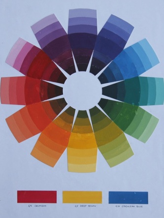 Colour wheel made with Crimson, Deep Yellow and Cerulean
This combination produces mid greens, mid purples and mid oranges. |
Complementary mixes.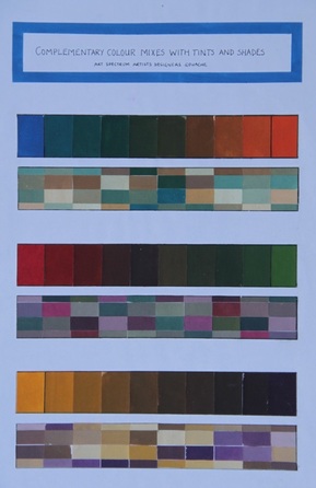 Complementary mixes with Cerulean, Crimson and Deep Yellow.
Mixing a primary with its opposite creates a range of shadow and neutral colours.
The opposite of Blue, here Cerulean, is orange, here made with Deep Yellow + Crimson. The opposite of Red, here Crimson, is green, here made with Deep Yellow and Cerulean. The opposite of Yellow, here Deep Yellow, is purple, here made with Crimson and Cerulean. |
Warm red, cool yellow, cool blue.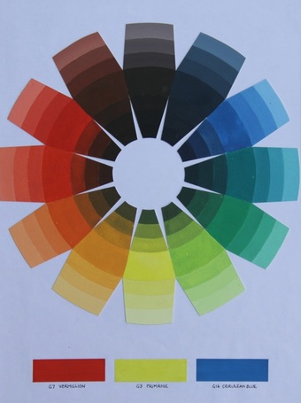 Colour wheel made with Vermillion, Primrose and Cerulean.
This triad produces neutralised greys, indigo and earthy reds rather than purples, mid oranges and bright greens. Cool red, cool yellow, warm blue.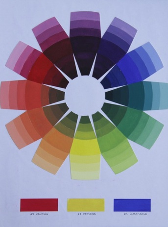 Colour wheel made with Crimson, Primrose and Ultramarine.
This triad produces bright purples, mid greens and dull oranges. |
Complementary mixes.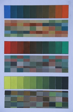 Complementary mixes with Cerulean, Vermilion and Cerulean.
The opposite of Blue, here Cerulean, is orange, here made with Primrose and Vermillion. The opposite of Red, here Vermillion, is green, here made with Primrose and Cerulean. The opposite of Yellow, here Deep Yellow, is purple, here made with Crimson and Cerulean. Complementary mixes.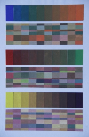 Complementary mixes with Ultramarine, Crimson and Primrose.
The opposite of Blue, here Ultramarine, is orange, here made with Primrose and Crimson. The opposite of Red, here Crimson, is green, here made with Primrose and Ultramarine. The opposite of Yellow, here Primrose, is purple, here made with Crimson and Ultramarine. |
Warm red, warm blue, warm yellow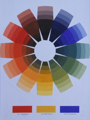 Colour wheel made from Vermillion, Deep Yellow and Ultramarine.
This triad produces neutralised purples, bright oranges and dull neutralised greens. |
Complementary mixes.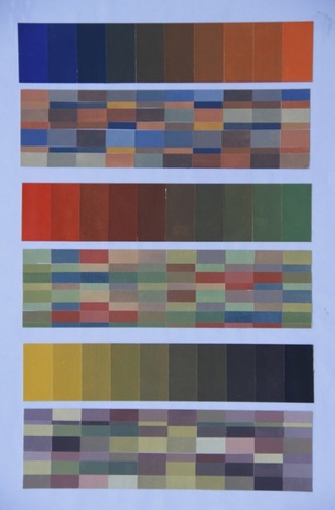 Complementary mixes with Ultramarine, Vermillion and Deep Yellow.
The opposite of Blue, here Ultramarine, is orange, here made with Deep Yellow and Vermillion. The opposite of Red, here Vermillion, is green, here made with Deep Yellow and Ultramarine. The opposite of Yellow, here Deep Yellow, is purple, here made with Crimson and Ultramarine. |
The most useful combination if you really need to limit the number of tubes of paints you buy would be a cool crimson or rose red, a warm blue and a warm yellow. This would create realistic colours - dull greens, bright purples and mid oranges we often see in the real world. However, if funds allow it, a warm and a cool red, a warm and a cool yellow and a warm and a cool blue will increase your colour options dramatically. I actually prefer a rose red (look for PV19) to a crimson for mixing - it is closer to a primary.
Reds and Greens
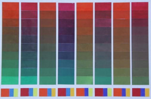
Red/Green opposites using Art Spectrum gouache - Vermillion, Crimson, Cerulean, Primrose, Deep Yellow and Ultramarine.
Using the same split primary palette as above, this chart shows the ranges of opposites produced by mixing each red with each possible green.
Yellows and Purples
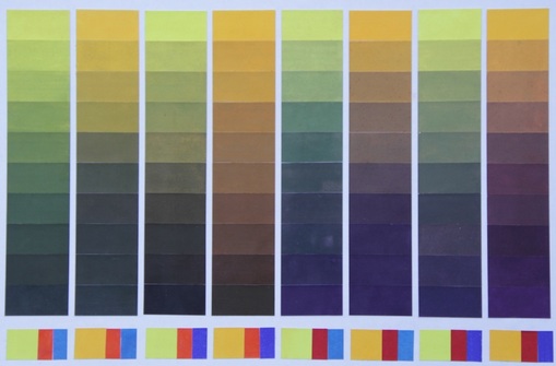
Yellow/Purple opposites using Art Spectrum gouache - Vermillion, Crimson, Cerulean, Primrose, Deep Yellow and Ultramarine.
In this case each yellow is mixed with each possible purple. Notice how the vermillion creates a very dull purple with either of the blues.
Blues and Oranges
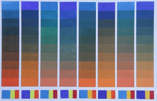
Blue/Orange opposites using Art Spectrum gouache - Vermillion, Crimson, Cerulean, Primrose, Deep Yellow and Ultramarine.
This chart shows each blue mixed with each possible orange using only the six primaries. Notice how some combinations produce some lovely greens and turquoises .
This page was last edited April 2018