Sketchbook Pages - colour mixing
I have a number of sketchbooks that I use to test colours, ink, pens, palettes and so on. I think of these as 'working sketchbooks'. Here are some of the pages, often with links to my Blog which explains what ideas I worked through. Like all my sketchbook scans, they are numbered #(sketchbook number) P(page number) so I can find them again if I need to.
Five colours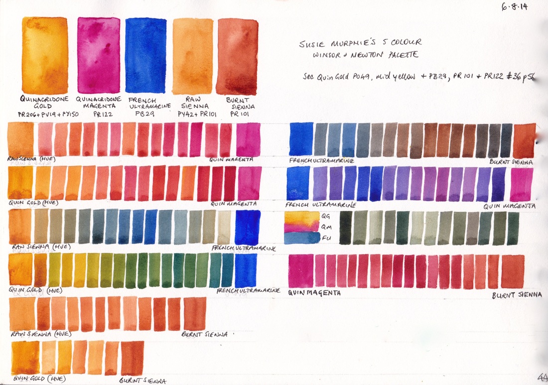
#36 P44 Mixing with SM palette
A personal palette (Susie Murphie) using Winsor & Newton watercolours. See another variation of this palette on my blog here and my prefered version on the right.
8 colour palette with lots of oranges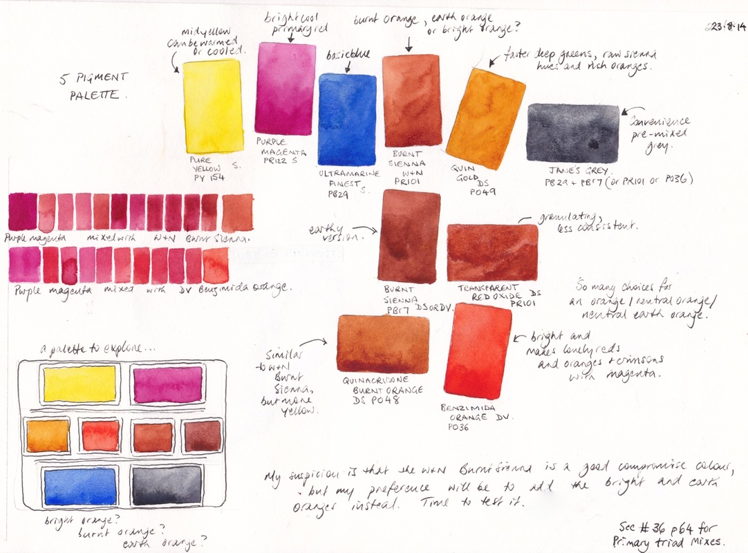
#35 P47 more variations
This palette is based heavily around oranges in all forms. I wondered whether a bright orange would be more useful than a burnt orange or Burnt Sienna in a palette. I set up one with three different oranges as pictured in the bottom left. I'd prefer Quinacridone Rose to magenta.
Six colours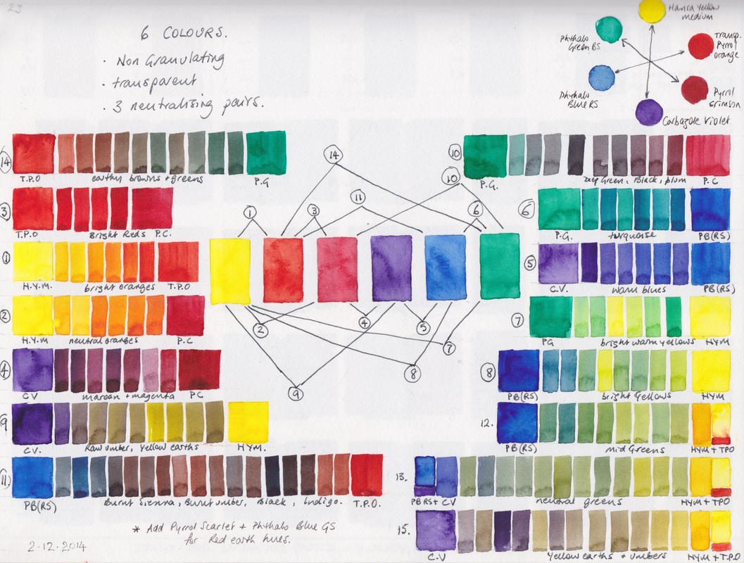
#39 P23 6-colours non granulating.
This is a balanced full gamut palette based around 3 bright neutralising pairs. You can see more on my blog post here.
|
Five colours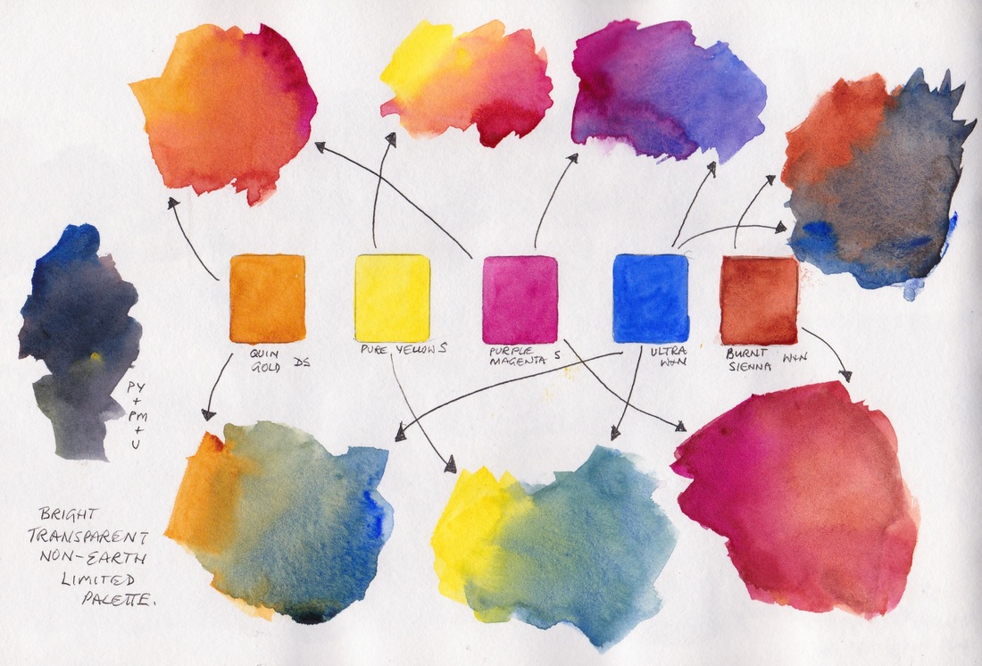
#36 P56, mixing based on SM palette
This 5-colour palette was based around Susie Murphie's palette, but adding a bright primary yellow instead of raw sienna and a clean DS Quinacridone Gold instead of the W&N dull version. It's a very versatile palette. I still prefer the PBr7 Daniel Smith burnt sienna and quinacridone rose rather than purple magenta.
Six Colours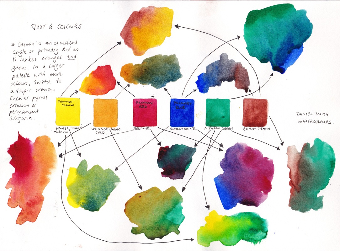
#35 P32 limited palette with Carmine
This is a great way to start with watercolour. The phthalo green can be mixed with the ble to make cool blues. For more detail about this versatile mixing set, see my Blog post here
Six Colours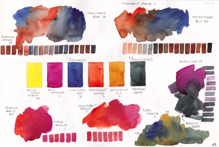
#36 P69 intense Indanthrone blue 6-colour palette
This 6-colour powerful, non-granulating palette exploration was based around Indanthrone Blue and Translucent Orange (Schmincke) as a mixing pair, with the very dark Perylene Green rather than phthalo green to neutralise PR122 Purple magenta. I have explored a lot of PR122 mixes but actually prefer the Quinacridone Rose PV19 palette options.
|
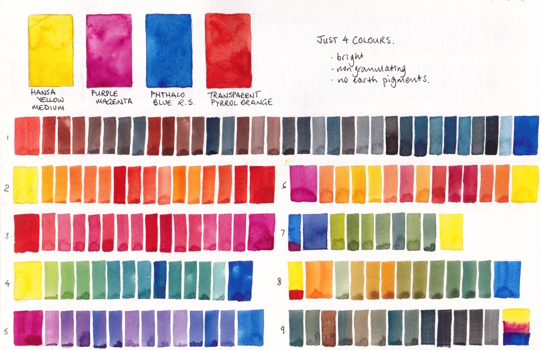
Just 4 colours - the Zorn palette |
Eleven-pigment palette exploration |
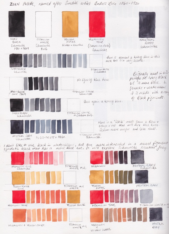
#39 P58 Zorn palette
|
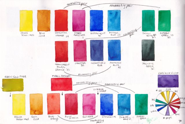
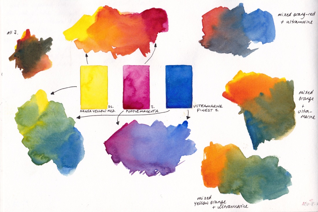
#36 P70 bright palette options - no earths
|
|
This is an historical oil painting palette. You can see more about it on my blog here.
|
This palette was exploring neutralising pairs to create earth colours and ended up being 11 pigments, including an orange, green and purple. The PY129 Green Gold is the least important, but lot of mixing is needed if you don't have earth pigments.
|