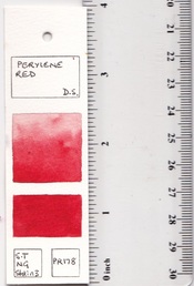
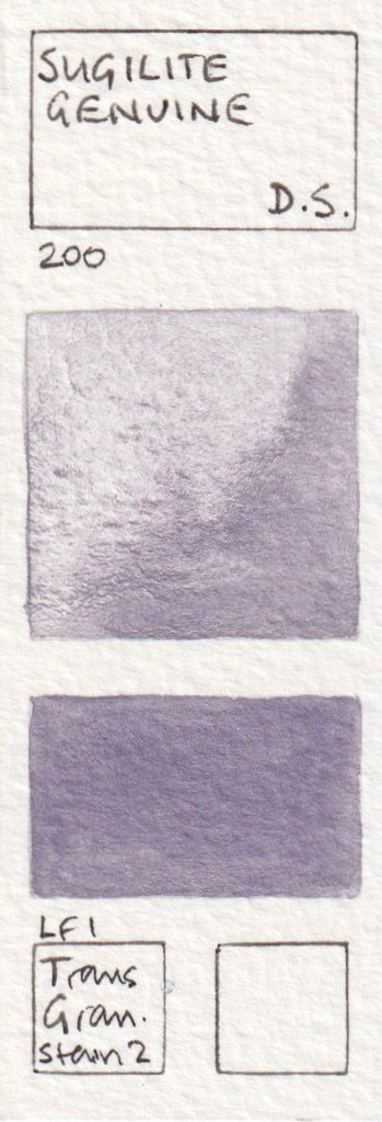
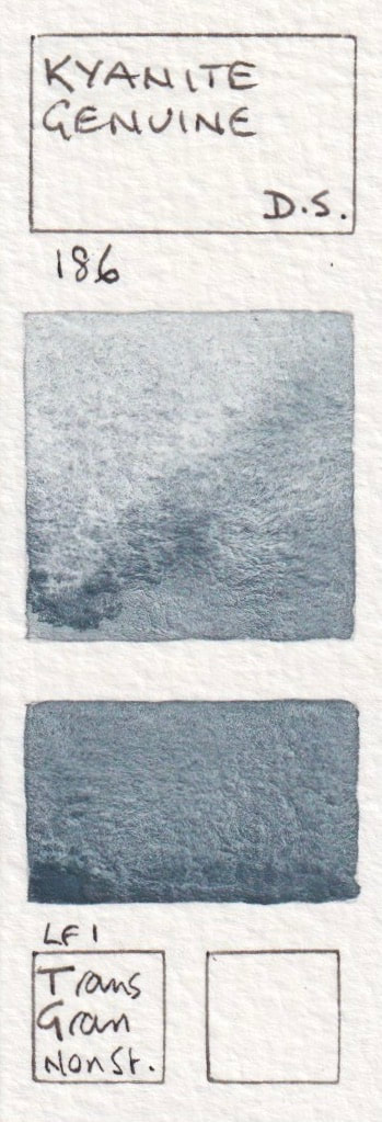
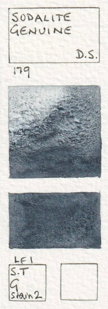
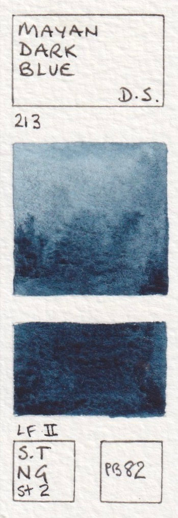
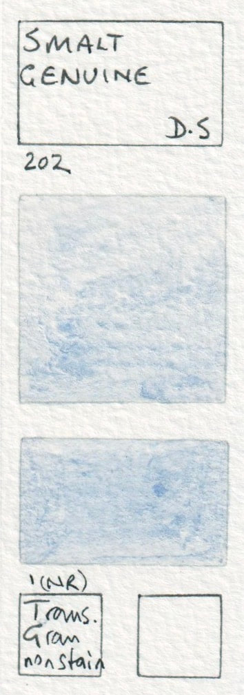
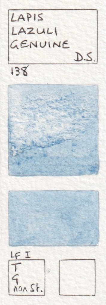
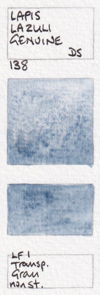
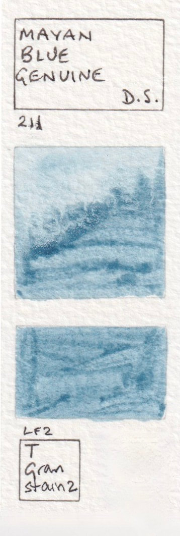
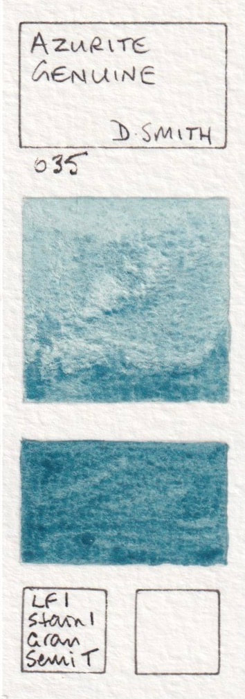
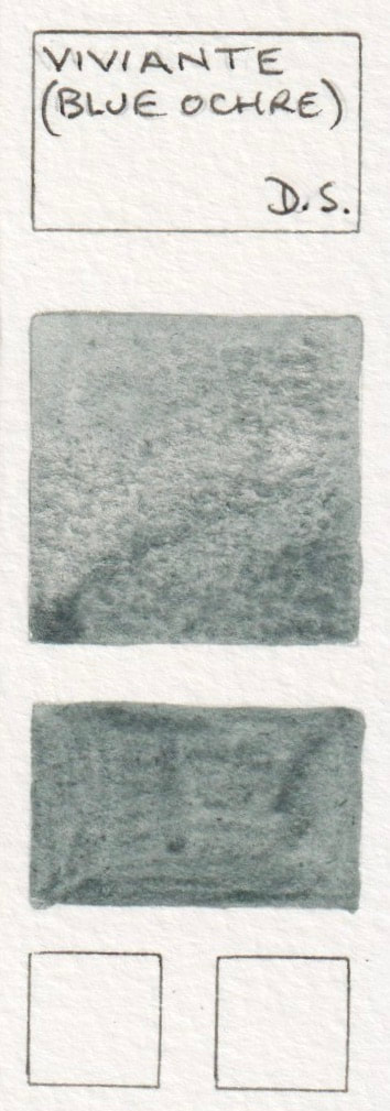
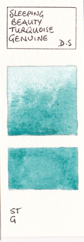
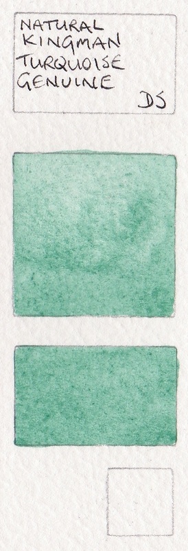
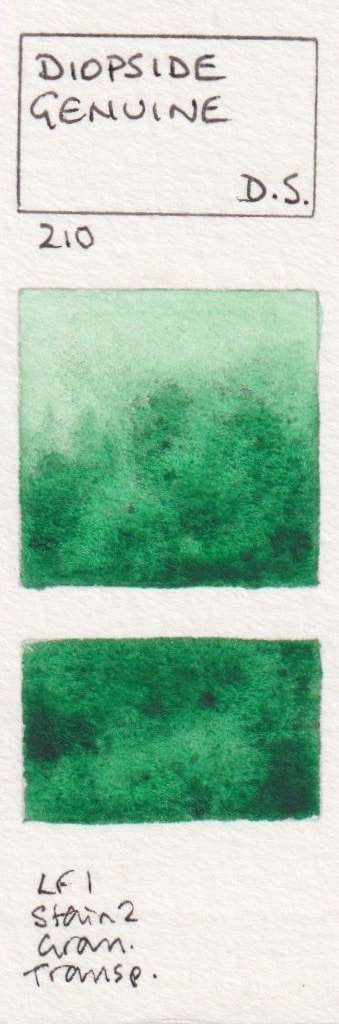
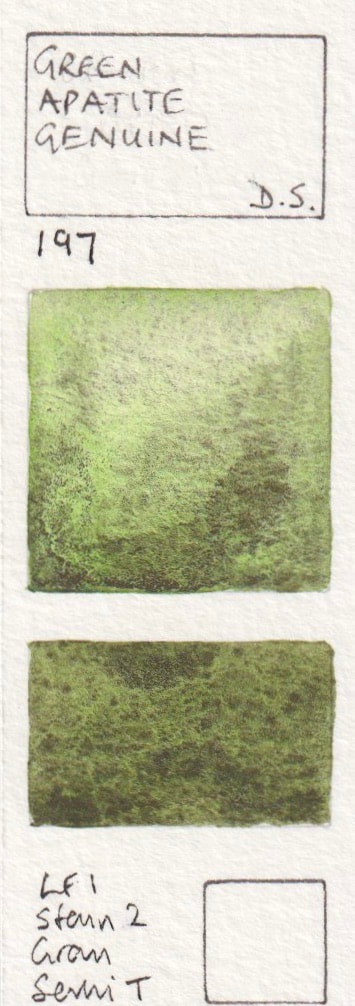
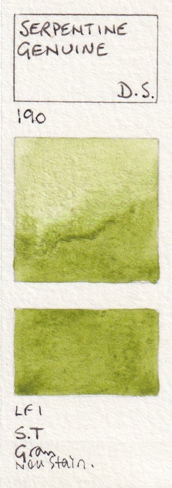
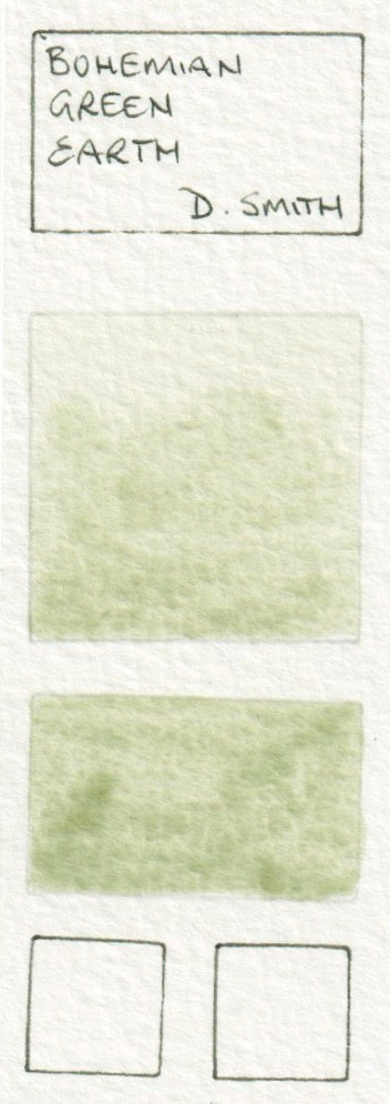
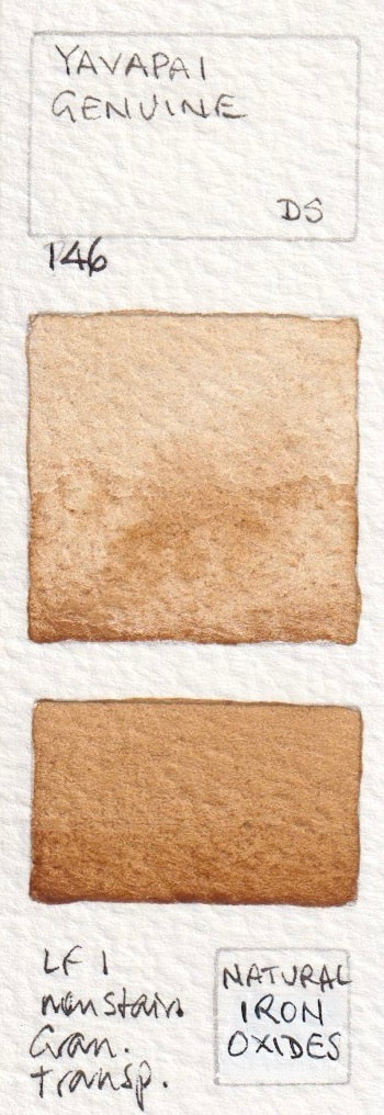
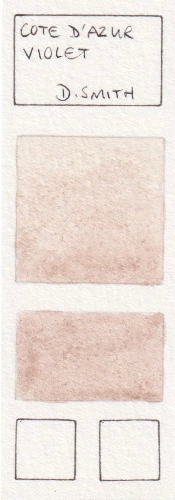
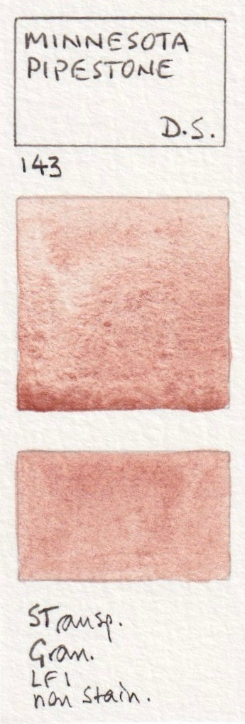
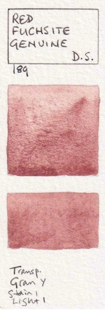
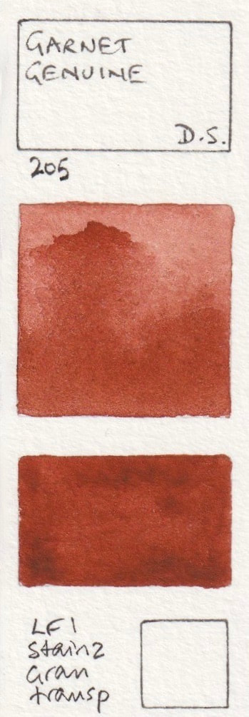
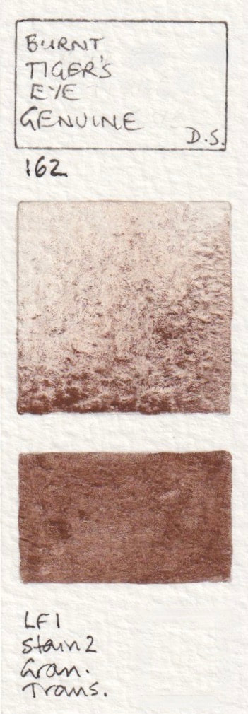
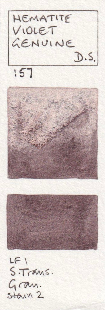
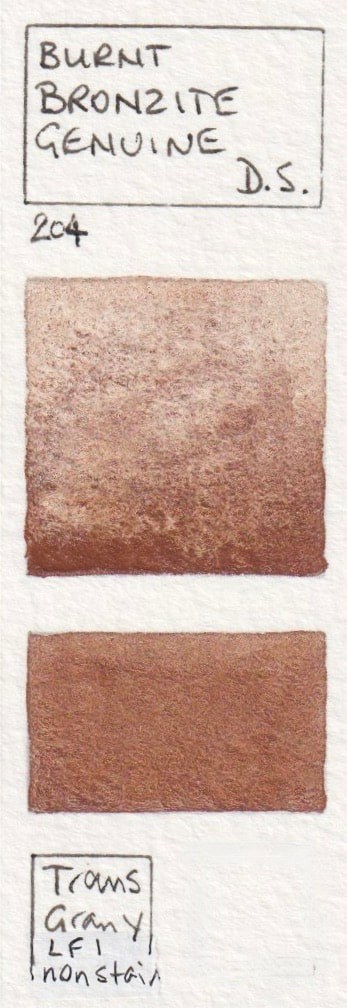
11 - Primatek Watercolour SwatchesThere are literally hundreds of artist quality watercolours available from many brands. I have tested many of them and created swatches as seen on the right. The square box is painted into a damp wash at the top to show the colour mixed in water, with more pigment added towards the bottom. The rectangle is painted in a juicy wash to show the mass-tone. The small squares at the bottom of the swatch have the pigment number and characteristics - staining, lightfast rating, granulation and transparency. I plan to keep adding to these hundreds of swatches as I try new paints.
|
The size of my swatches
|
|
If you find my website and blog useful, please consider making a one-off donation or perhaps a regular payment to help me keep my content free and up to date :-)
|
|
Primateks
Daniel Smith has a huge range of Primatek colours, many of which are remarkable. They are ground up precious or semiprecious stones so are generally very granulating and some have sparkle. Some have a palette of colours within one paint tube, such as Green Apatite Genuine, so while they are expensive, they are incredibly versatile. I've chosen to put them all together here. Note that Rhodonite Genuine looks like a magenta. When first painted is was more pink but it changes with exposure to oxygen. It is important to test your colours for light-fastness. Vivianite, Sleeping Beauty Turquoise and Kingman Island Turquoise also changed or faded in my lightfast tests. See these results here.
- Rhodonite Genuine*; Purpurite Genuine*; Amethyst Genuine*; Sugilite Genuine*; Kyanite Genuine*
- Sodalite Genuine*, Mayan Dark Blue* - PB82; Smalt Genuine* (Discontinued); Lapis Lazuli Genuine*, Lapis Lazuli Genuine* - Daniel Smith (2022 sample)
- Mayan Blue Genuine*,Blue apatite Genuine*, Azurite Genuine (Discontinued); Vivianite (Blue Ochre) (Discontinued)*; Fuchsite Genuine*,
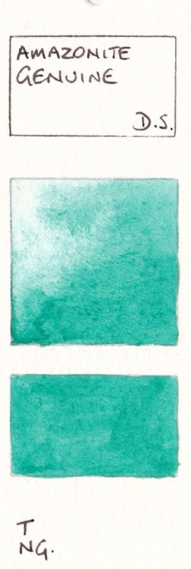
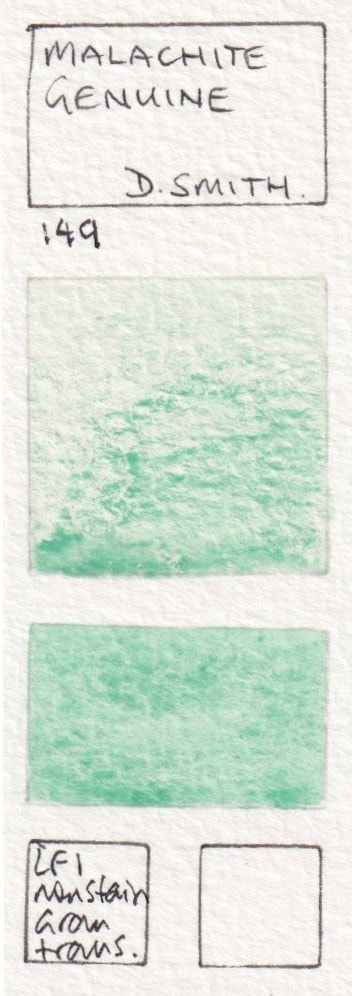
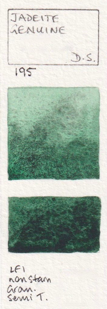
- Sleeping Beauty Turquoise Genuine; Natural Kingman Turquoise Genuine, Amazonite Genuine, Malachite Genuine* (Discontinued); Jadeite Genuine*;
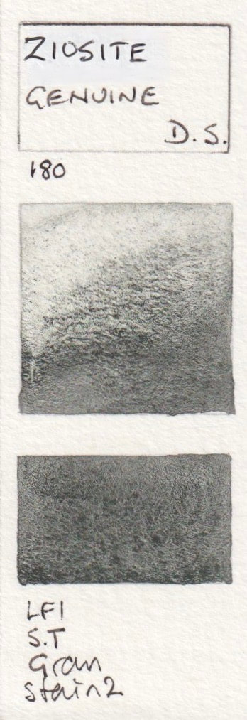
- Zoisite Genuine*; Diopside Genuine*, Green Apatite Genuine*, Serpentine Genuine*; Bohemian Green Earth* (Discontinued);
- Yavapai Genuine*; Bronze Genuine*; Cote D'Azure Violet* (Discontinued); Minnesota Pipestone Genuine*; Red Fuchsite Genuine*;
- Sedona Genuine*; Garnet Genuine*; Hematite Burnt Scarlet Genuine*; Burnt Tiger's Eye Genuine*; Hematite Violet Genuine*;
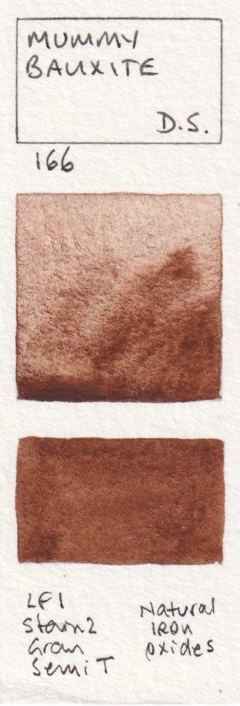
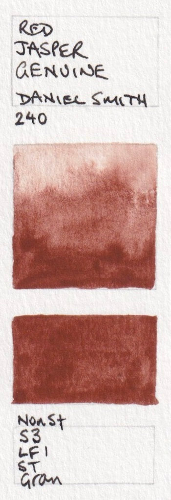
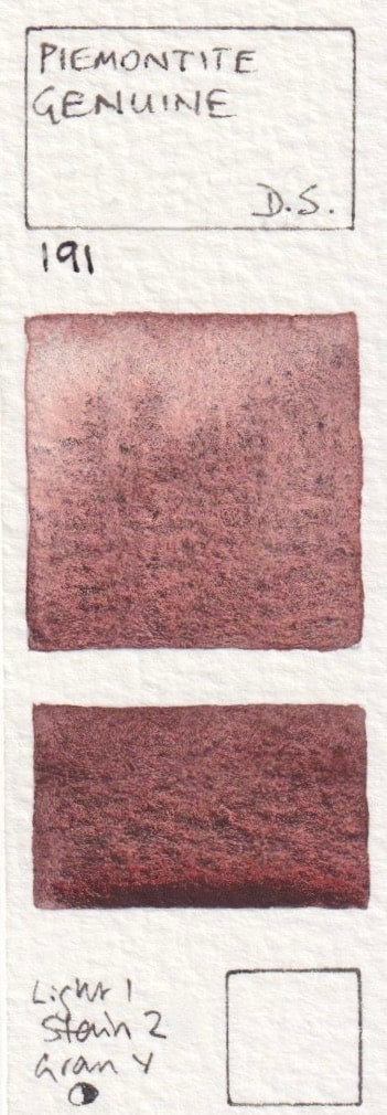
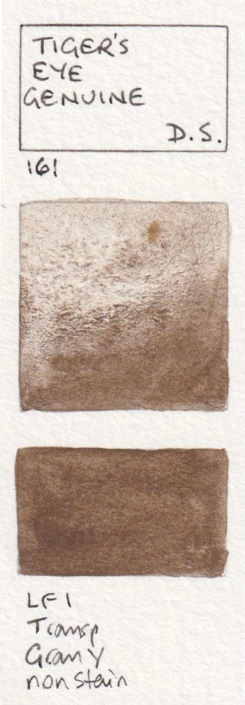
- Burnt Bronze Genuine*; Mummy Bauxite*; Red Jasper Genuine* (New 2019); Piemontite Genuine*; Bloodstone Genuine*;
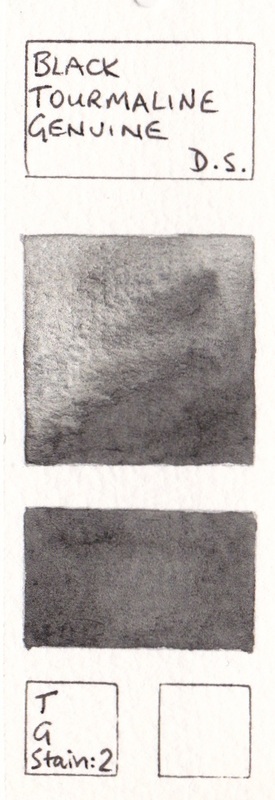
- Tiger's Eye Genuine*; Sickerite Genuine*; Hematite Genuine*; Black Tourmaline Genuine.
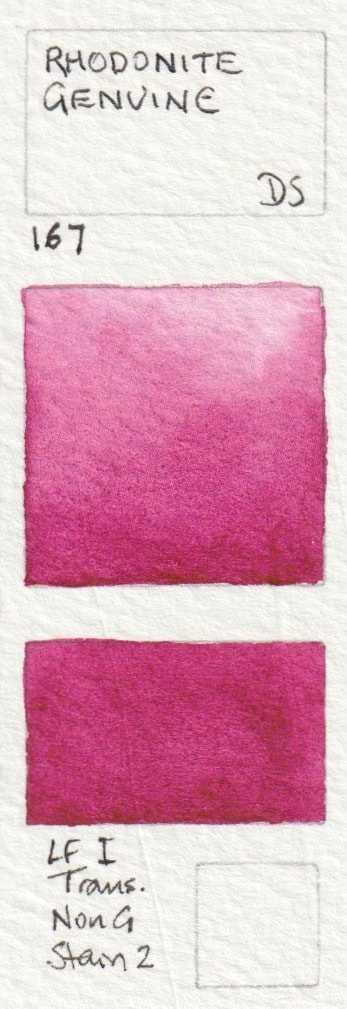
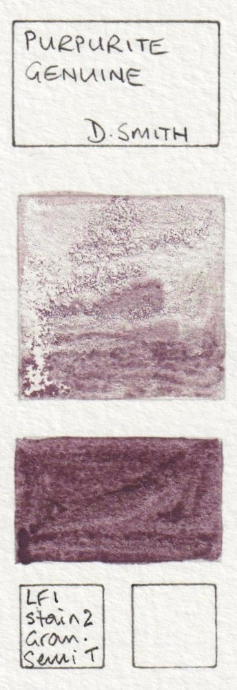
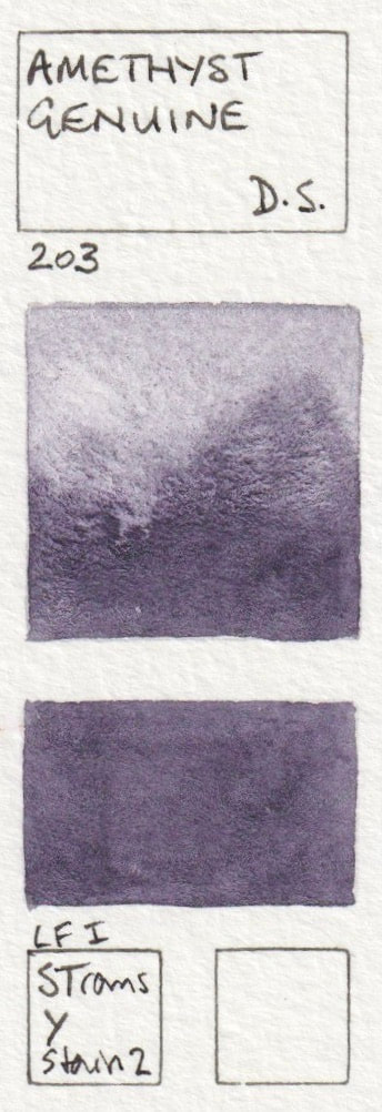


These swatches are painted and added as a guide. The intention is show the characteristics of each colour when painted. The colour reproduction is not perfect but hopefully will still be helpful used in conjunction with the manufacturer's website. Thank you to the many people from all over the world who have helped me with this section by sharing your favourite colours. If you notice errors please let me know so I can correct them. If you have artist quality watercolour that are not shown here and want to help me build up this resource, also please let me know :-)